hello!
get to know me more!
+639 562 684 697
markginald@gmail.com
let’s be friends
on the internet :)

hello!
get to know me more!
+639 562 684 697
markginald@gmail.com
let’s be friends
on the internet :)
hello!
get to know me more!
+639 562 684 697
markginald@gmail.com
let’s be friends
on the internet :)
the
branding
stuff
the branding stuff
past
works
past
works
topic:
topic:








This body of work focuses on creating clear and flexible visual guidelines that ensure brand consistency across campaigns, platforms, and executions. The projects include visual systems developed for campaigns and brands such as Your Run, Her Shine HMD Run 2025, Kik’s Tamarind, and Gourmet Series.
Each guideline was built to support real-world application—covering key elements such as color systems, typography, layout rules, graphic treatments, and usage for both digital and on-ground materials. The goal was to provide brands and teams with a strong visual foundation that allows creativity while maintaining coherence and recognizability.
From lifestyle and food brands to large-scale campaign assets, these visual guidelines were designed to scale across social content, marketing collaterals, and campaign rollouts while staying aligned with each brand’s tone, audience, and objectives.
drag
each
card
drag
each
card
This body of work focuses on creating clear and flexible visual guidelines that ensure brand consistency across campaigns, platforms, and executions. The projects include visual systems developed for campaigns and brands such as Your Run, Her Shine HMD Run 2025, Kik’s Tamarind, and Gourmet Series.
Each guideline was built to support real-world application—covering key elements such as color systems, typography, layout rules, graphic treatments, and usage for both digital and on-ground materials. The goal was to provide brands and teams with a strong visual foundation that allows creativity while maintaining coherence and recognizability.
From lifestyle and food brands to large-scale campaign assets, these visual guidelines were designed to scale across social content, marketing collaterals, and campaign rollouts while staying aligned with each brand’s tone, audience, and objectives.
drag
each
card


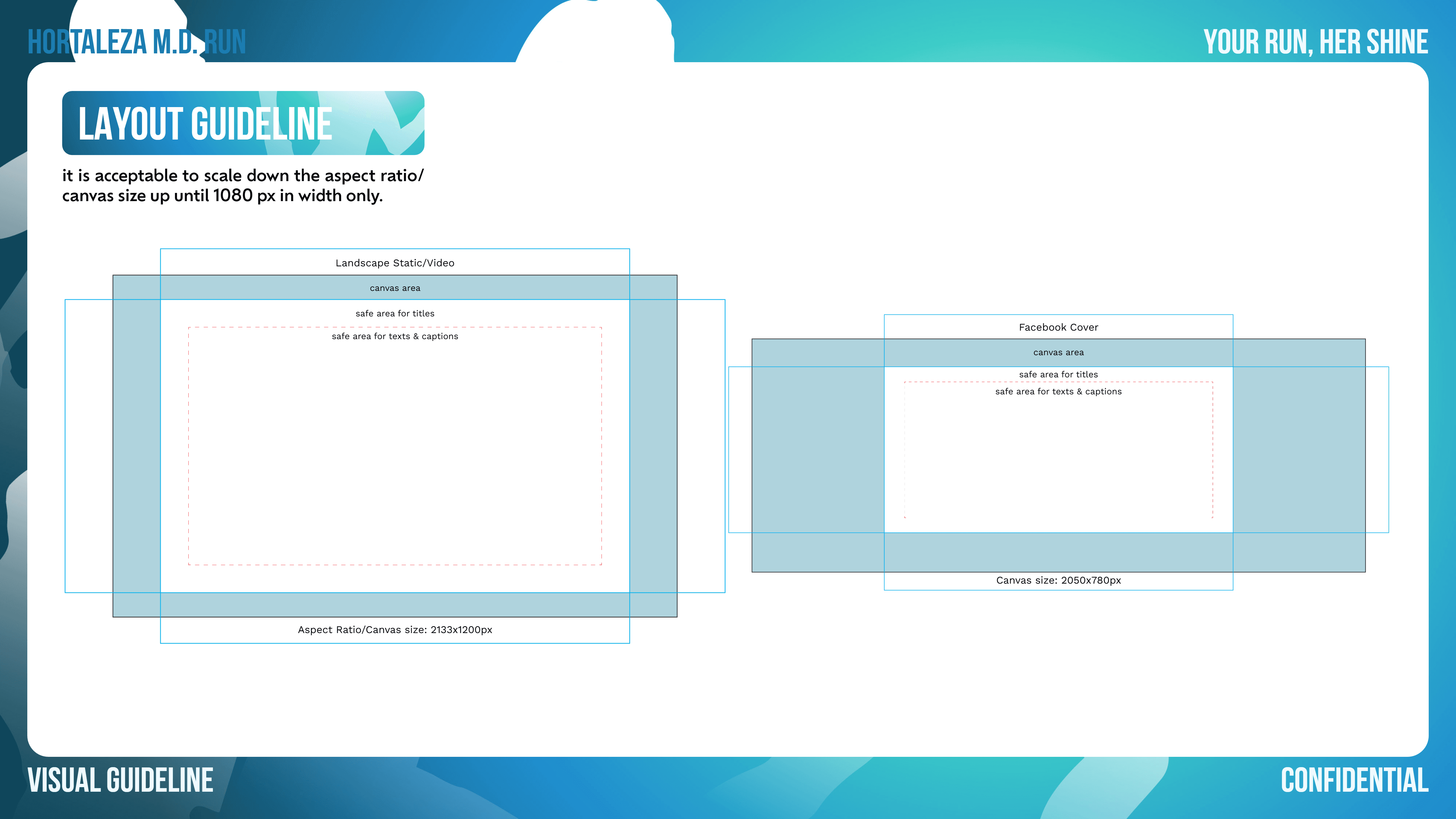
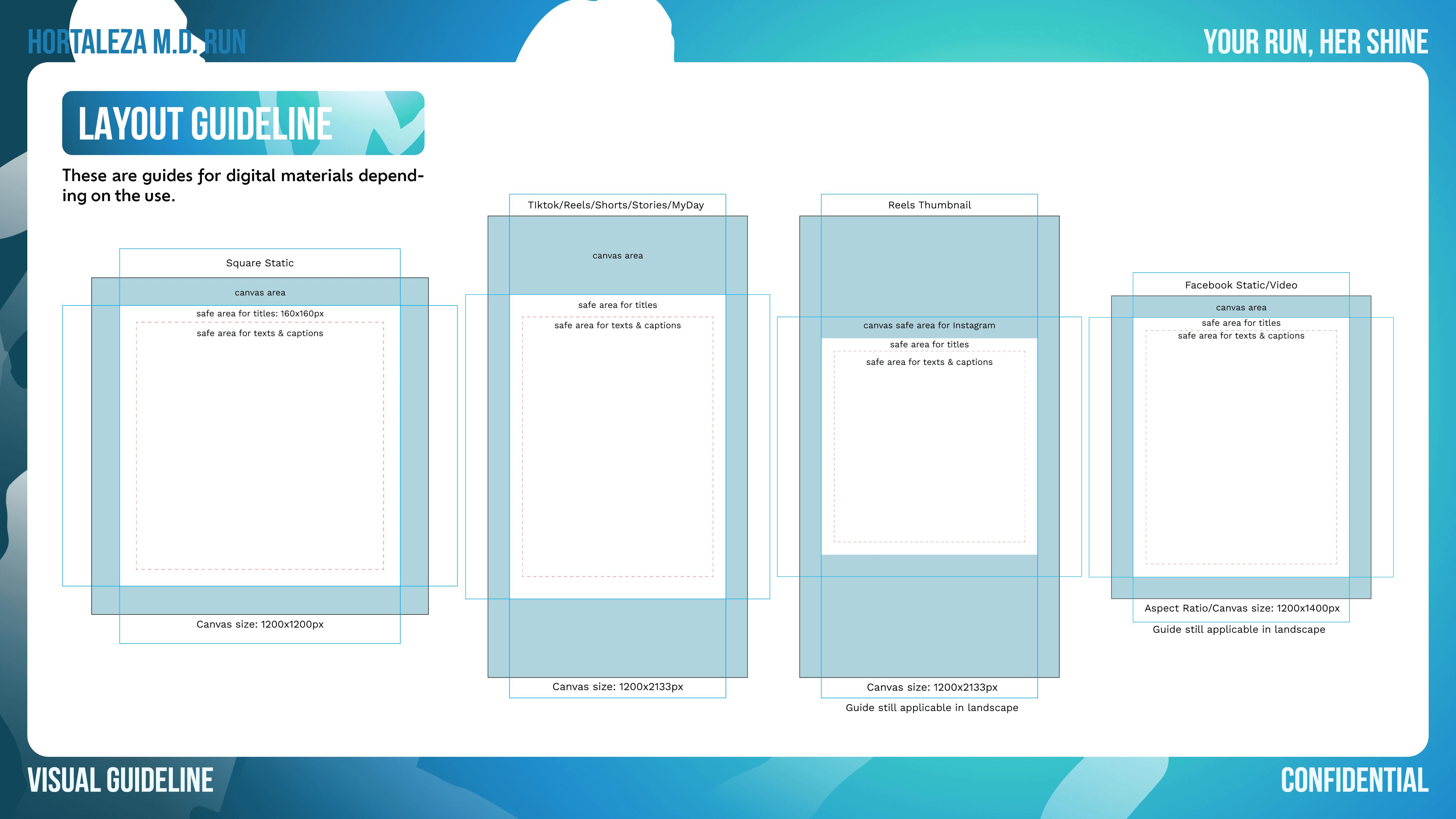

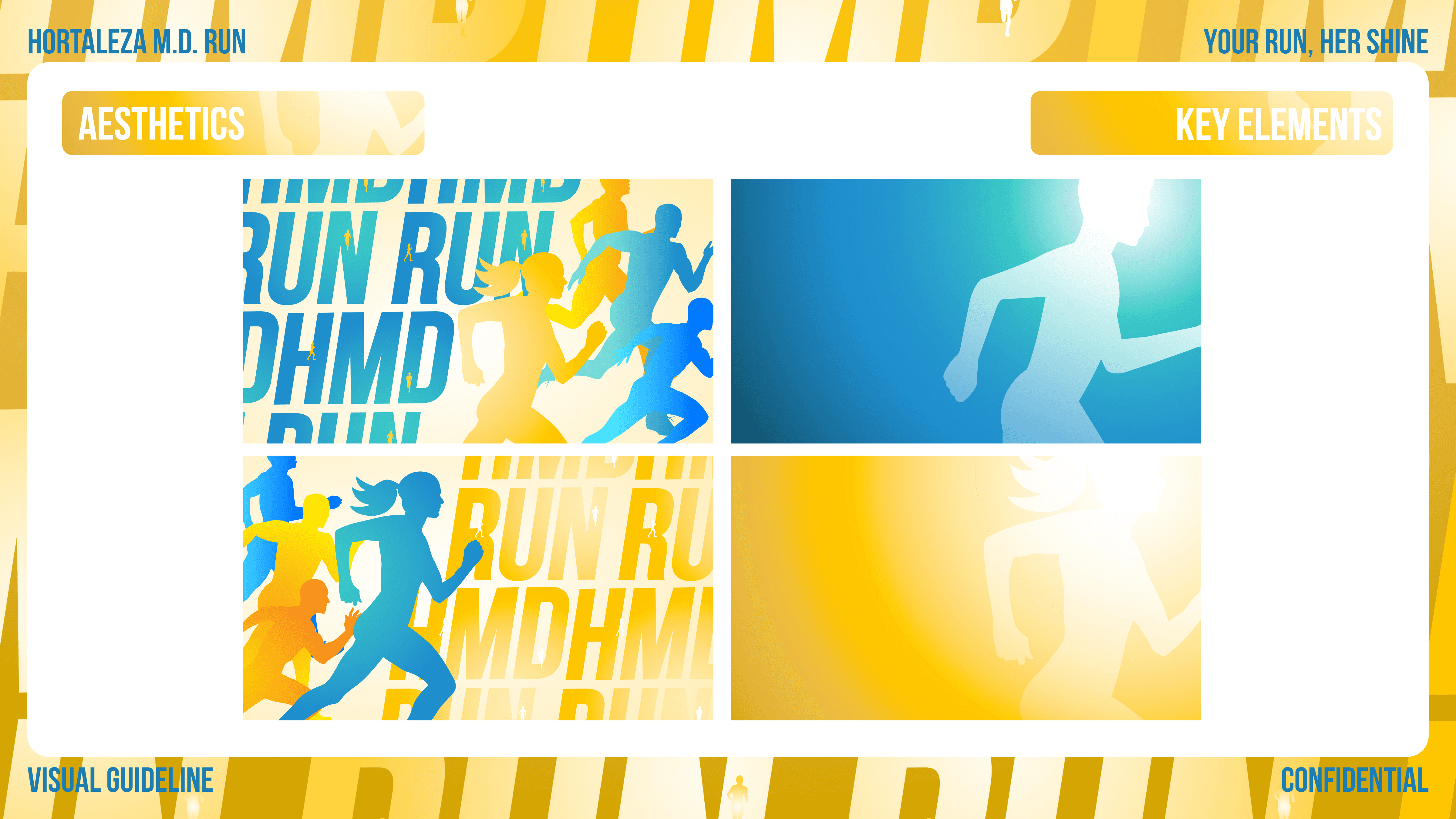
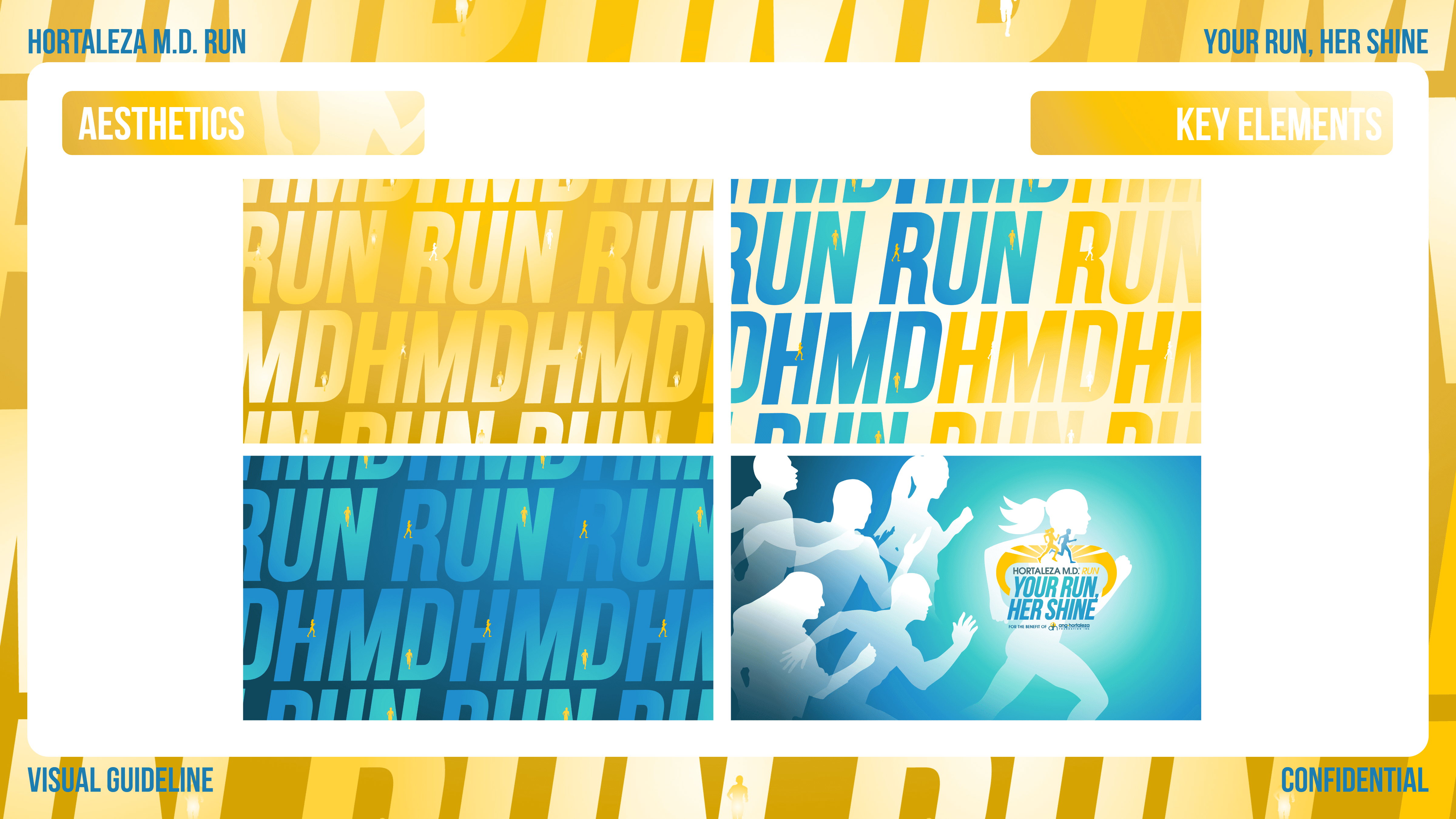
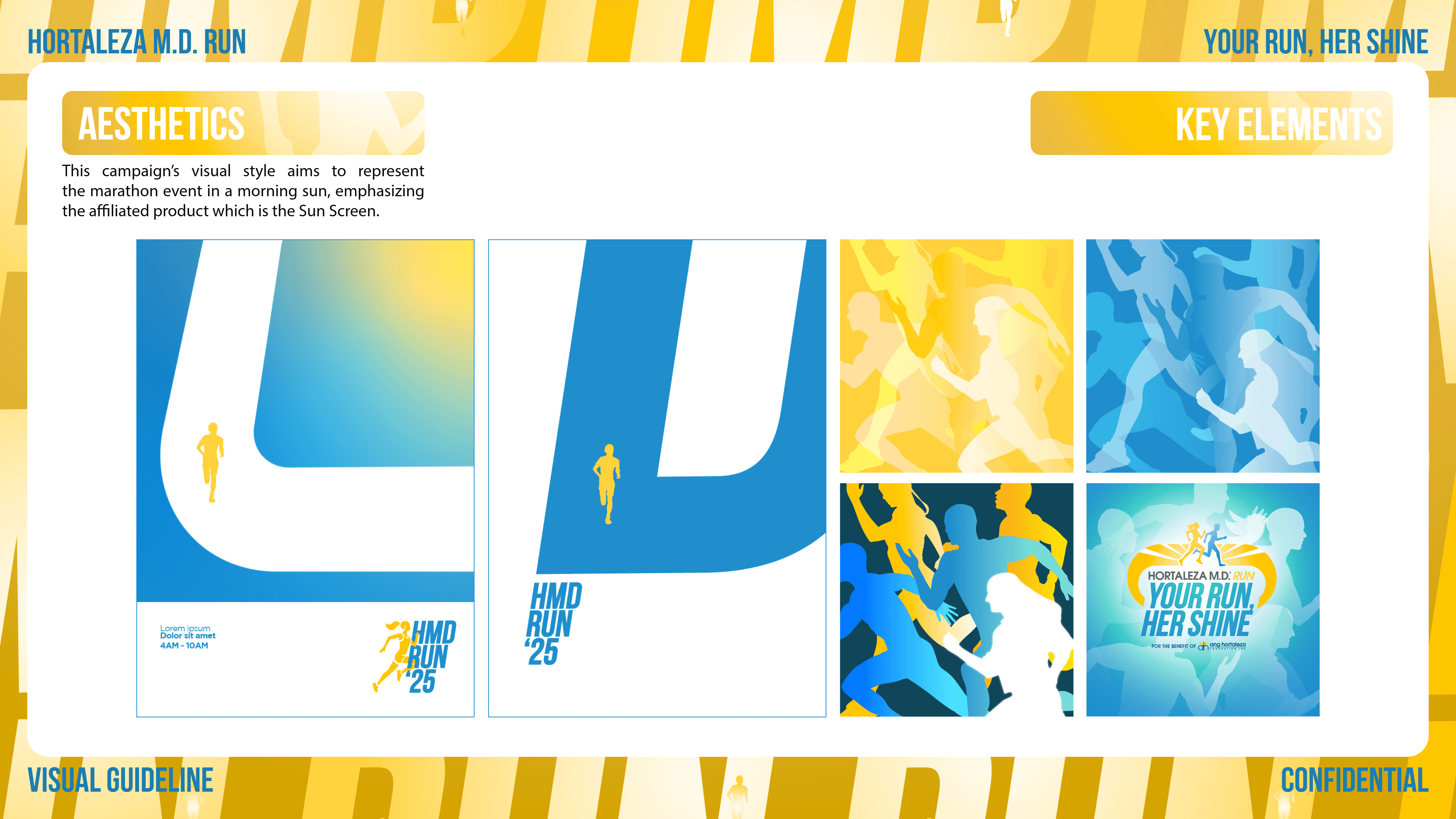


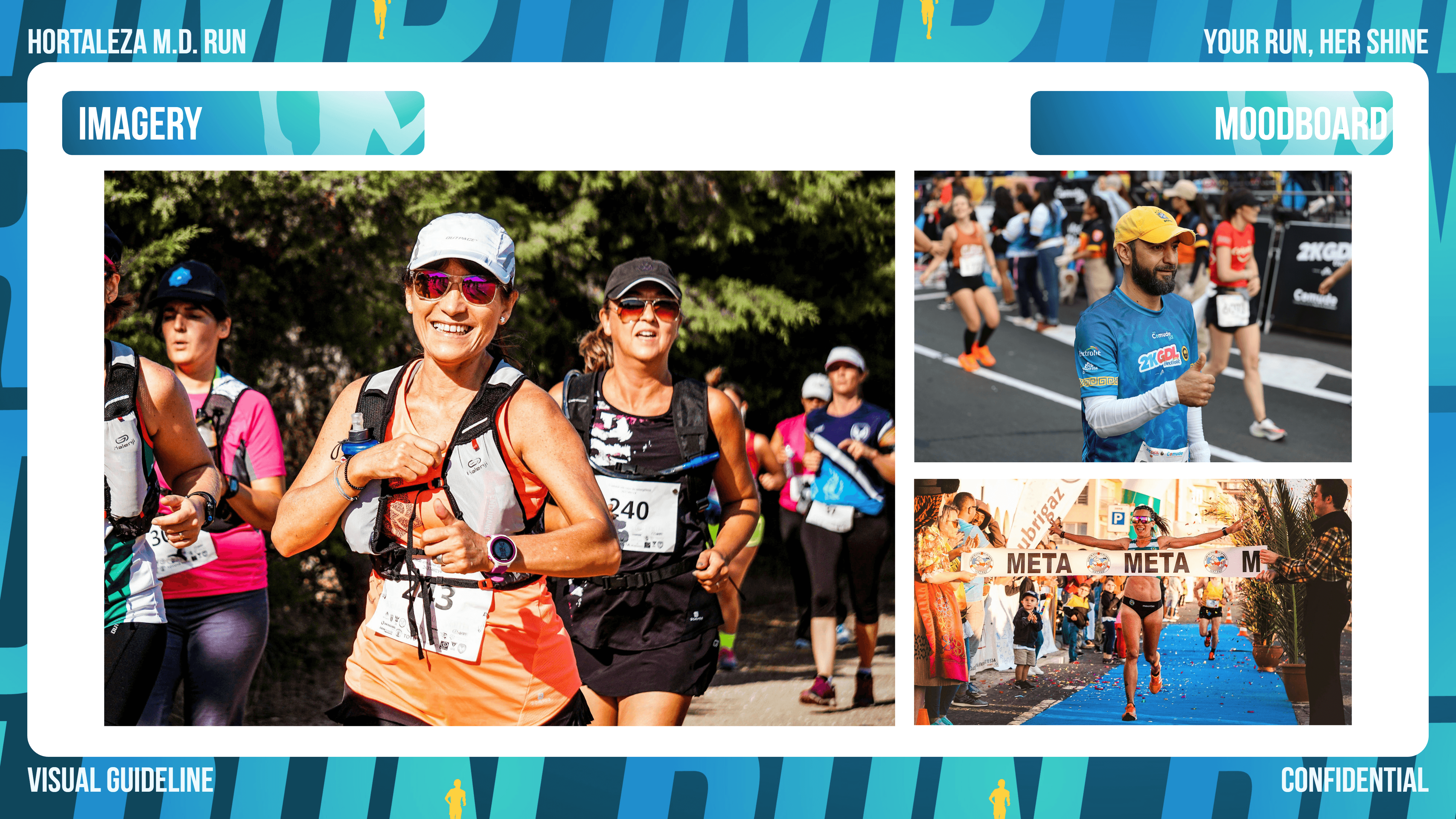

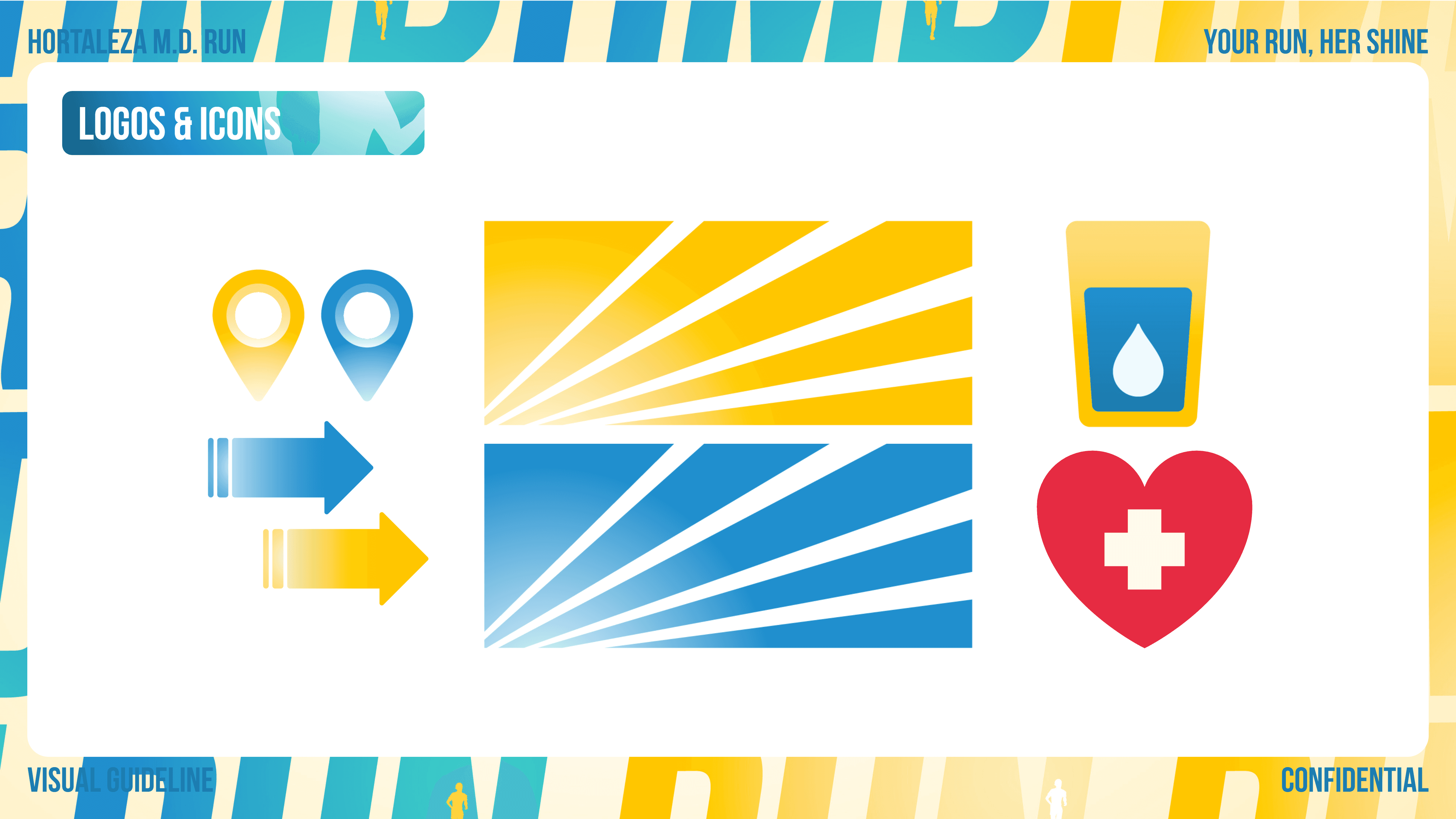
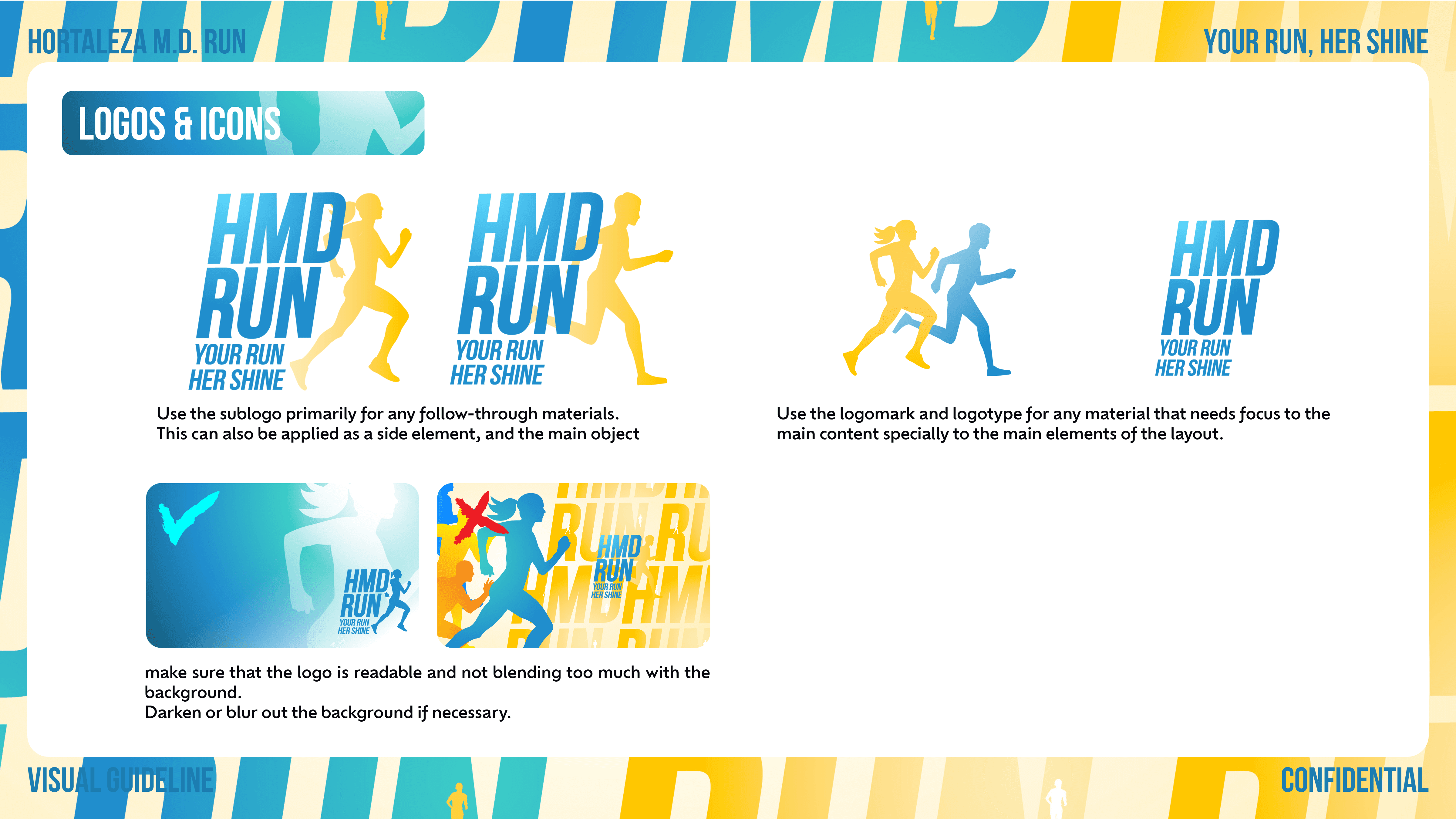
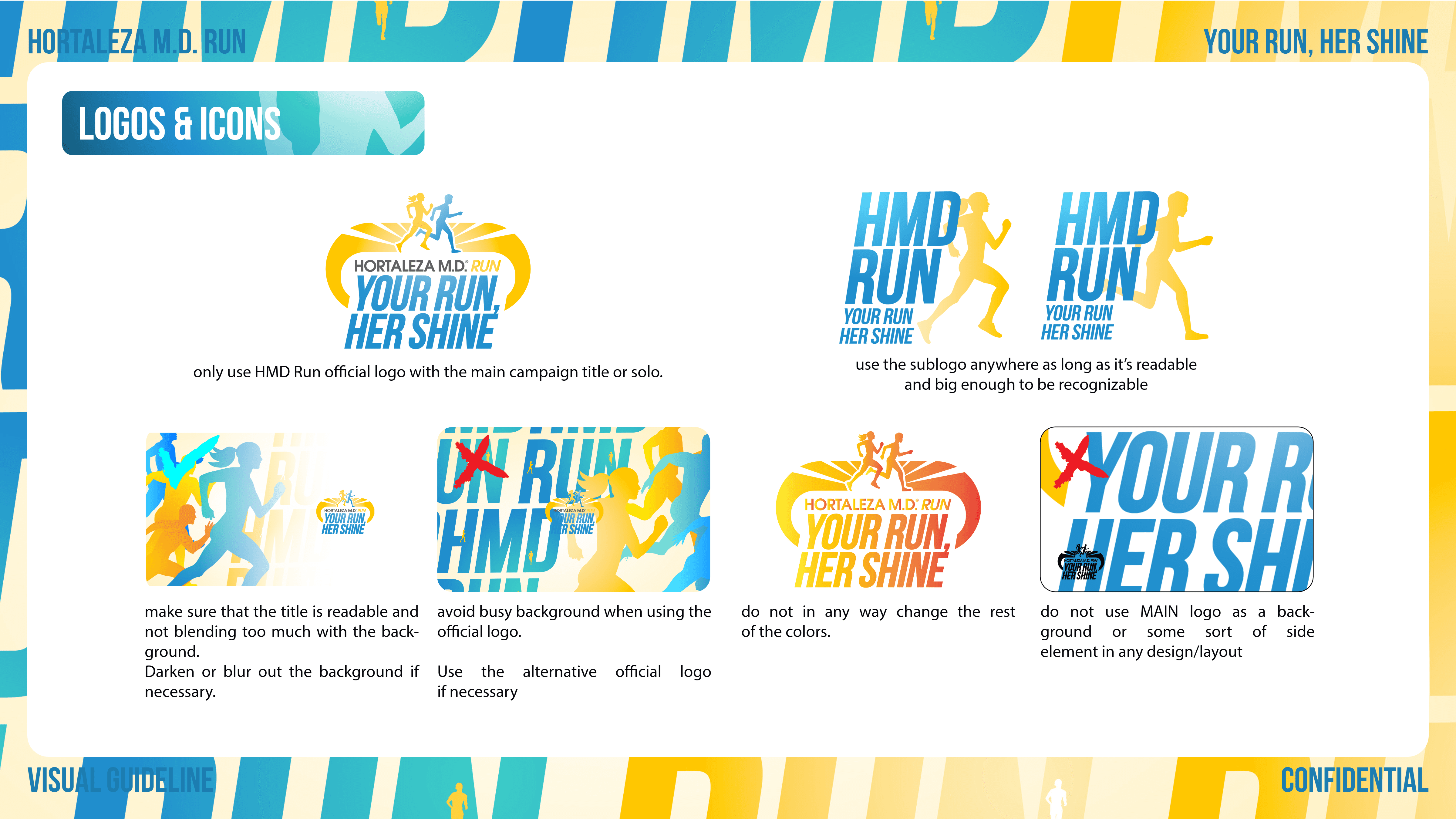

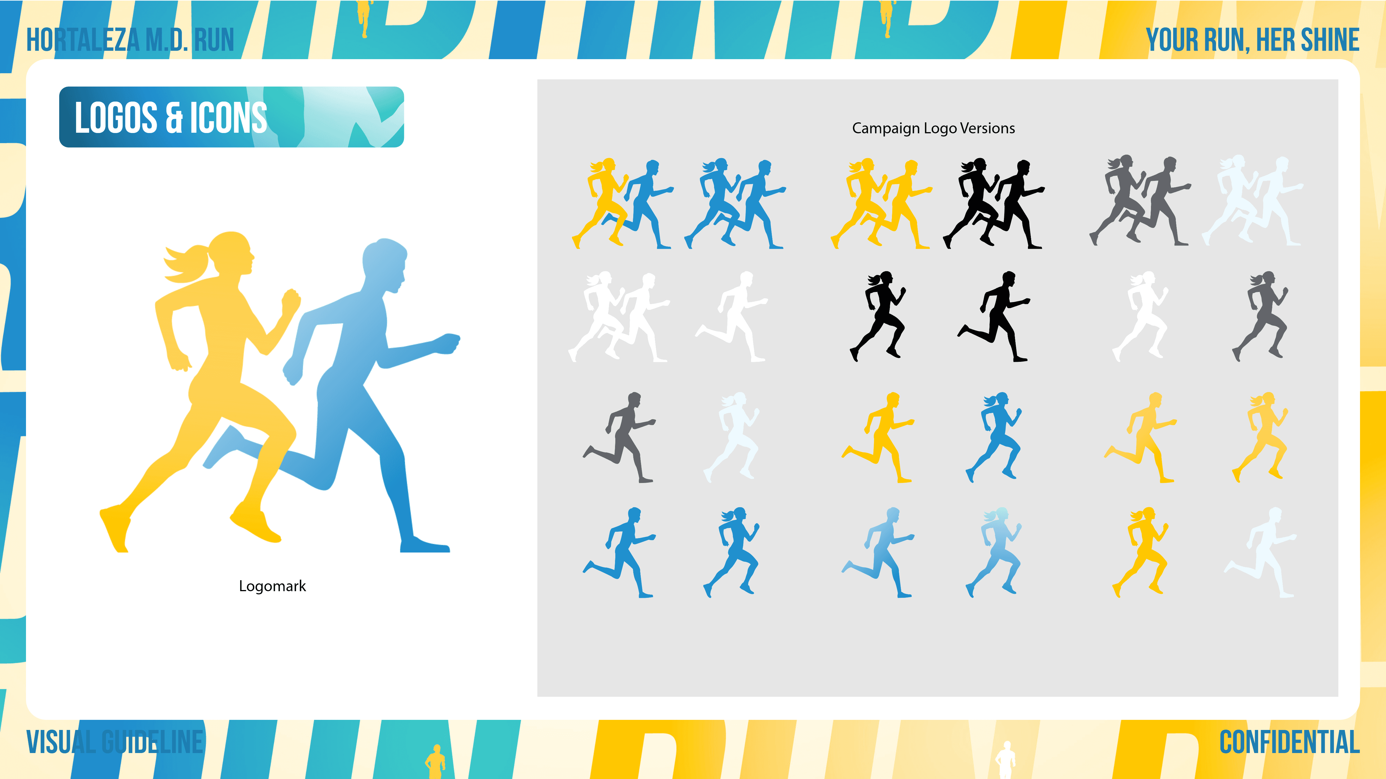
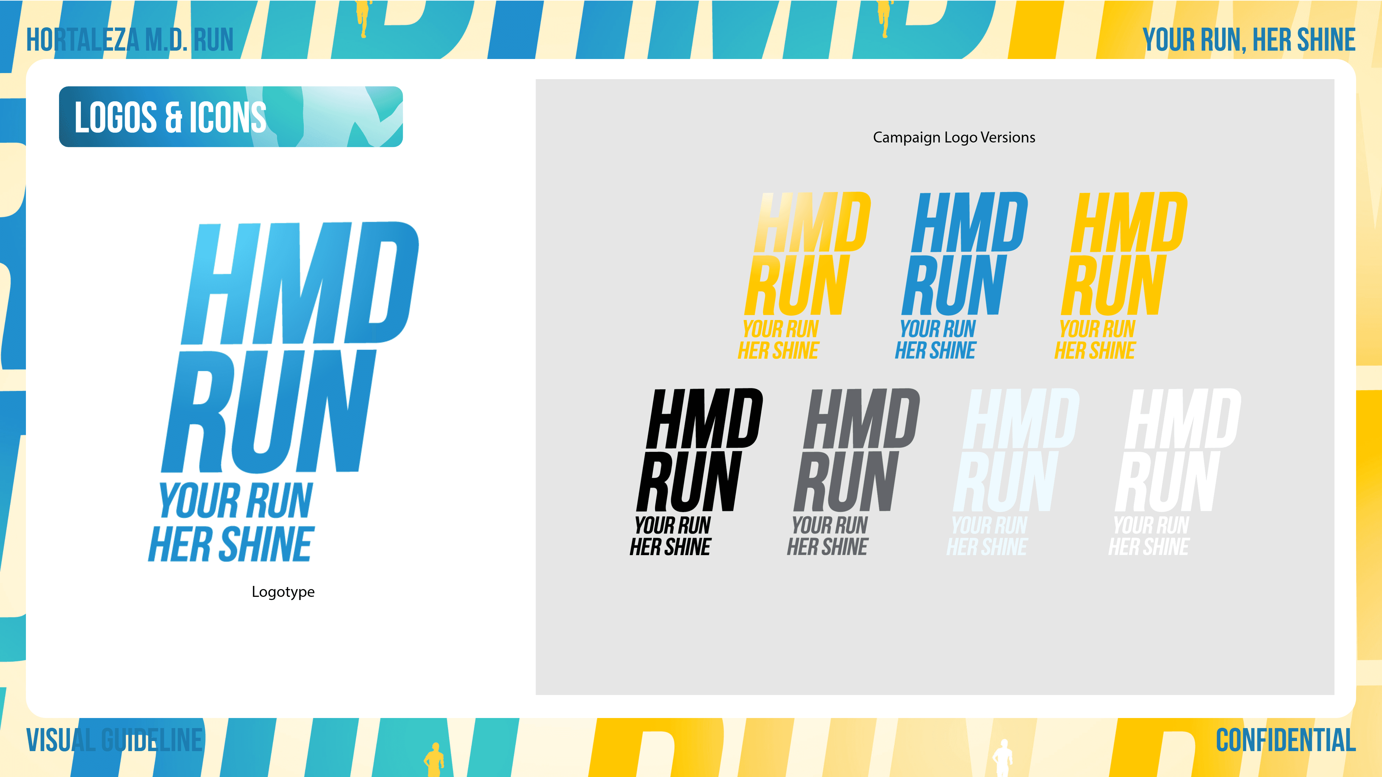
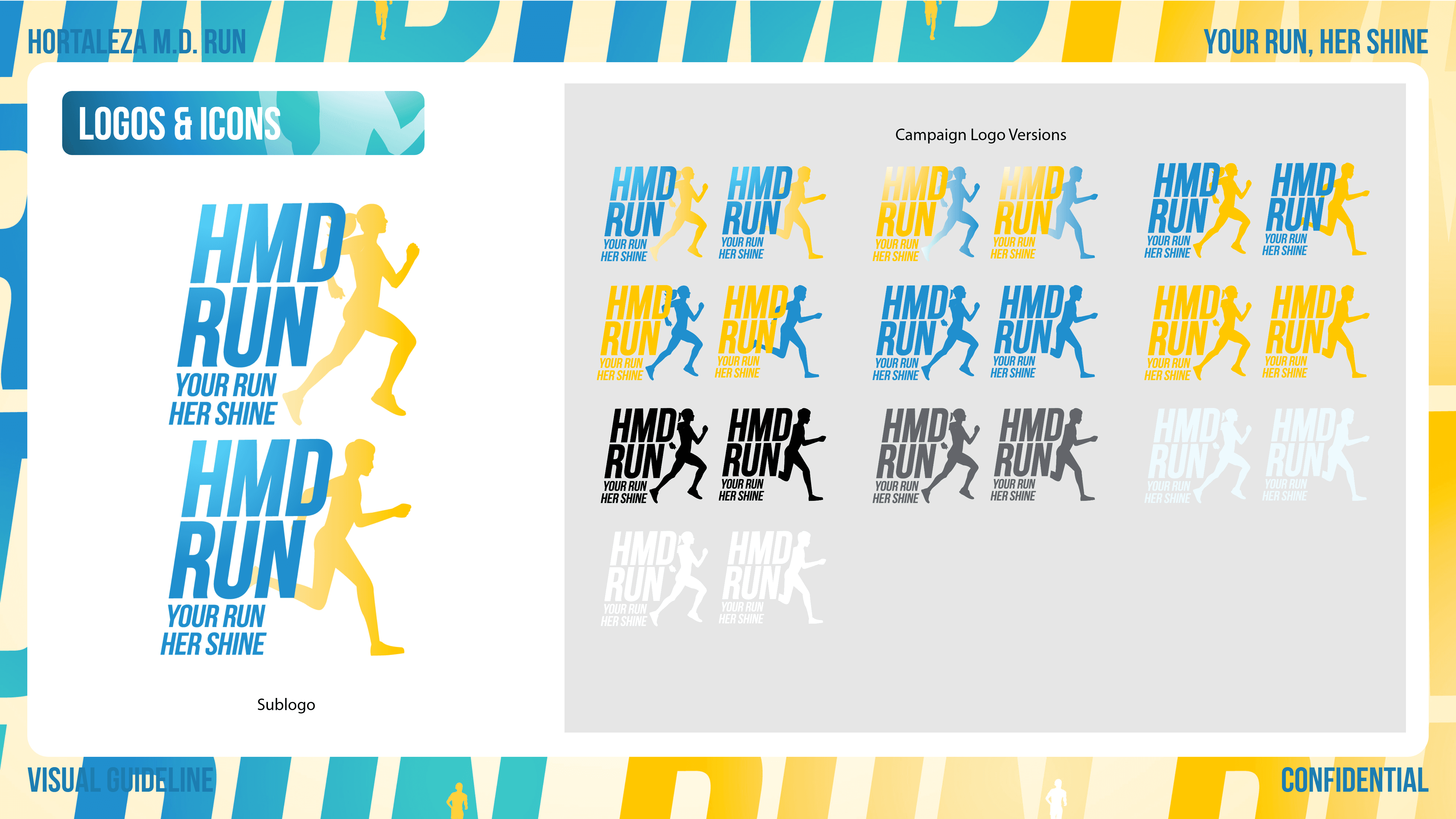
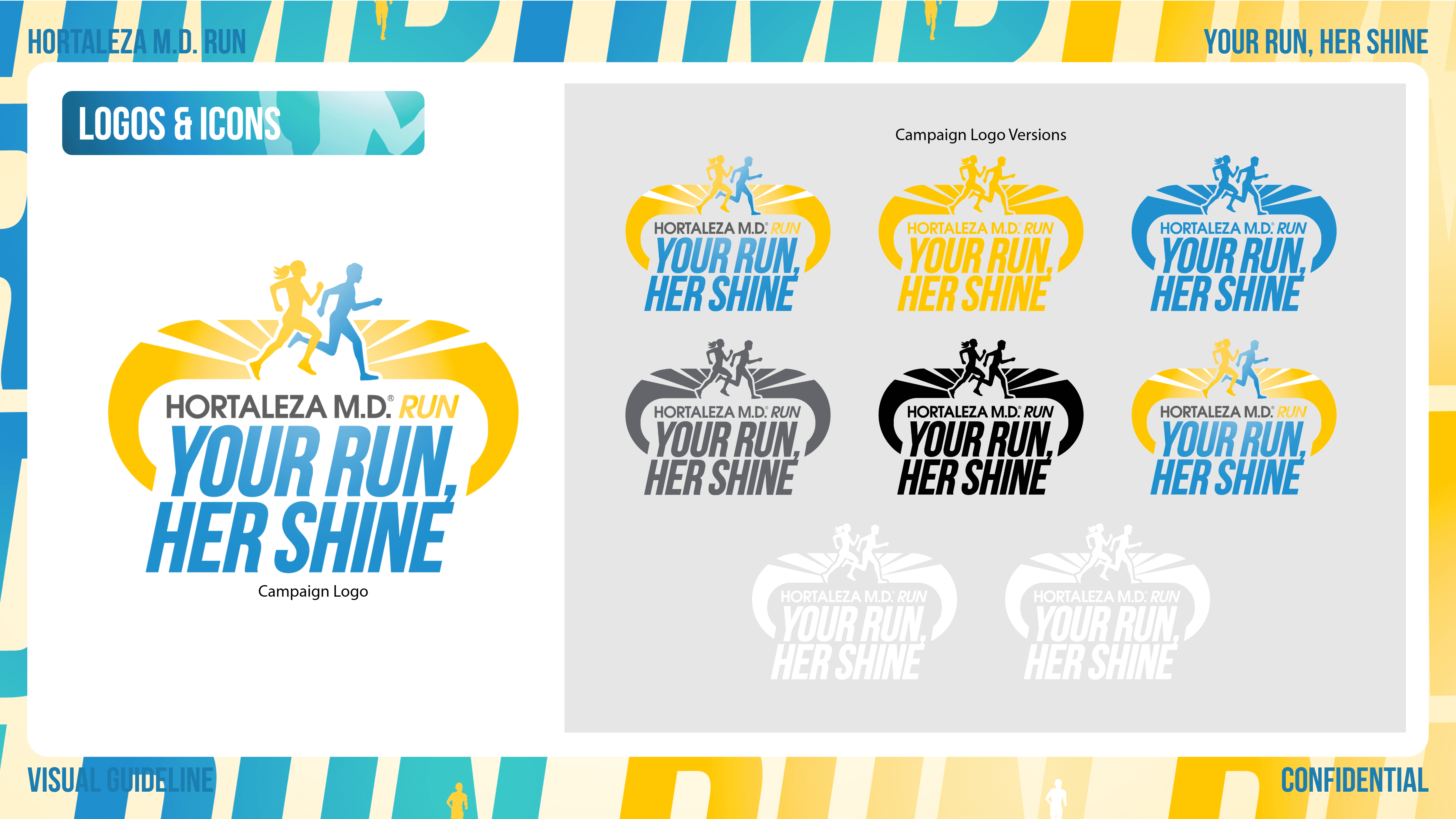

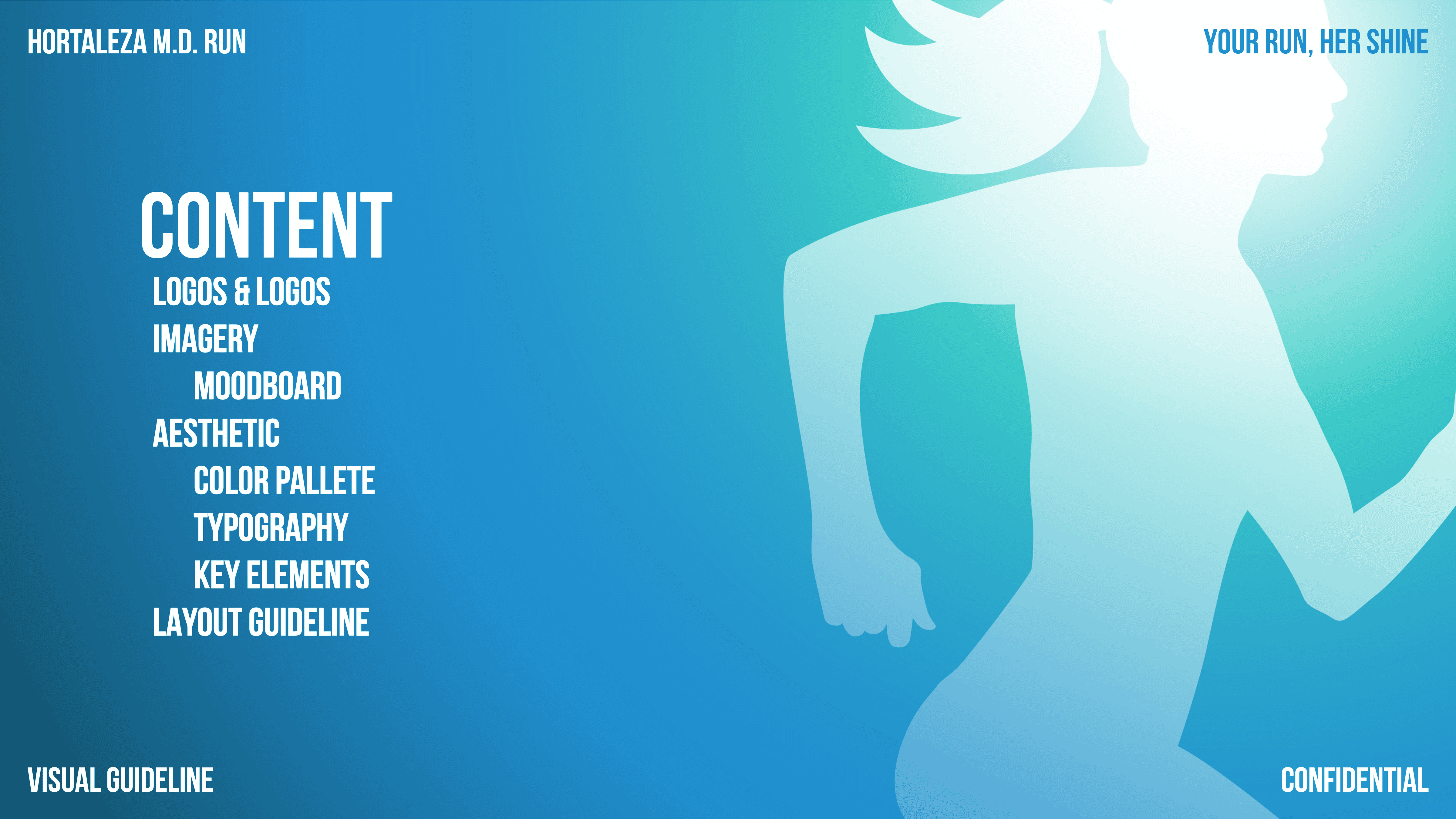
Your Run, Her Shine is brought to life through a high-energy visual strategy, documented in this complete guideline. The aesthetic is built on a foundation of vibrancy, movement, and optimism, utilizing a bright blue/sky motif contrasted with stimulating yellows and oranges.
The guideline dictates how this feeling is translated into practical assets—from web page structure designed for maximum engagement, to merchandise that promotes brand affiliation. It is a strategic blueprint that ensures every piece of communication, from a simple icon to a full event banner, works together to achieve the brand's goal of fostering a positive, active community.
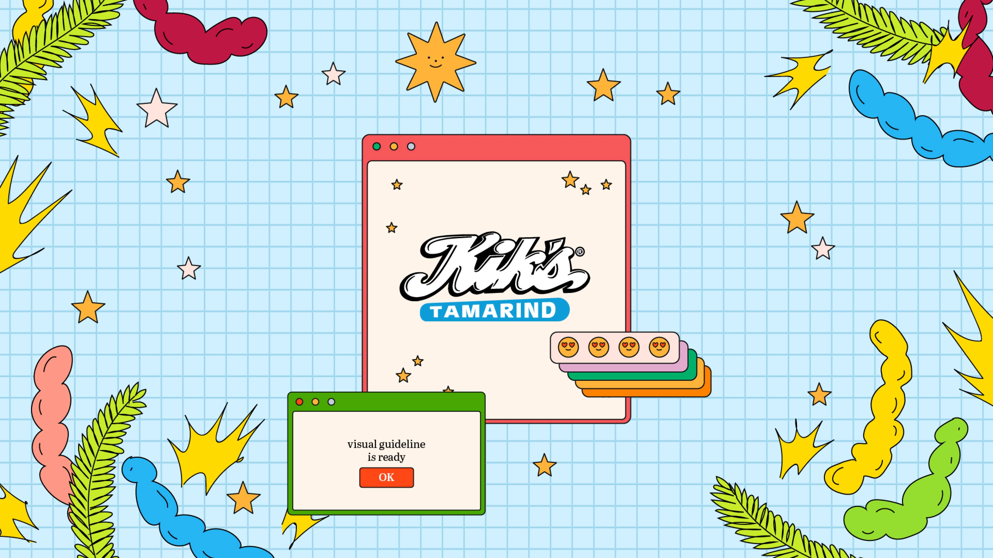
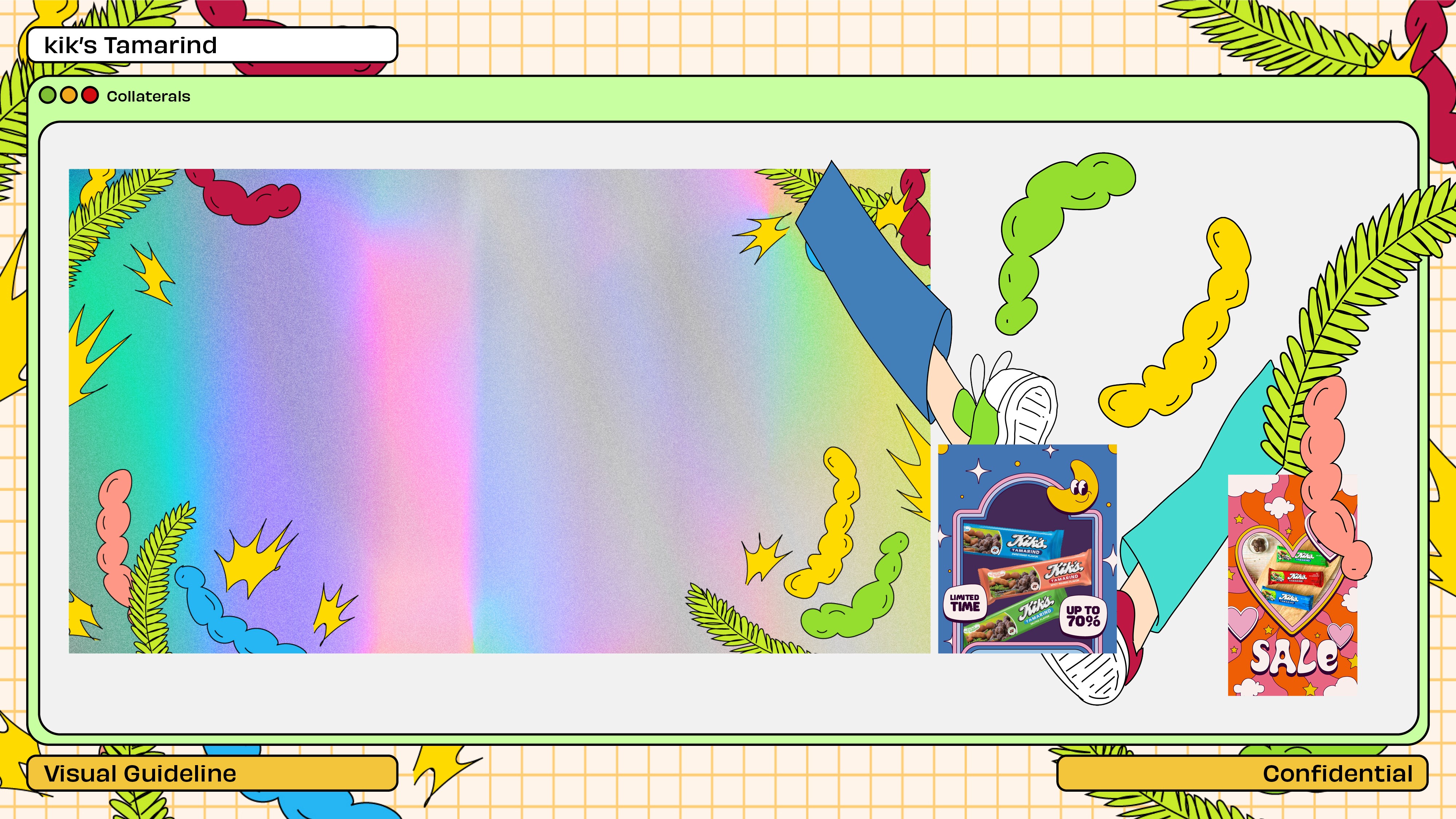

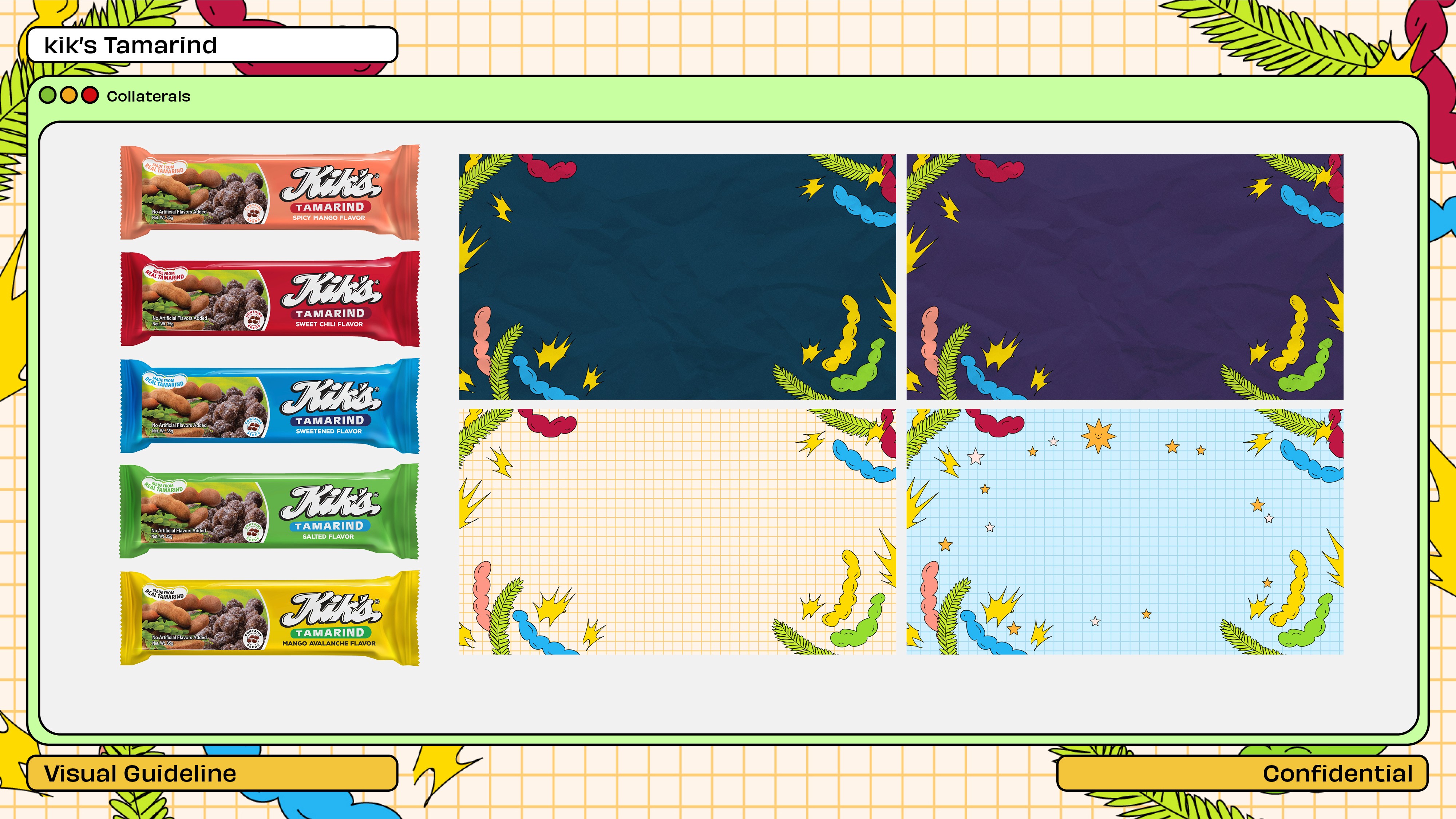
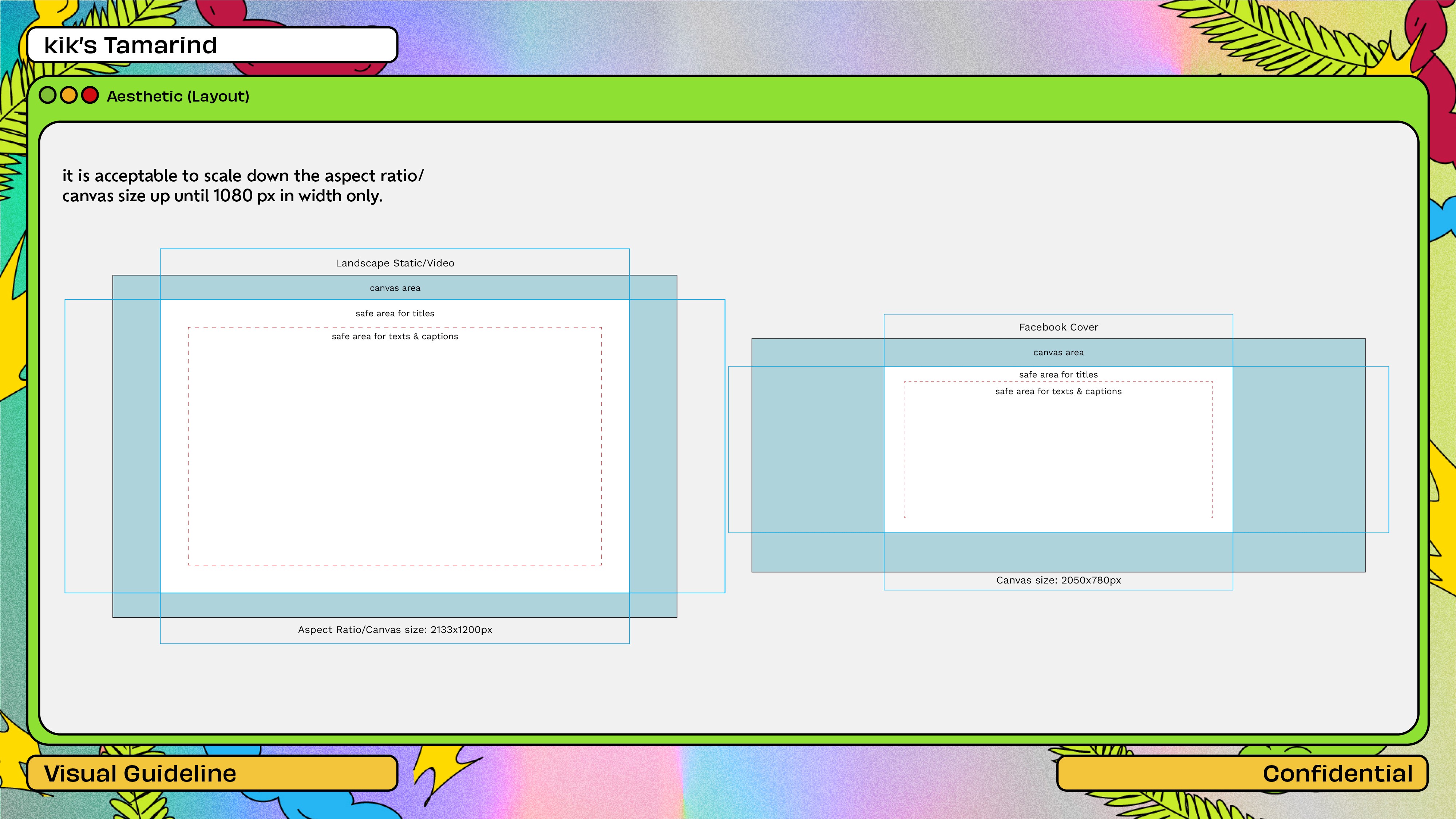
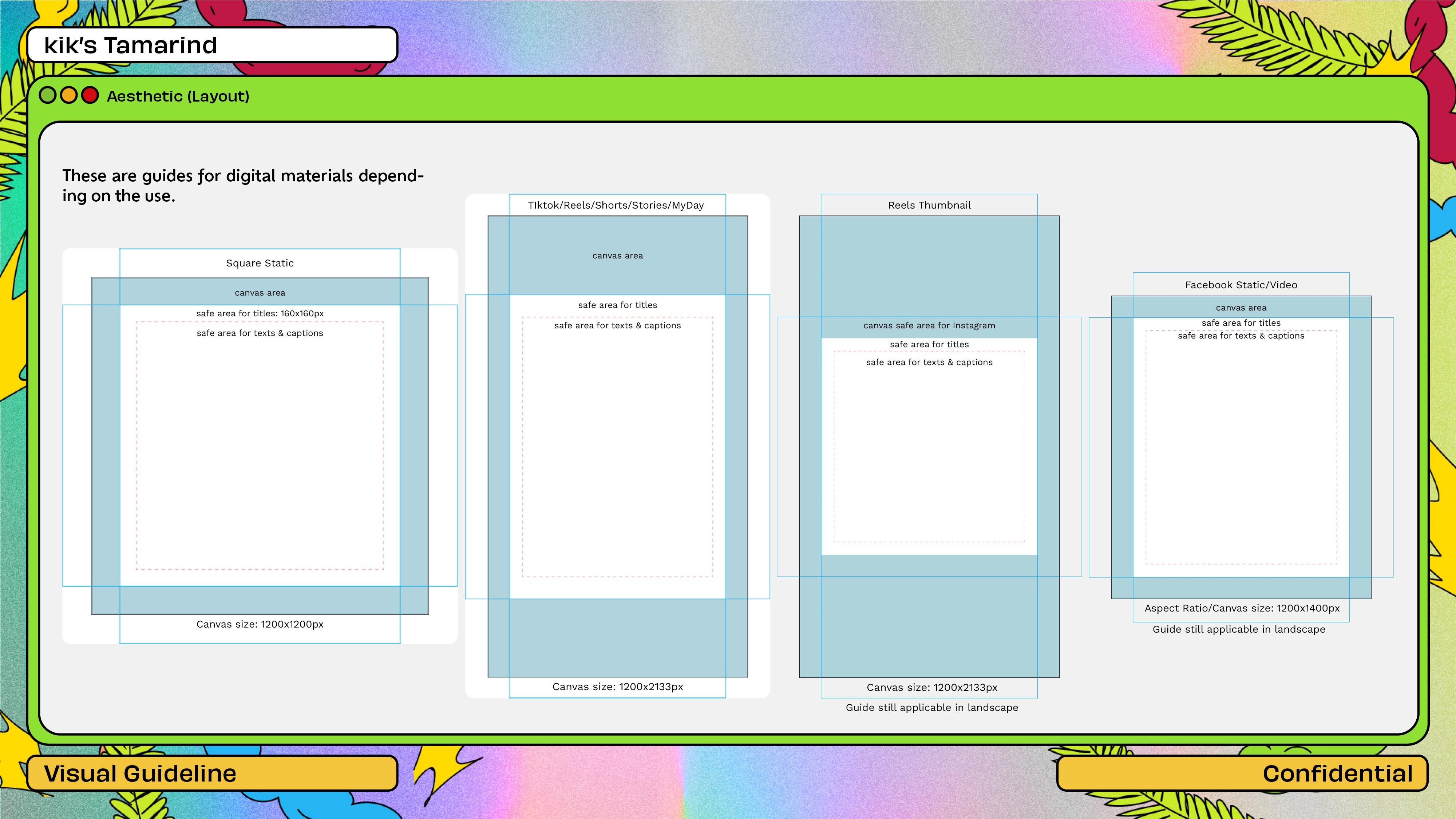
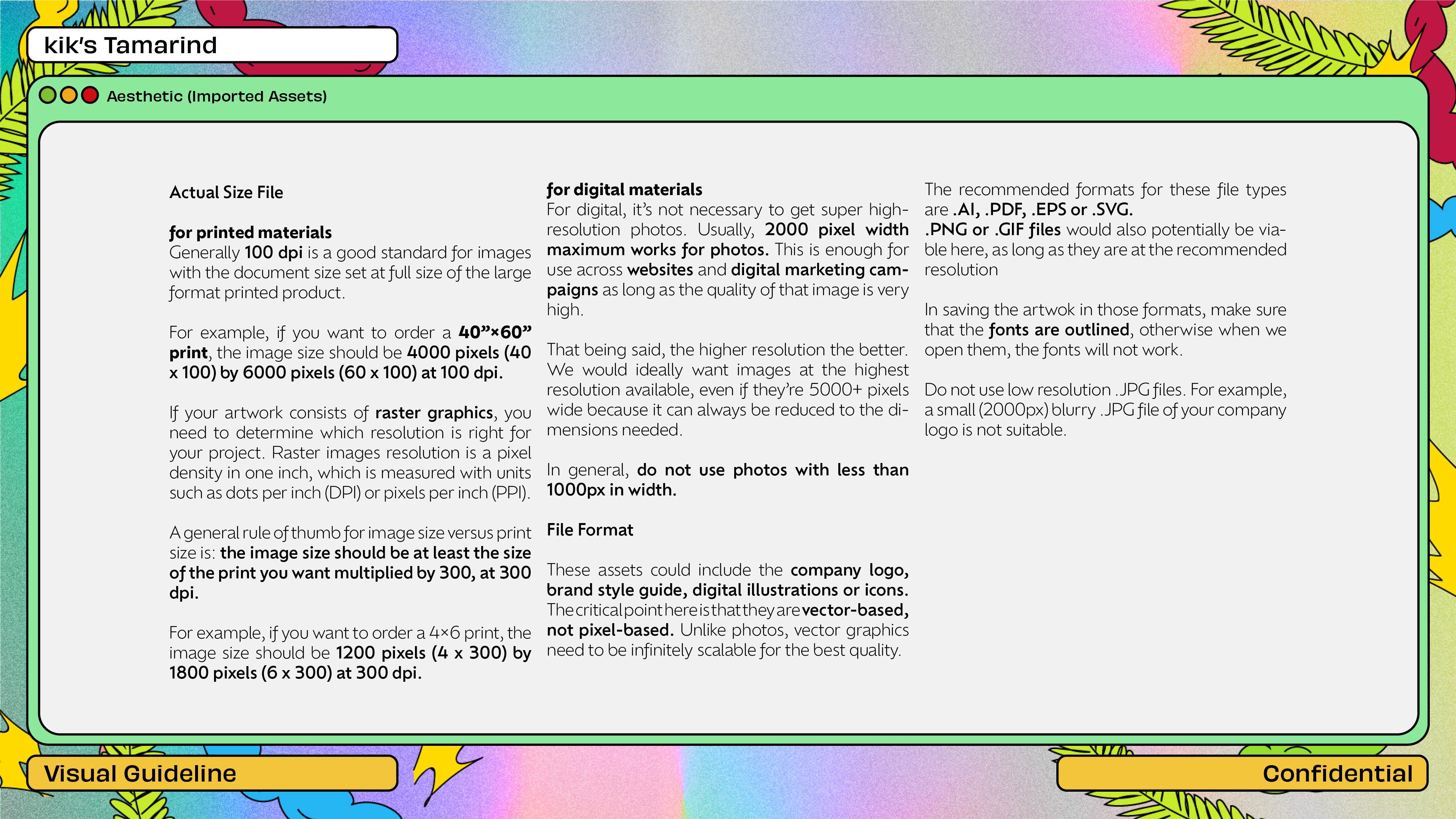
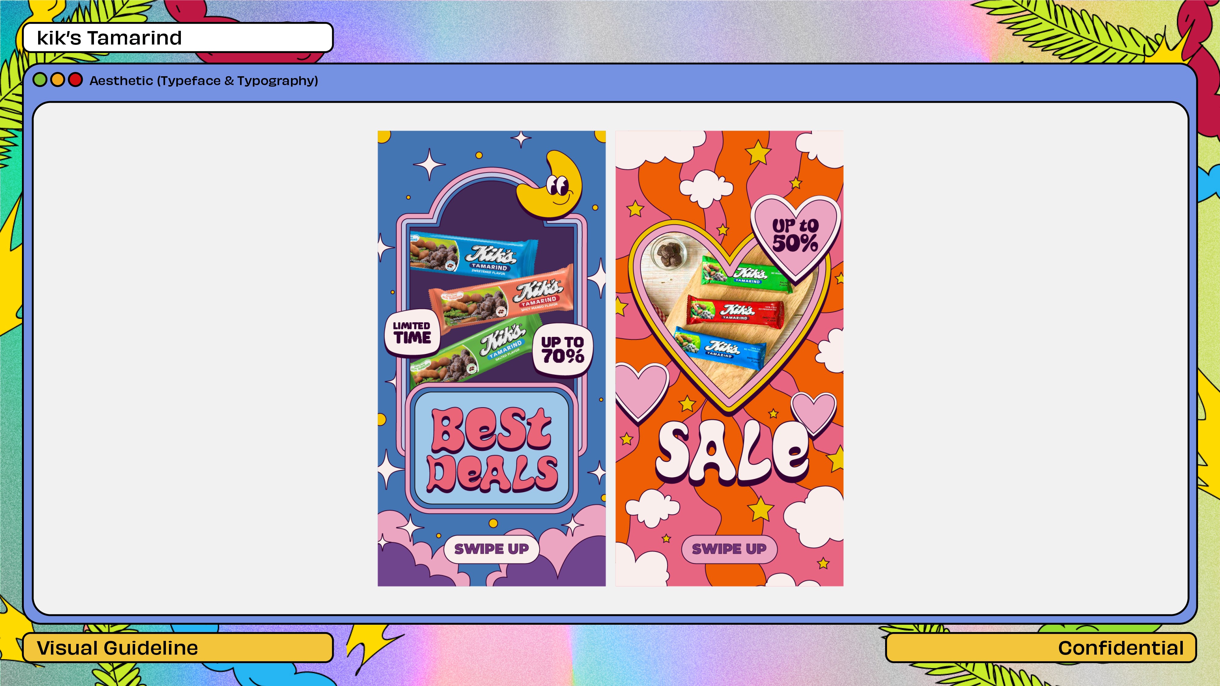
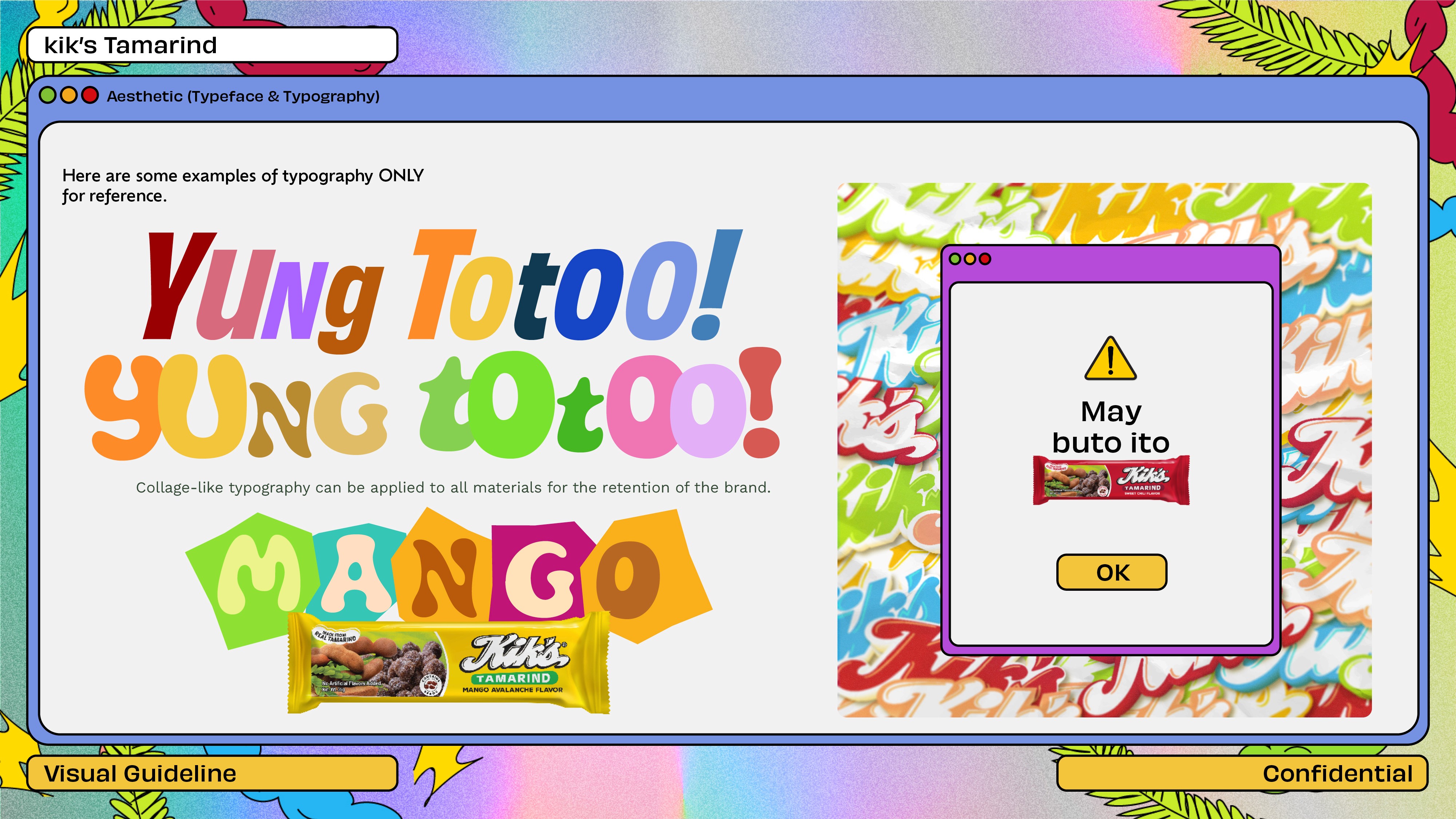
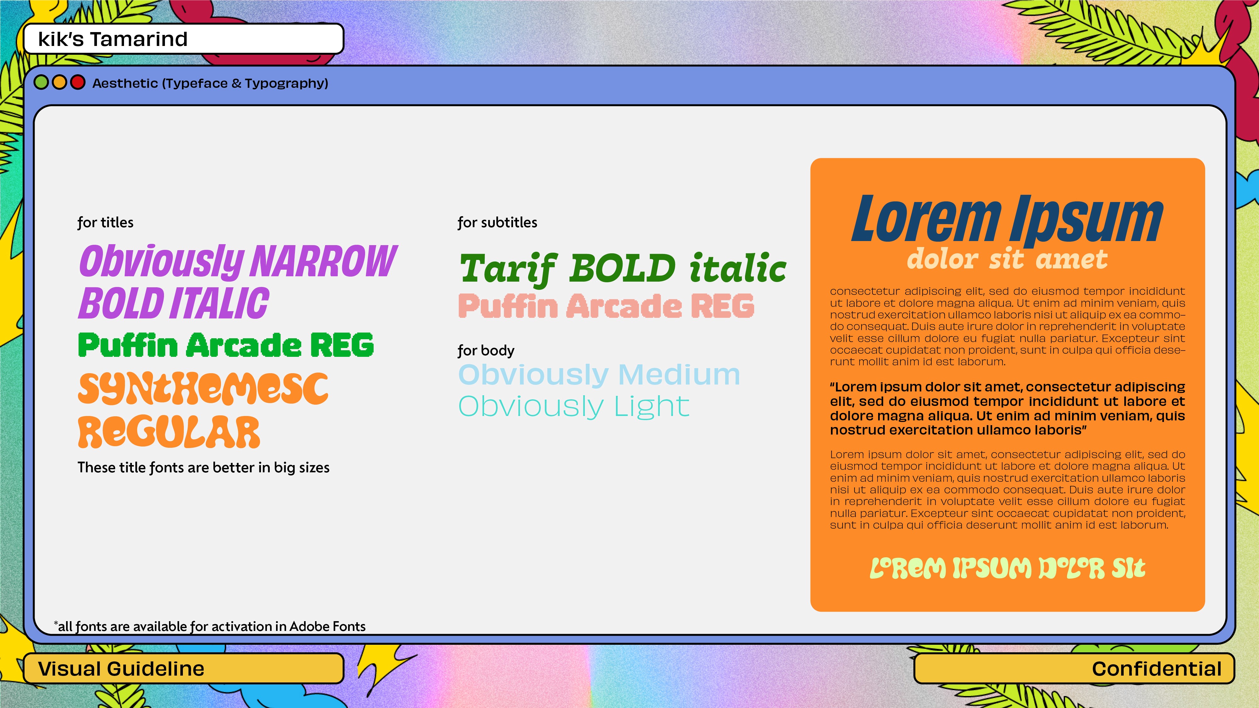
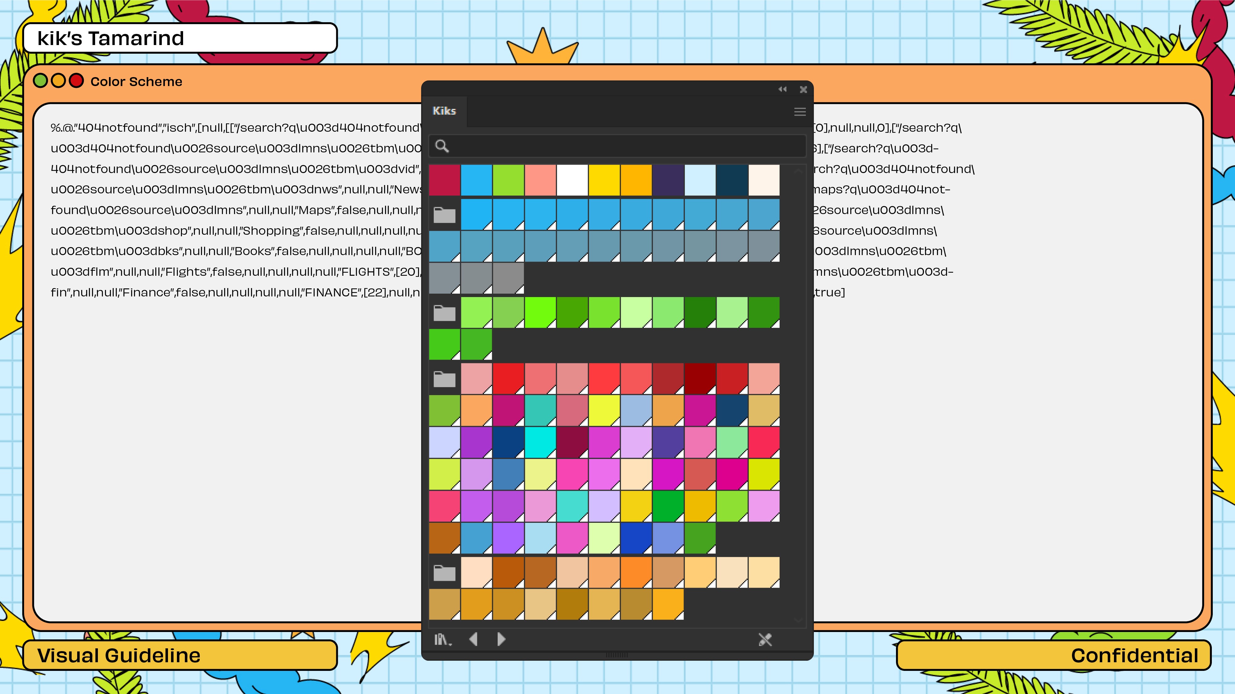
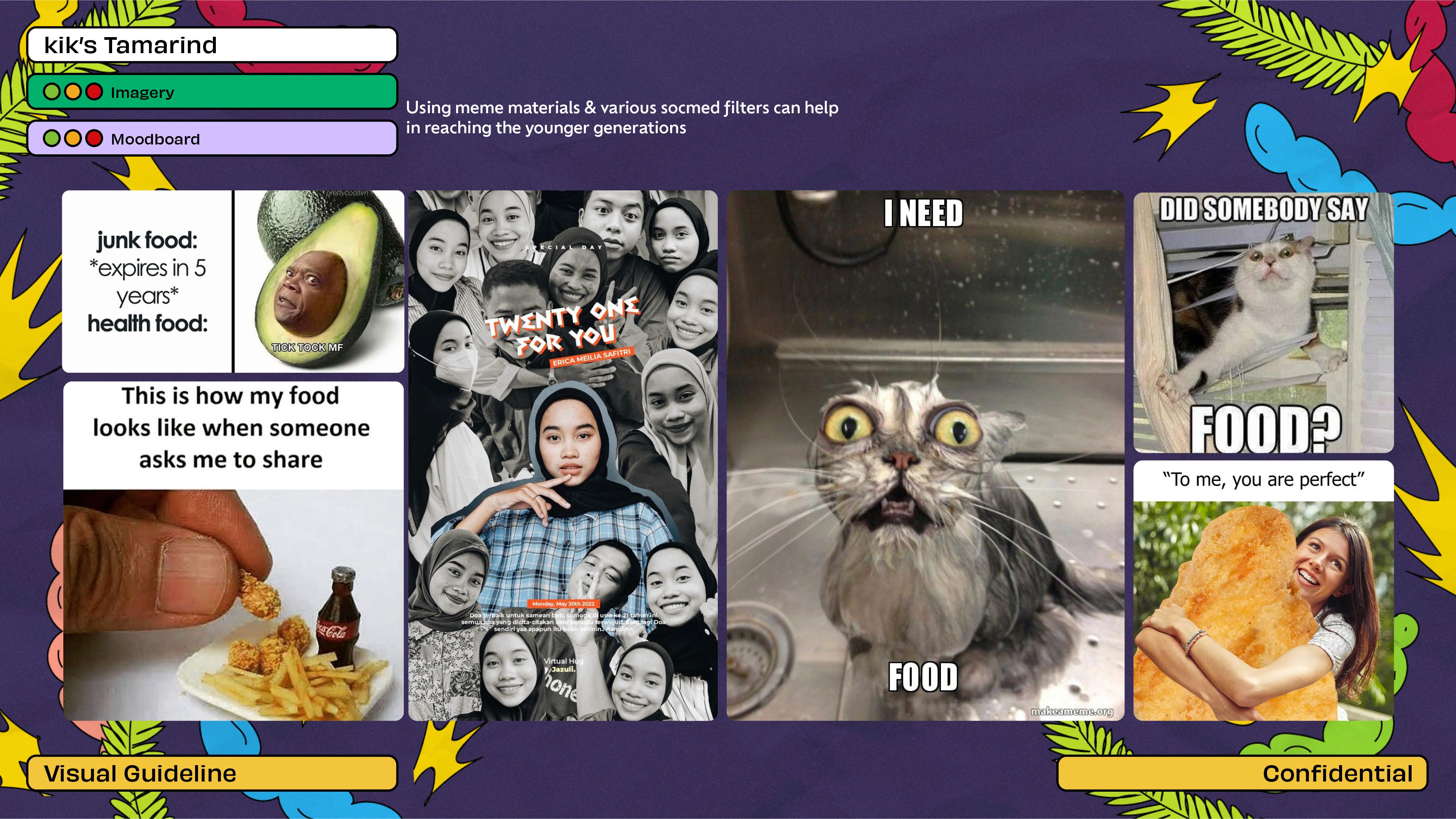
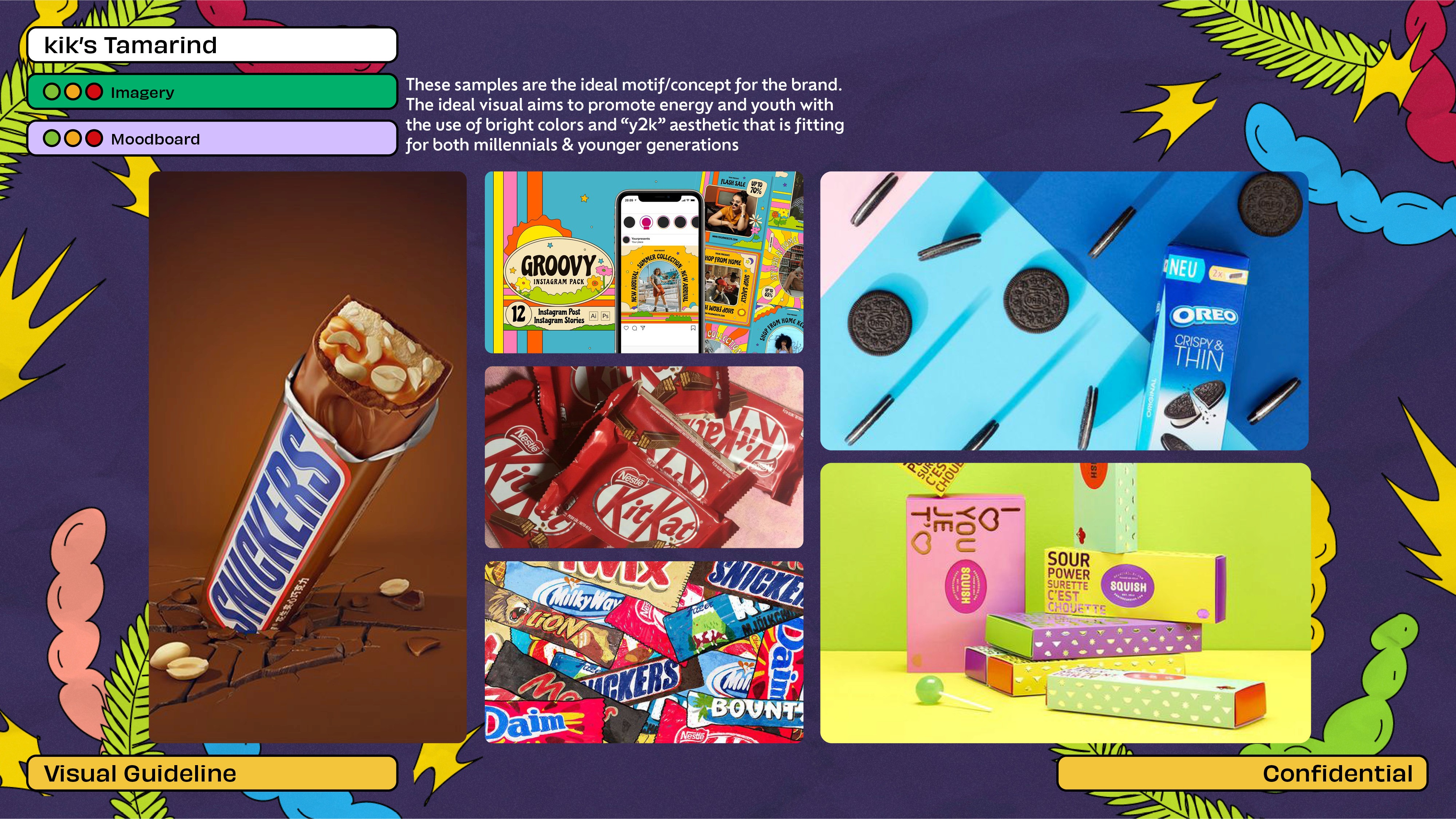
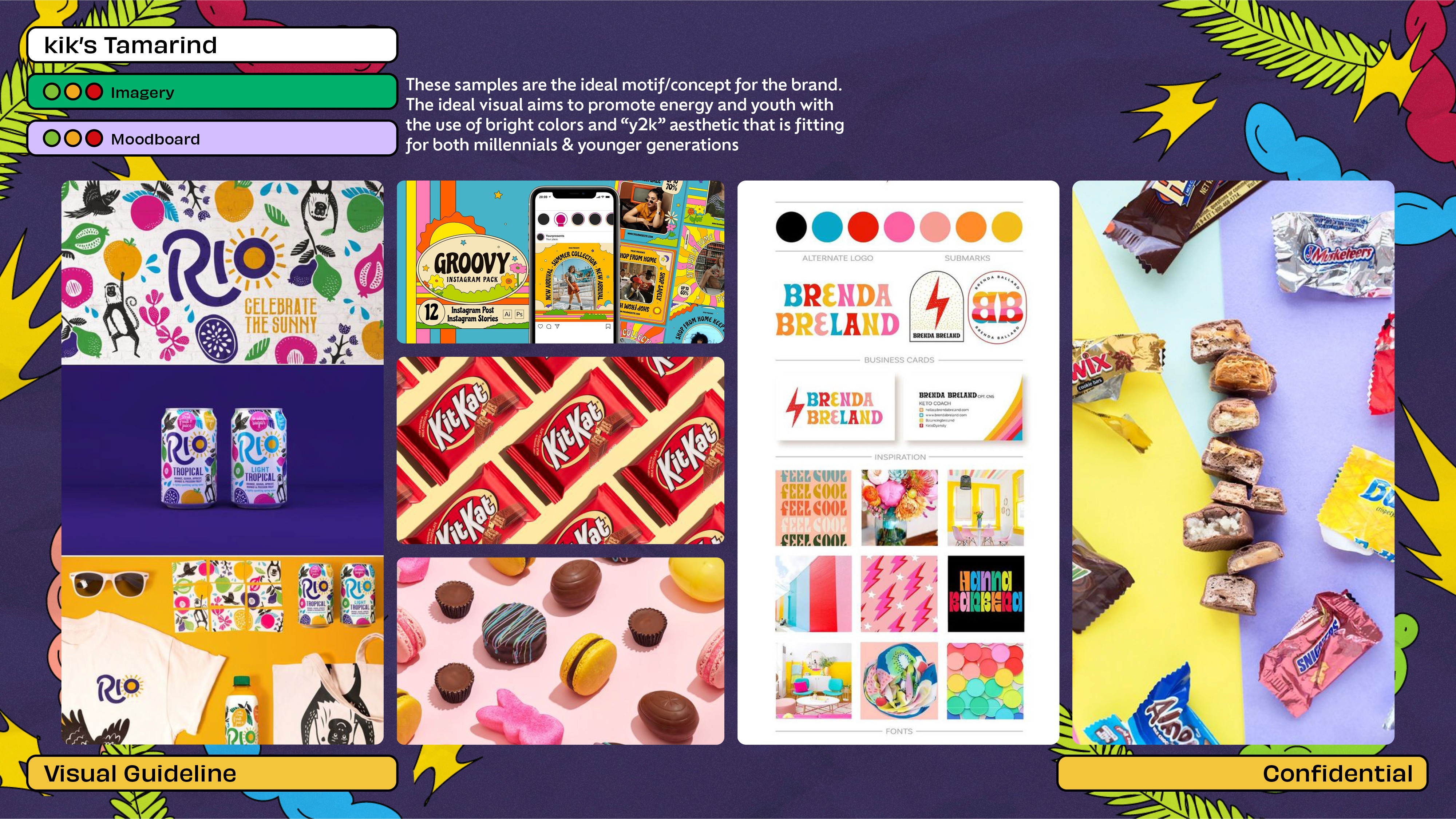
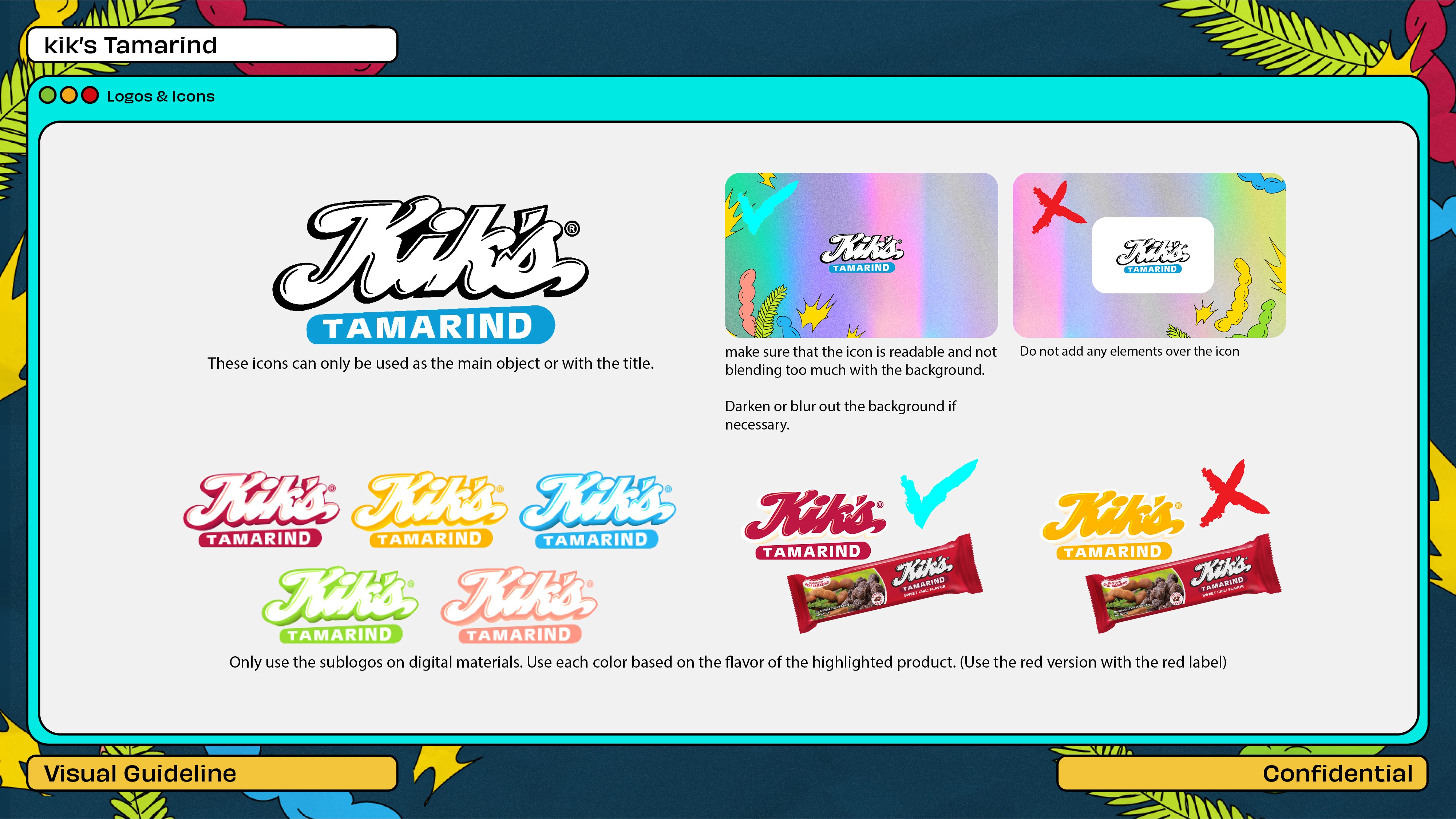
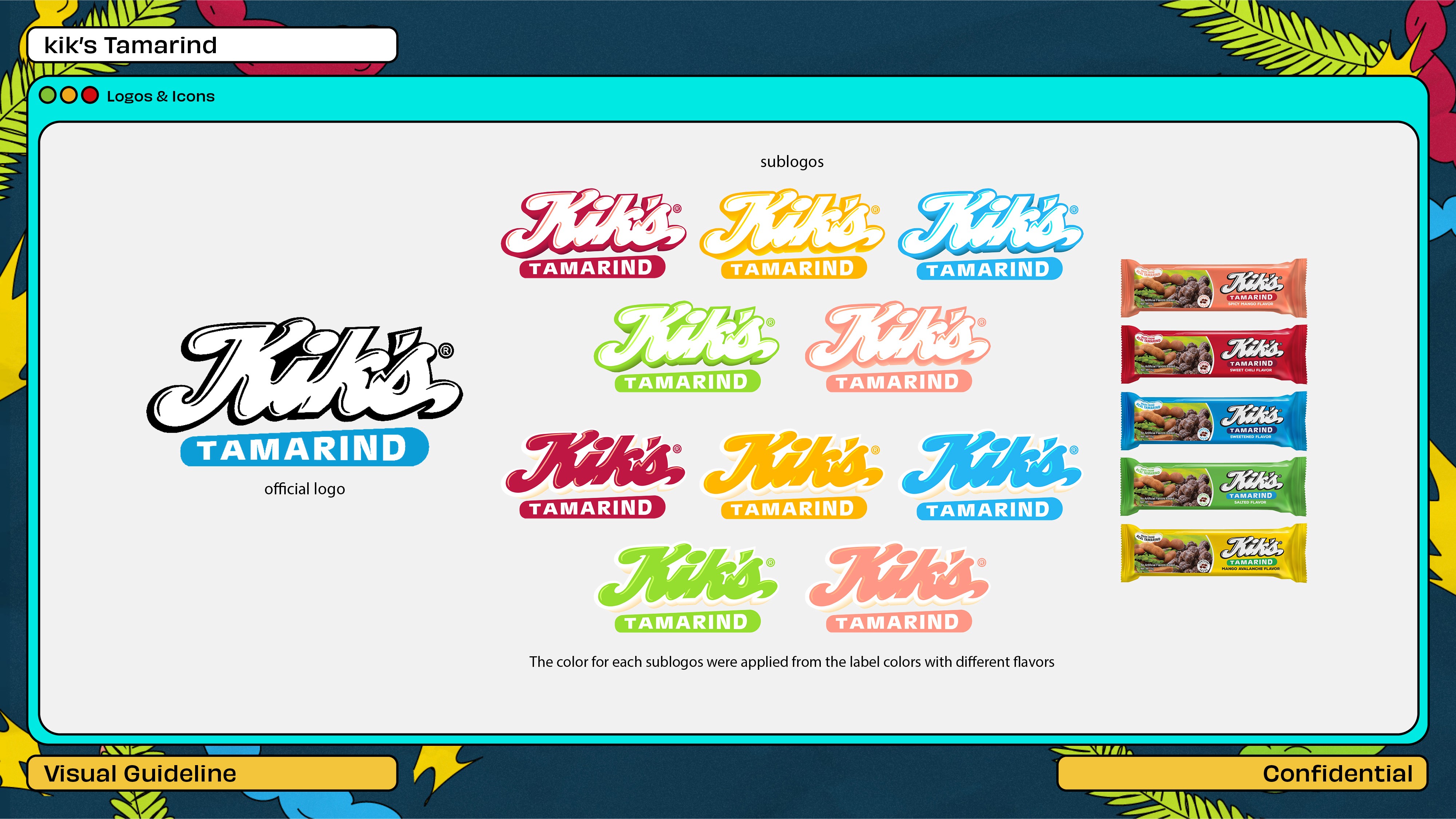
This project involved the creation of a comprehensive guideline utilizing a high-impact, maximalist Y2K aesthetic.
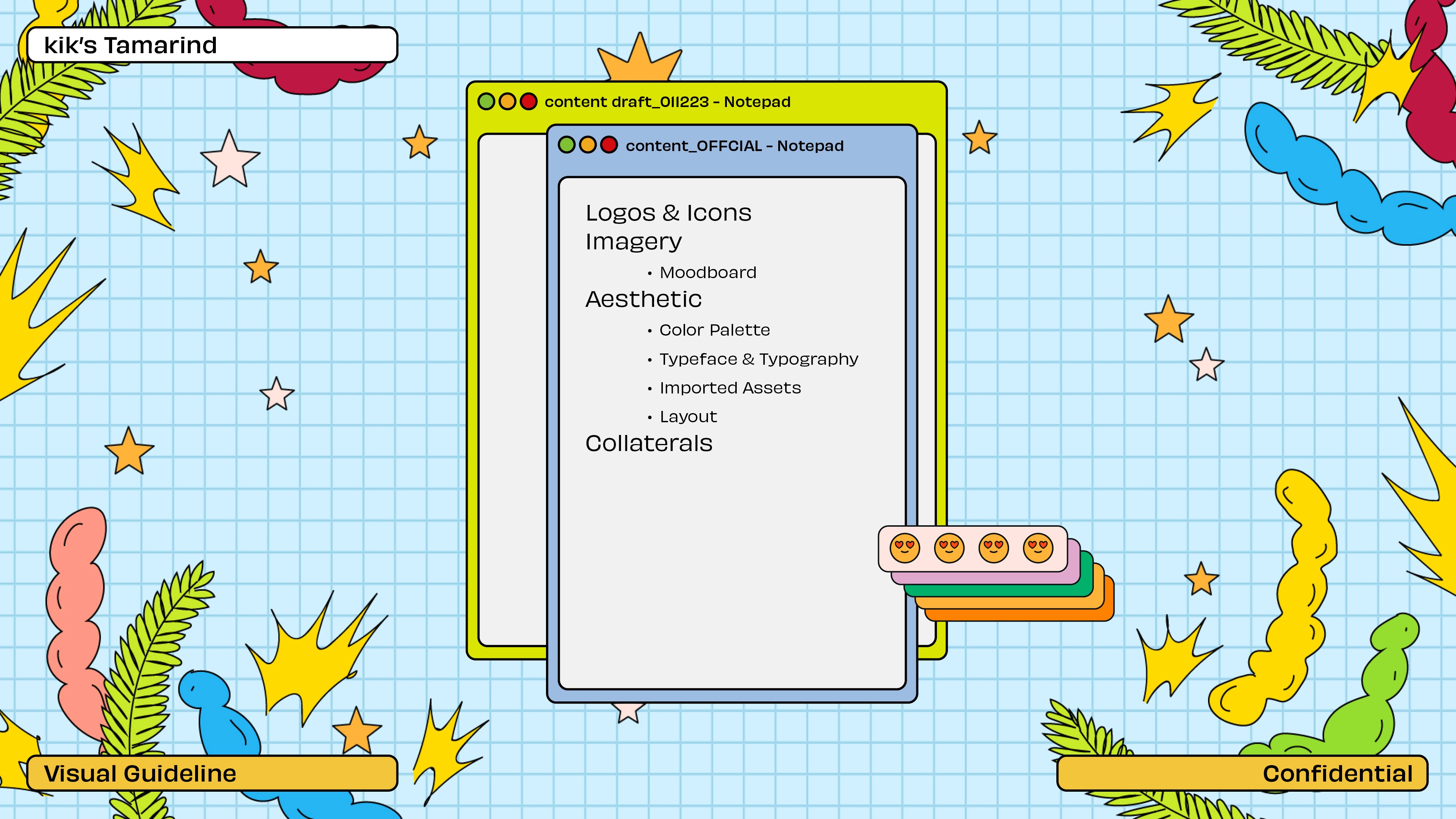
The goal was to establish a clear, yet high-energy, framework for the brand's online presence. The deliverable defines all key visual components: a highly saturated, layered color palette (including specific swatch values), primary and secondary typography usage, illustration styles (the custom tamarind motif), and photography direction for product and lifestyle imagery.
The guide incorporates demonstration sections showing how these elements combine to form modular e-commerce layouts and marketing assets, ensuring the brand maintains a distinct, cohesive, and vibrant identity across all digital touchpoints.
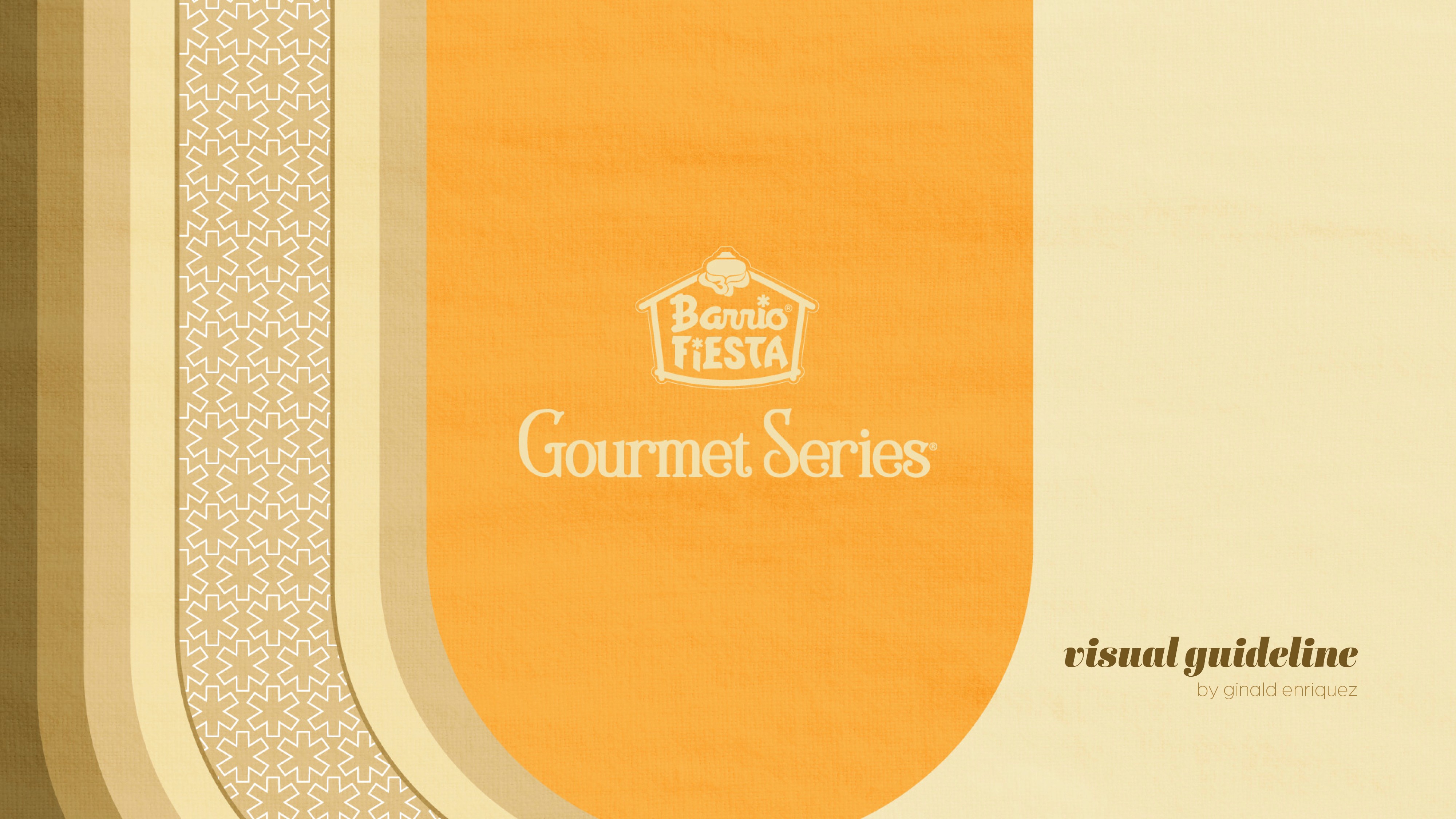
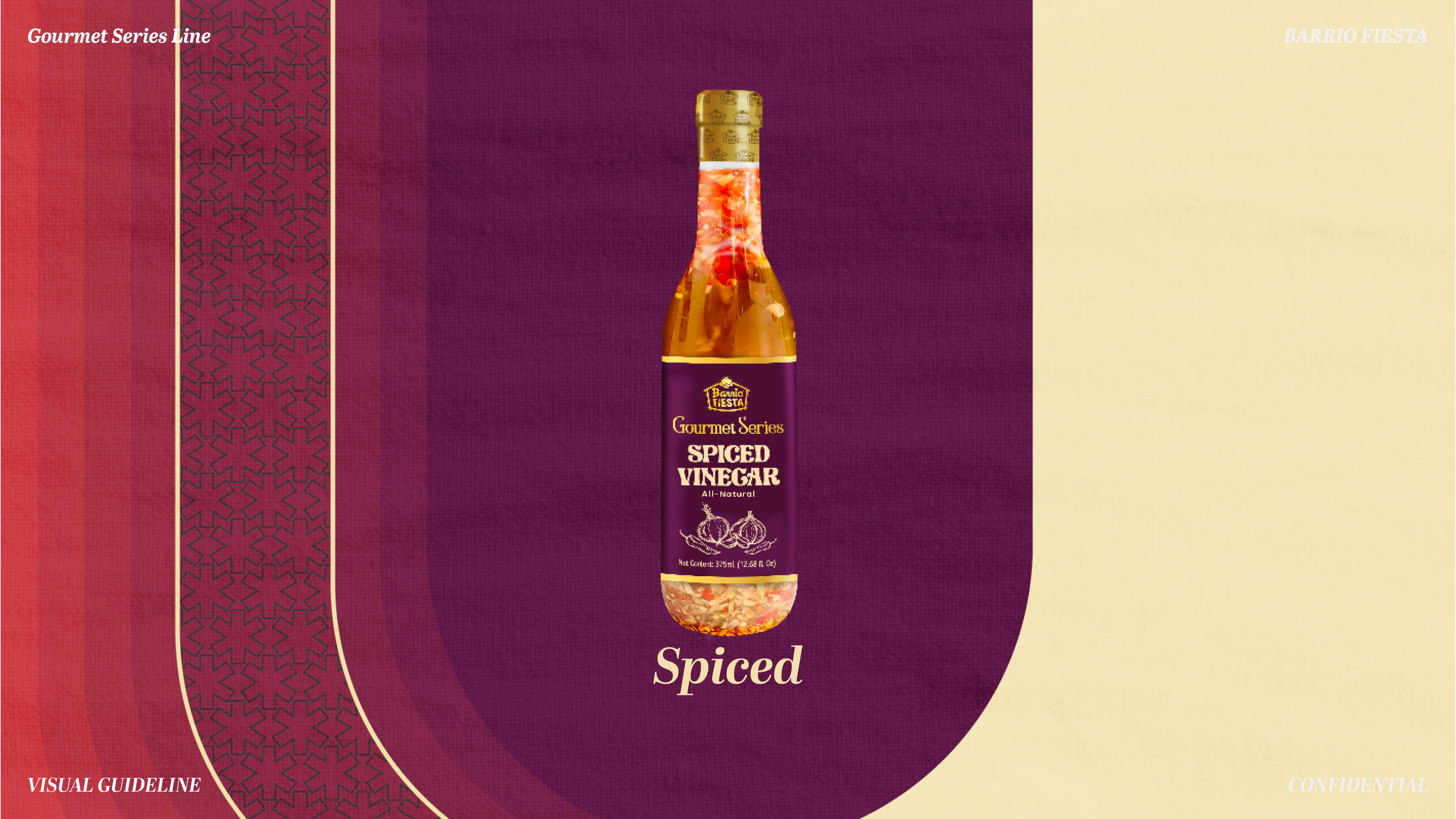
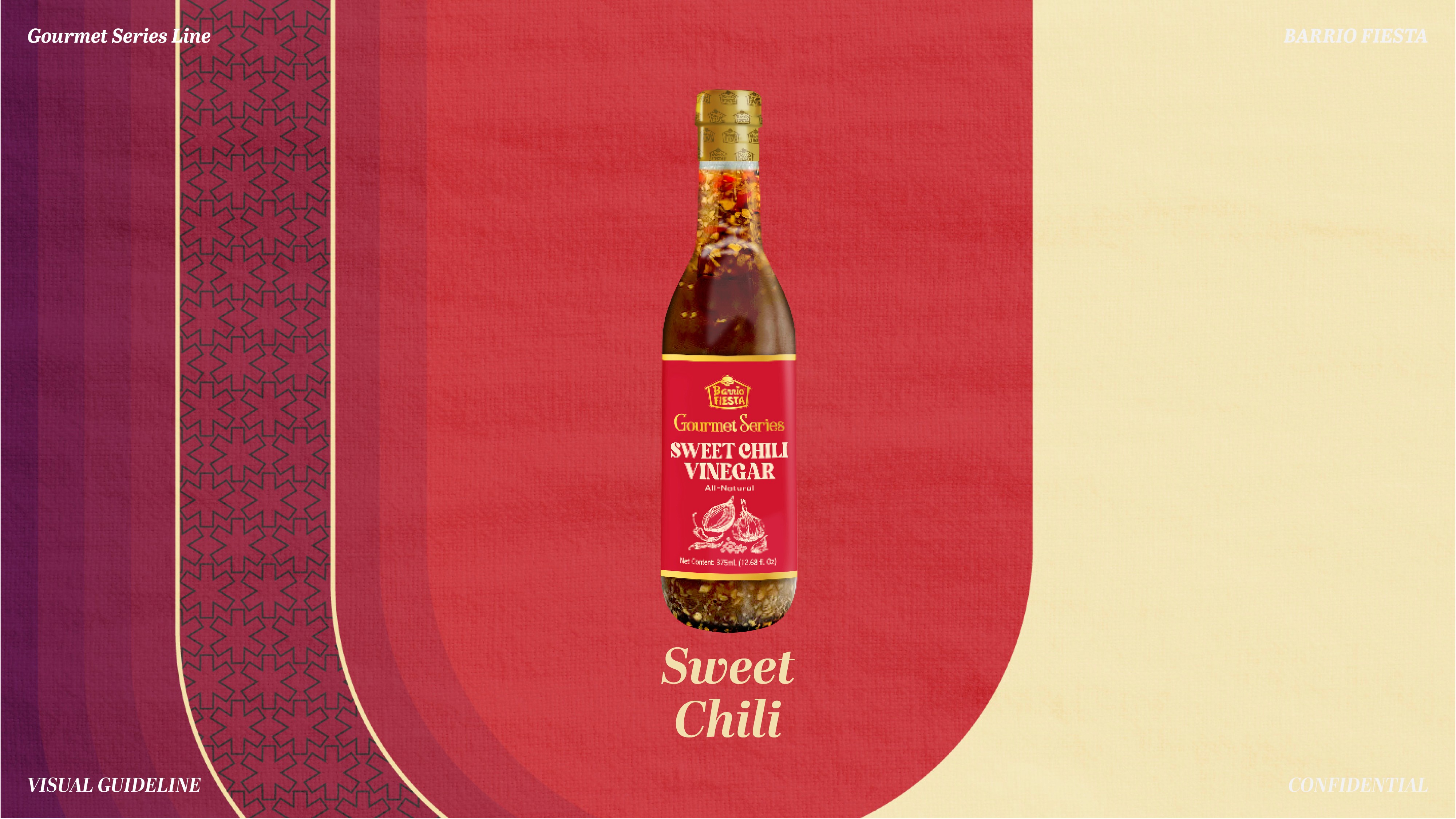
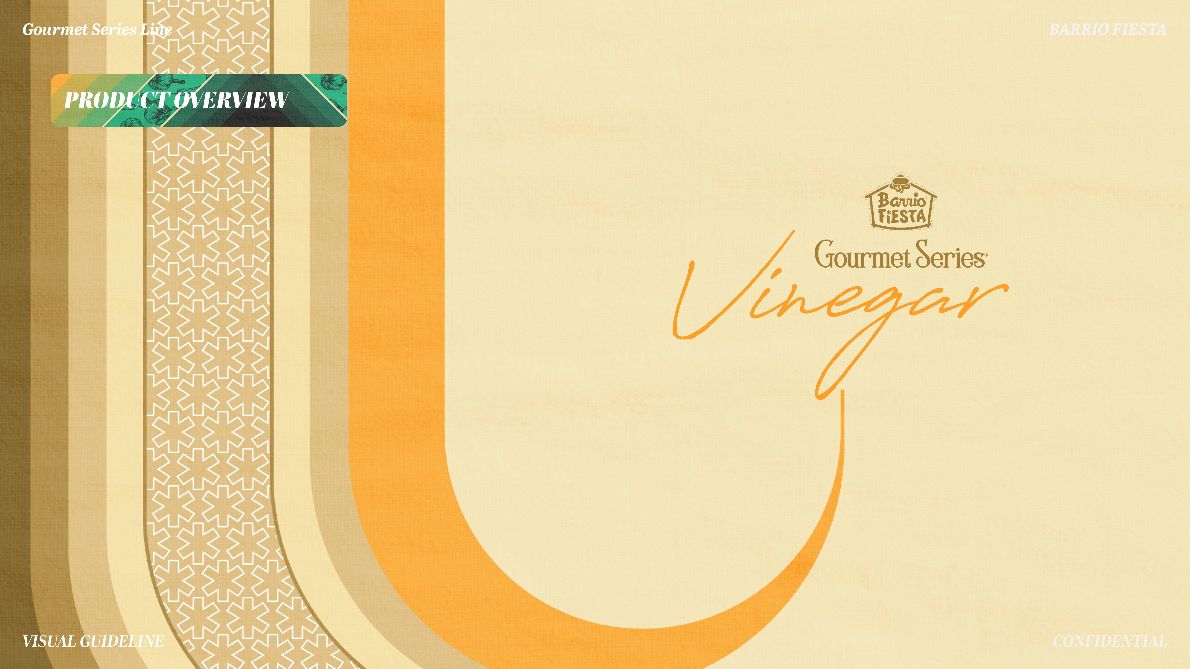
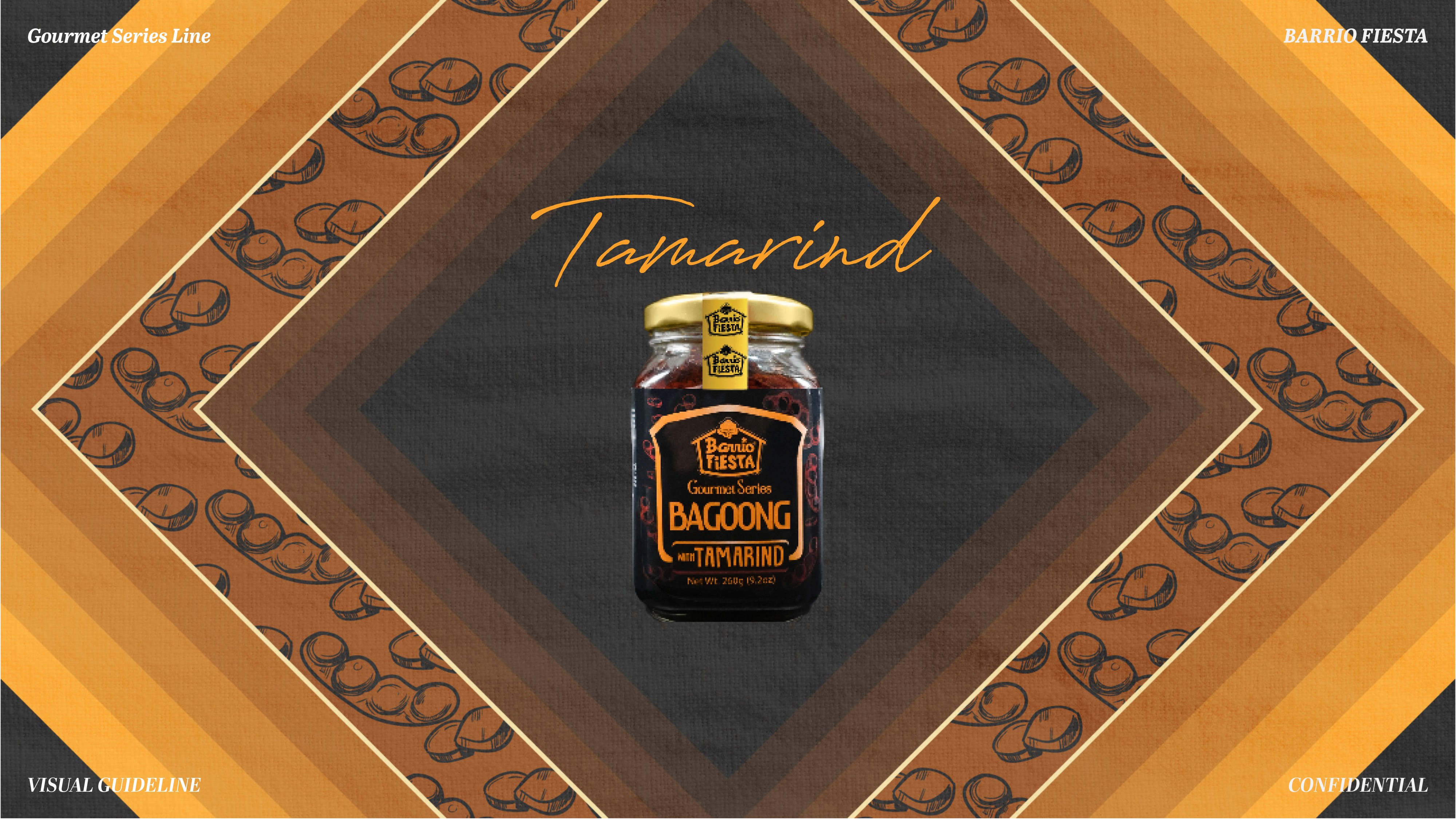
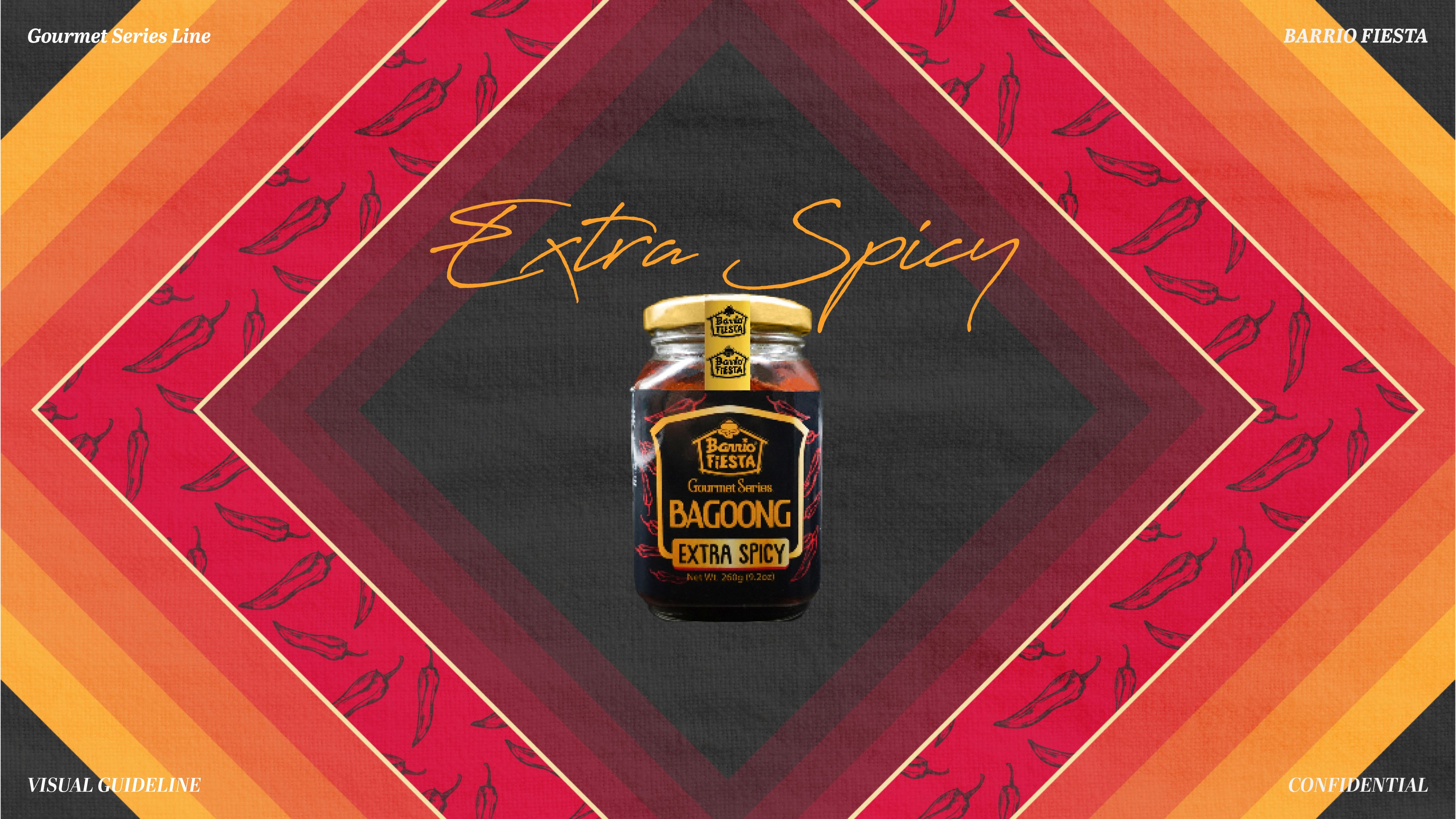
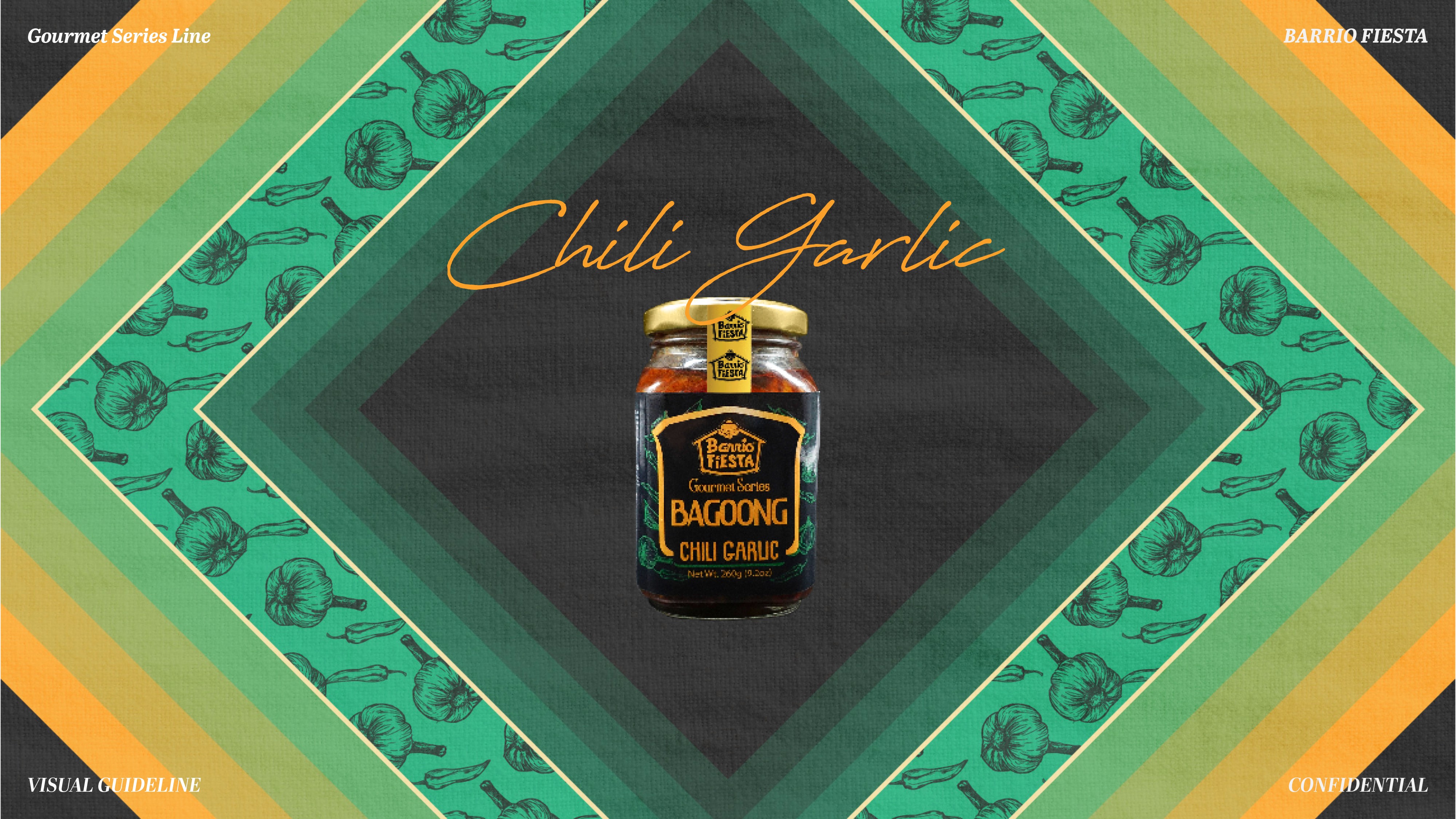
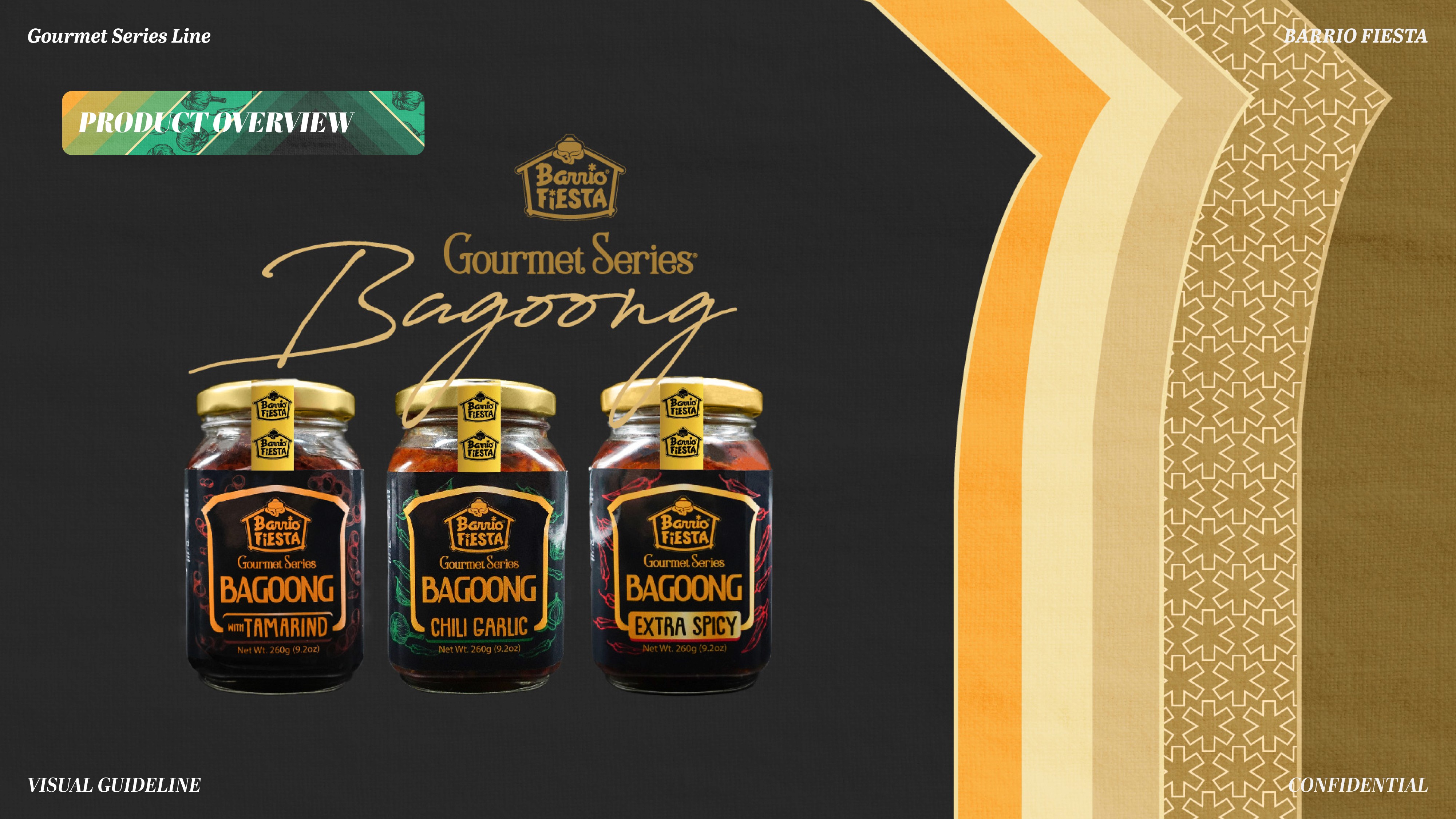
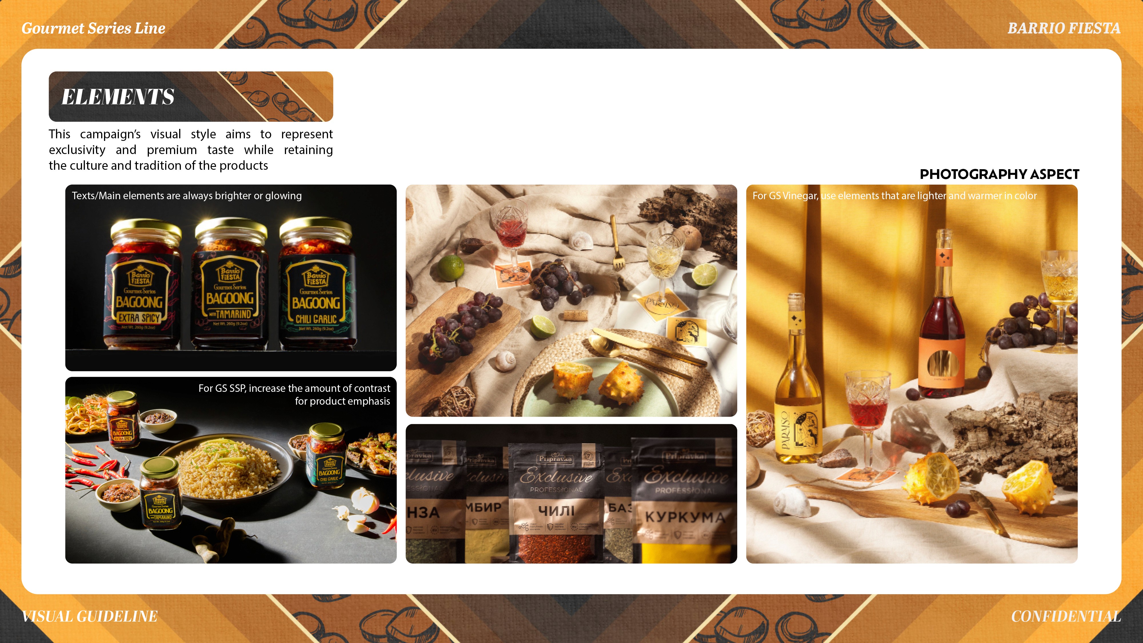
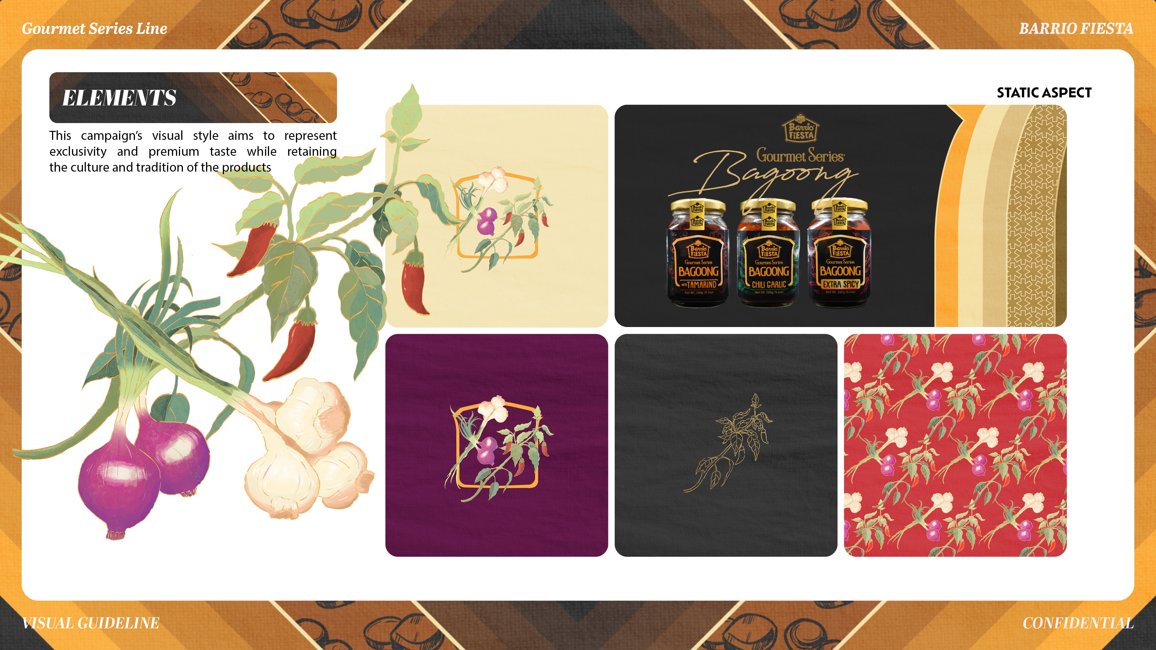
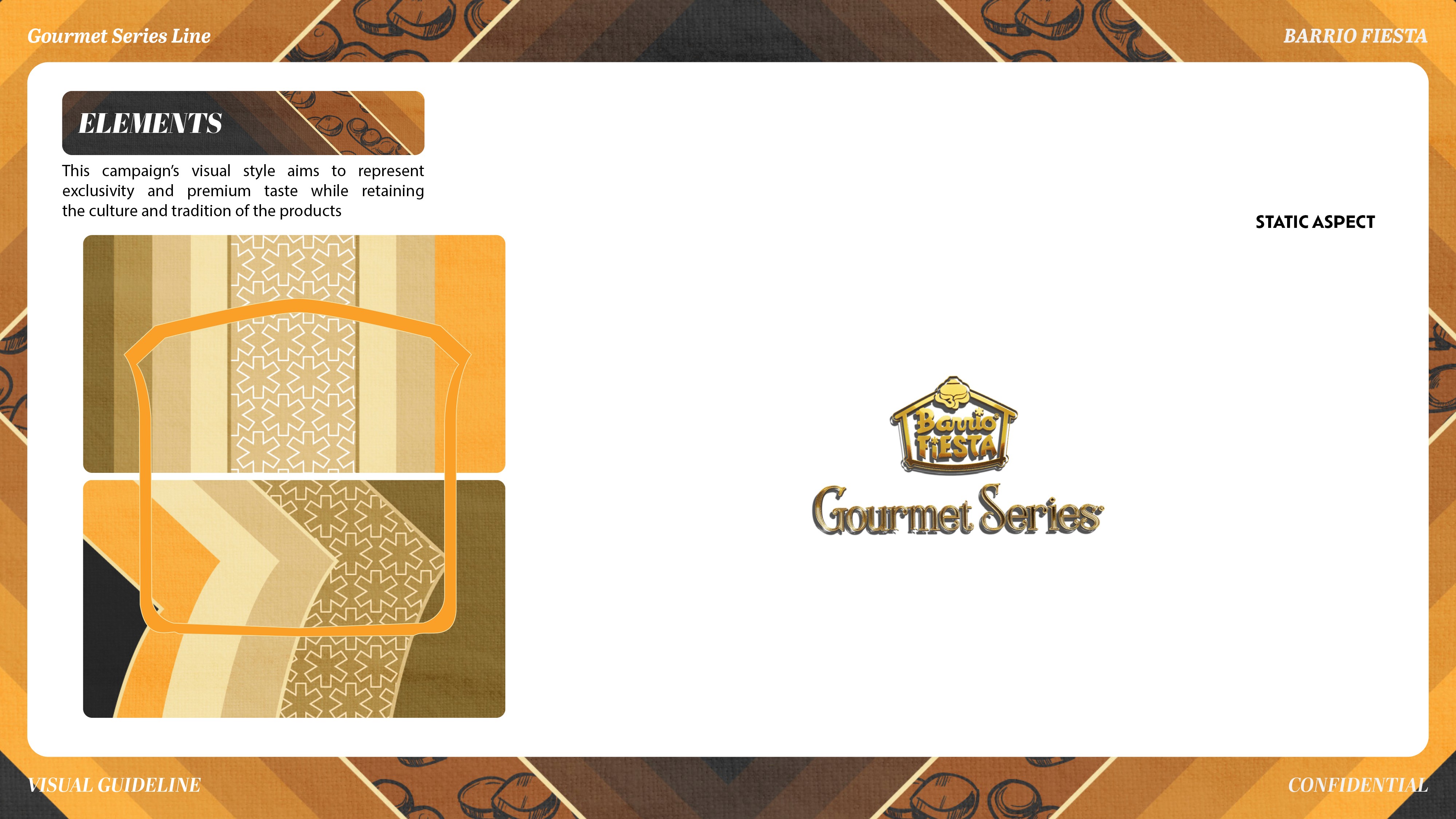
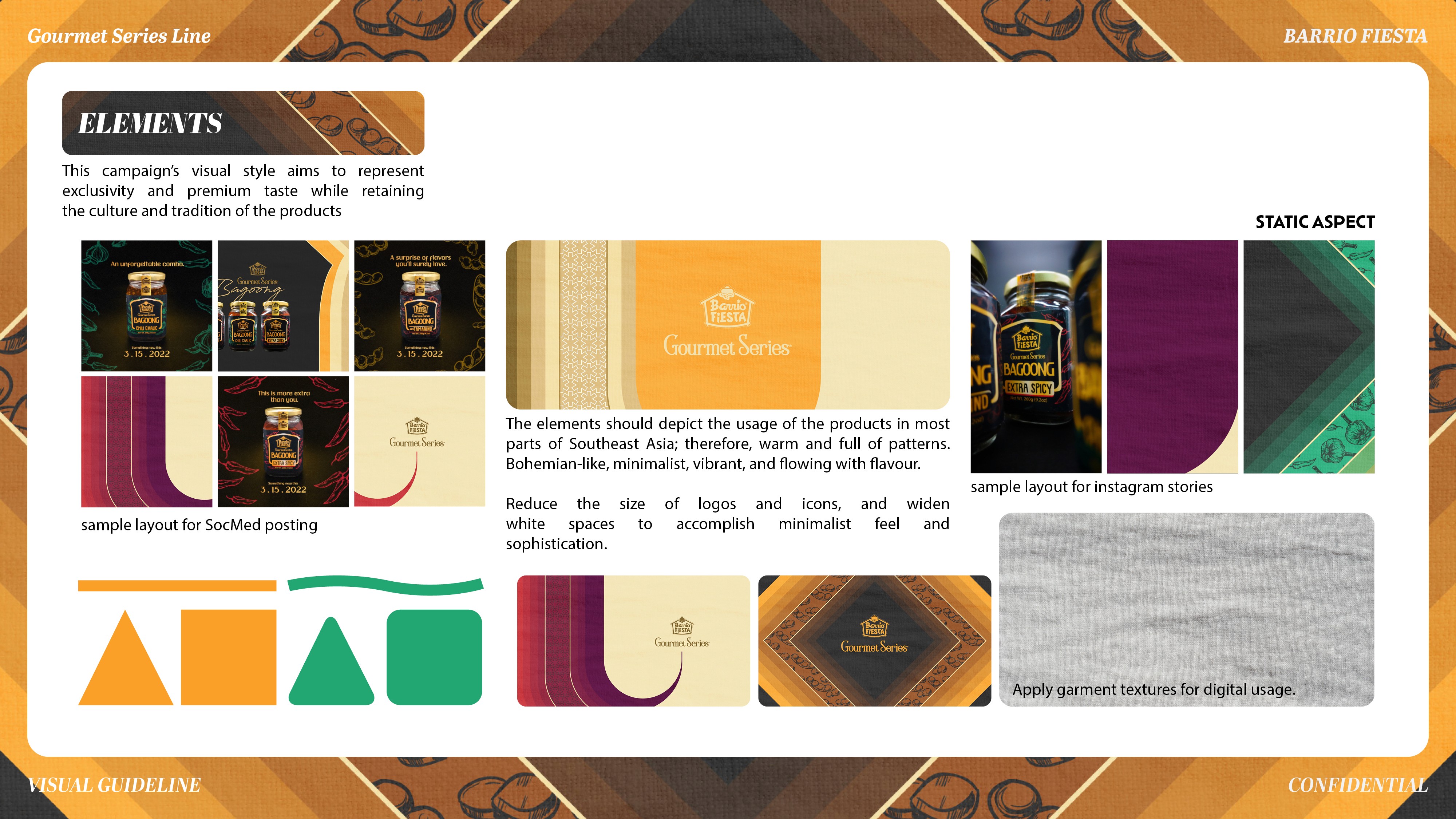
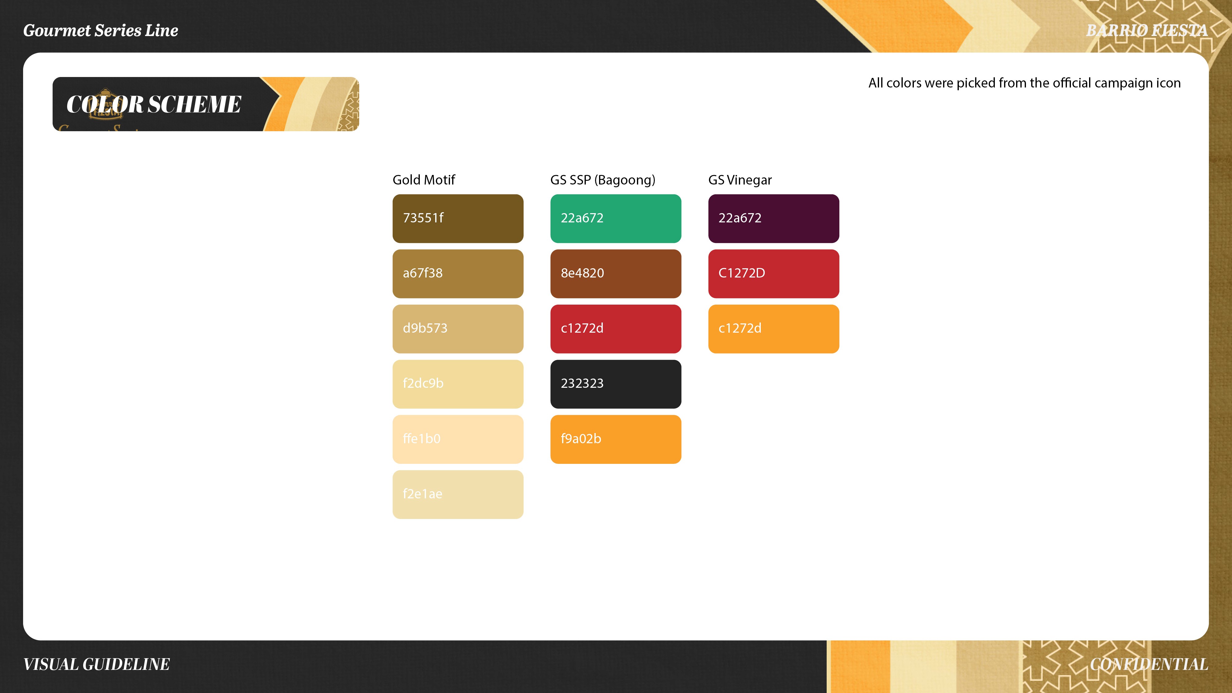
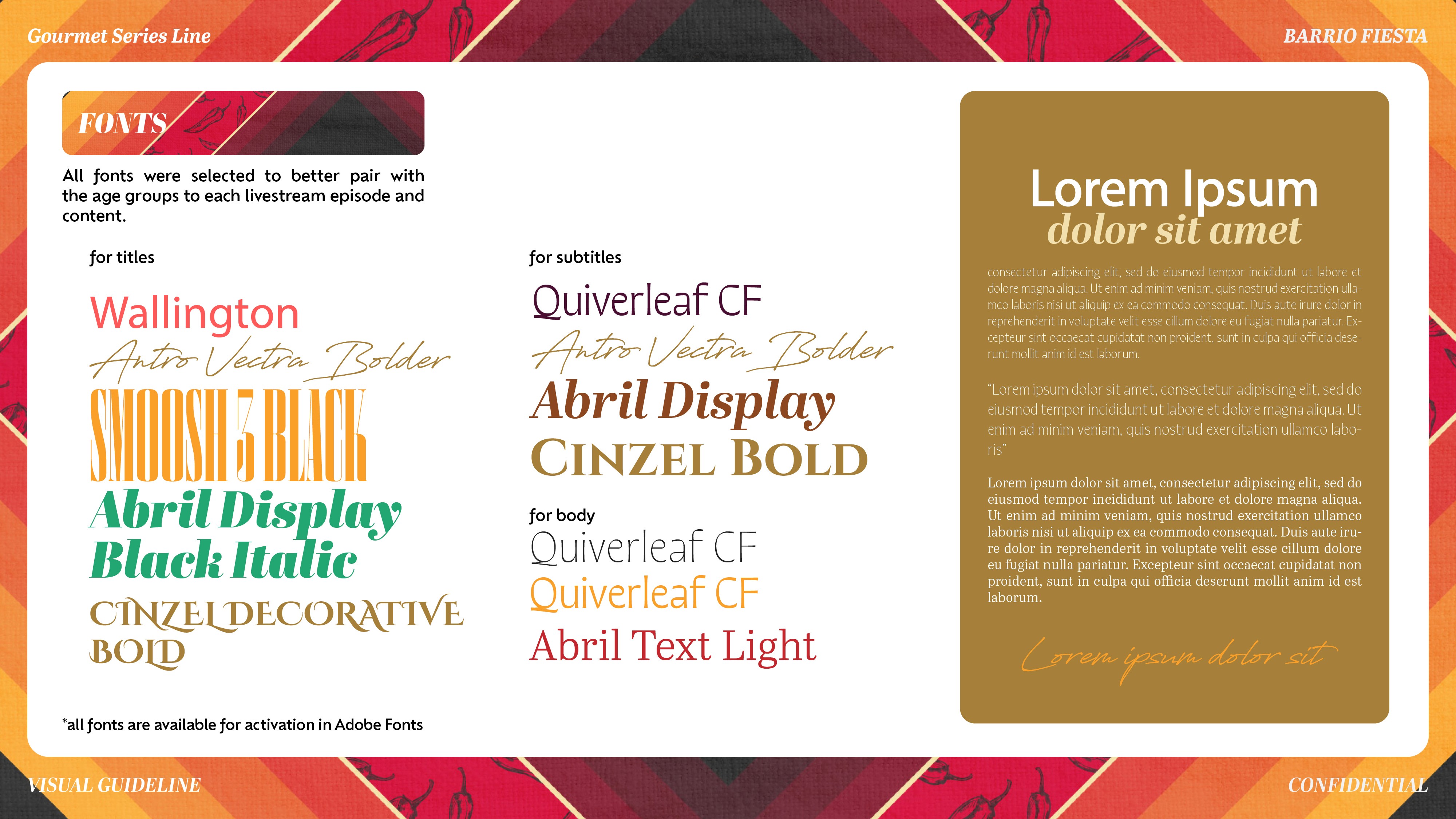
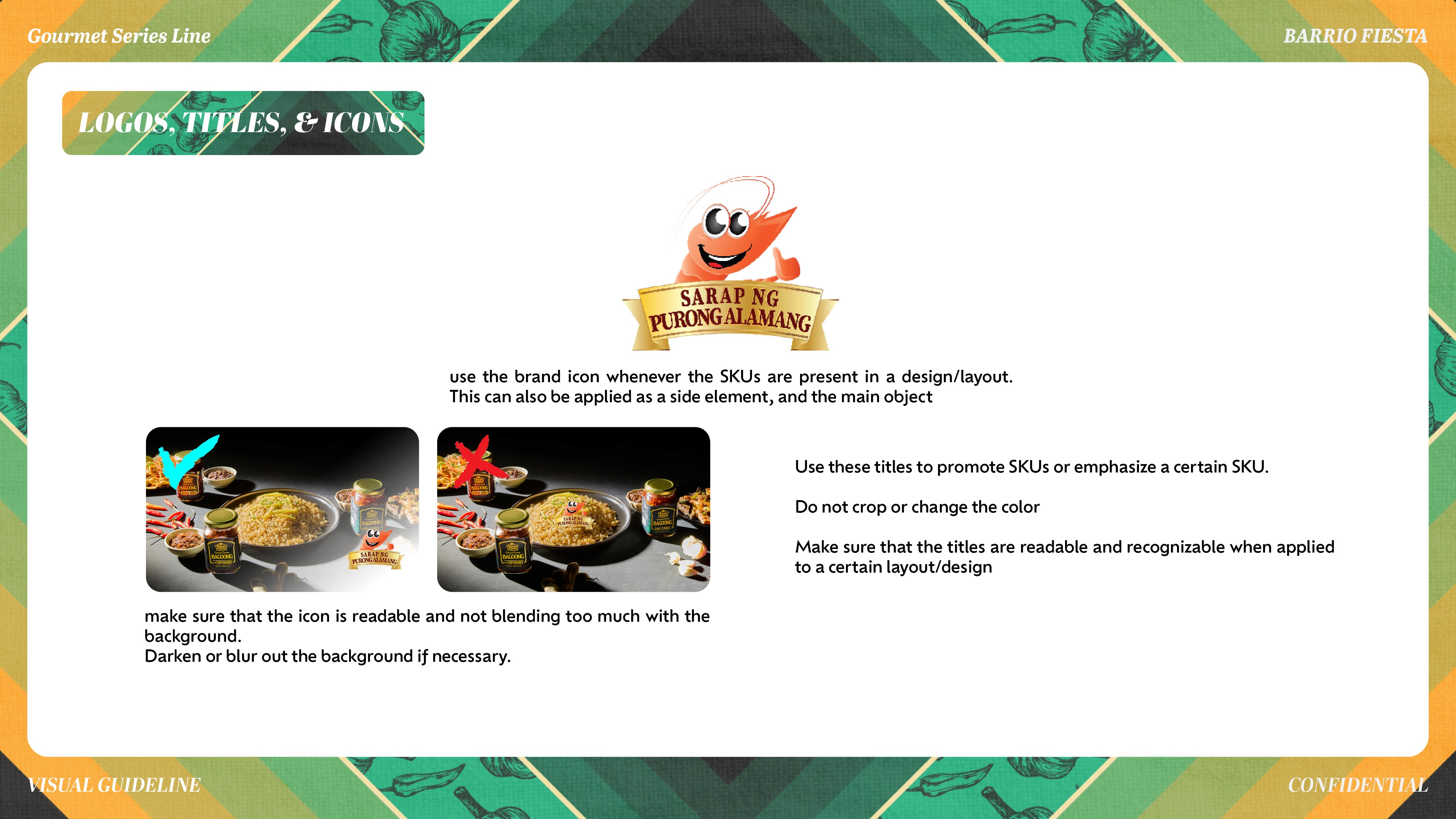
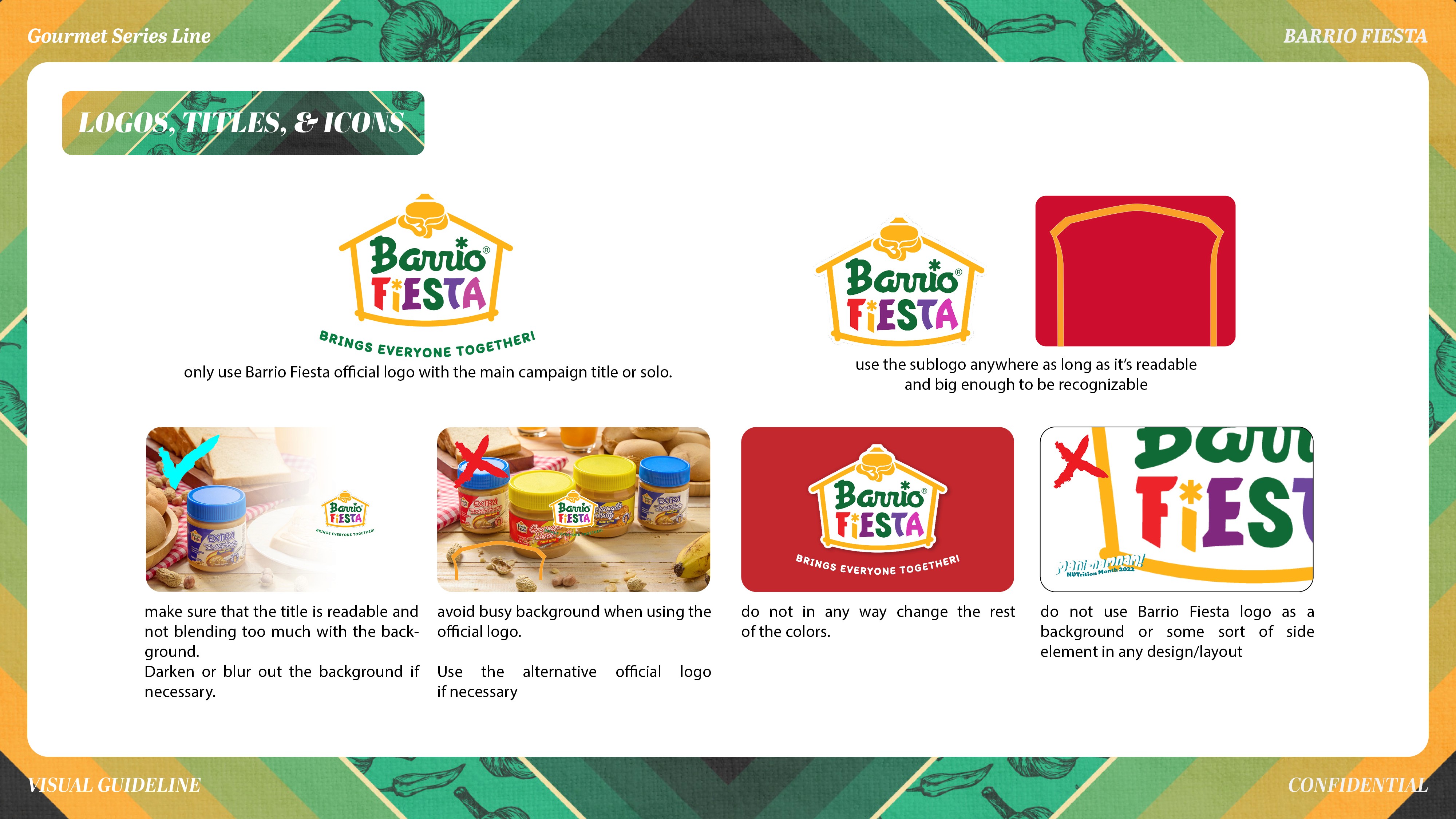
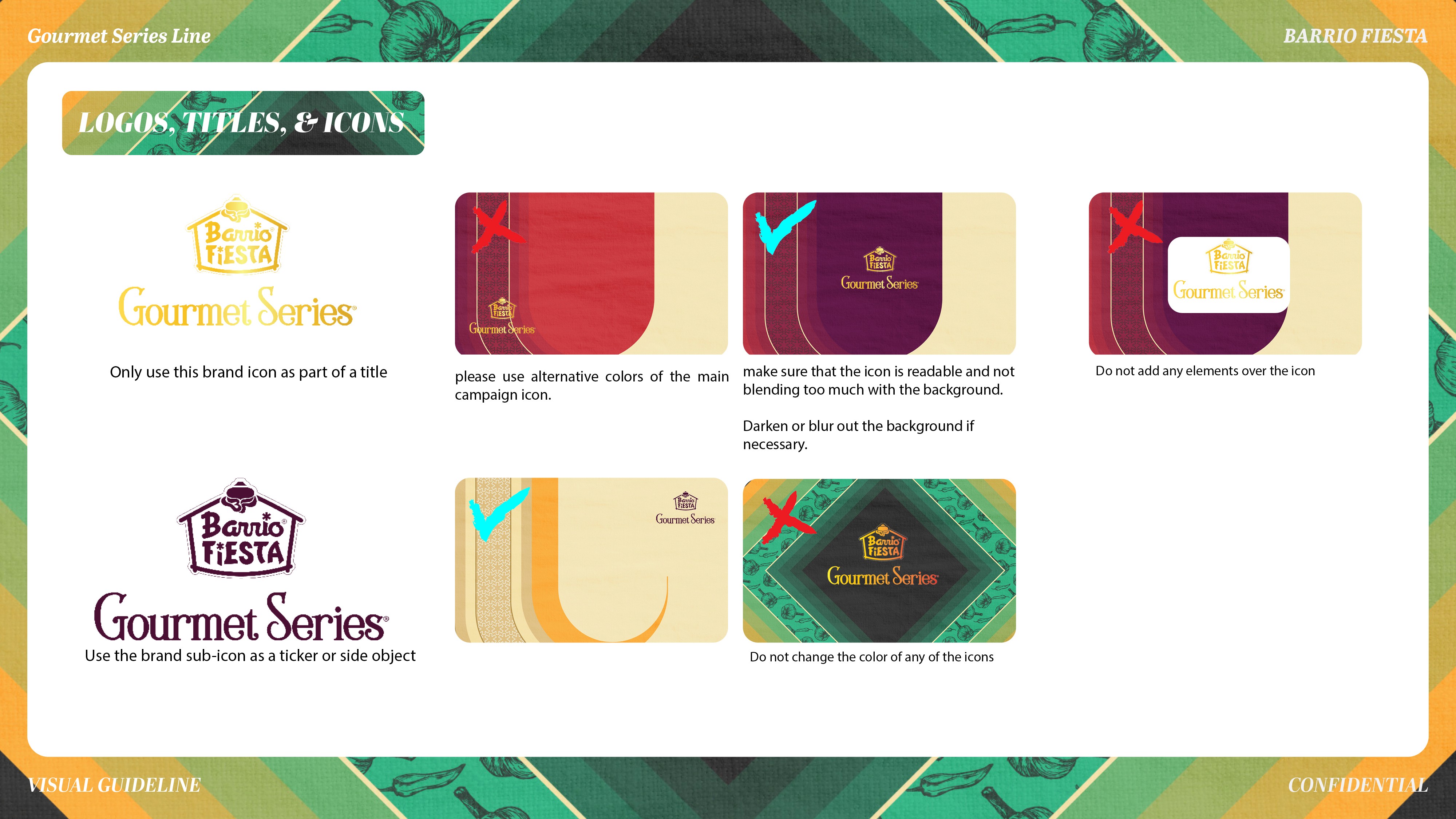
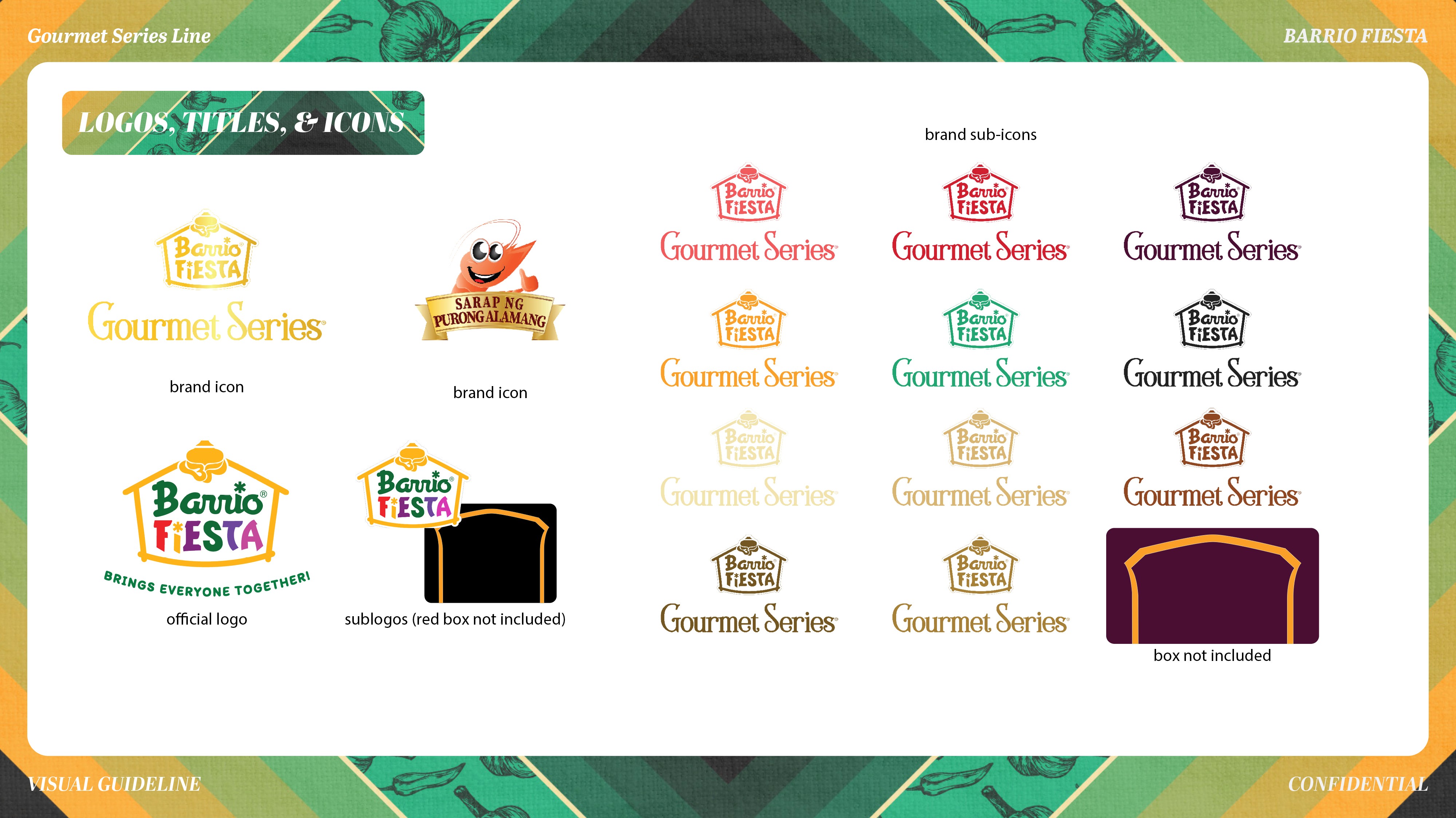
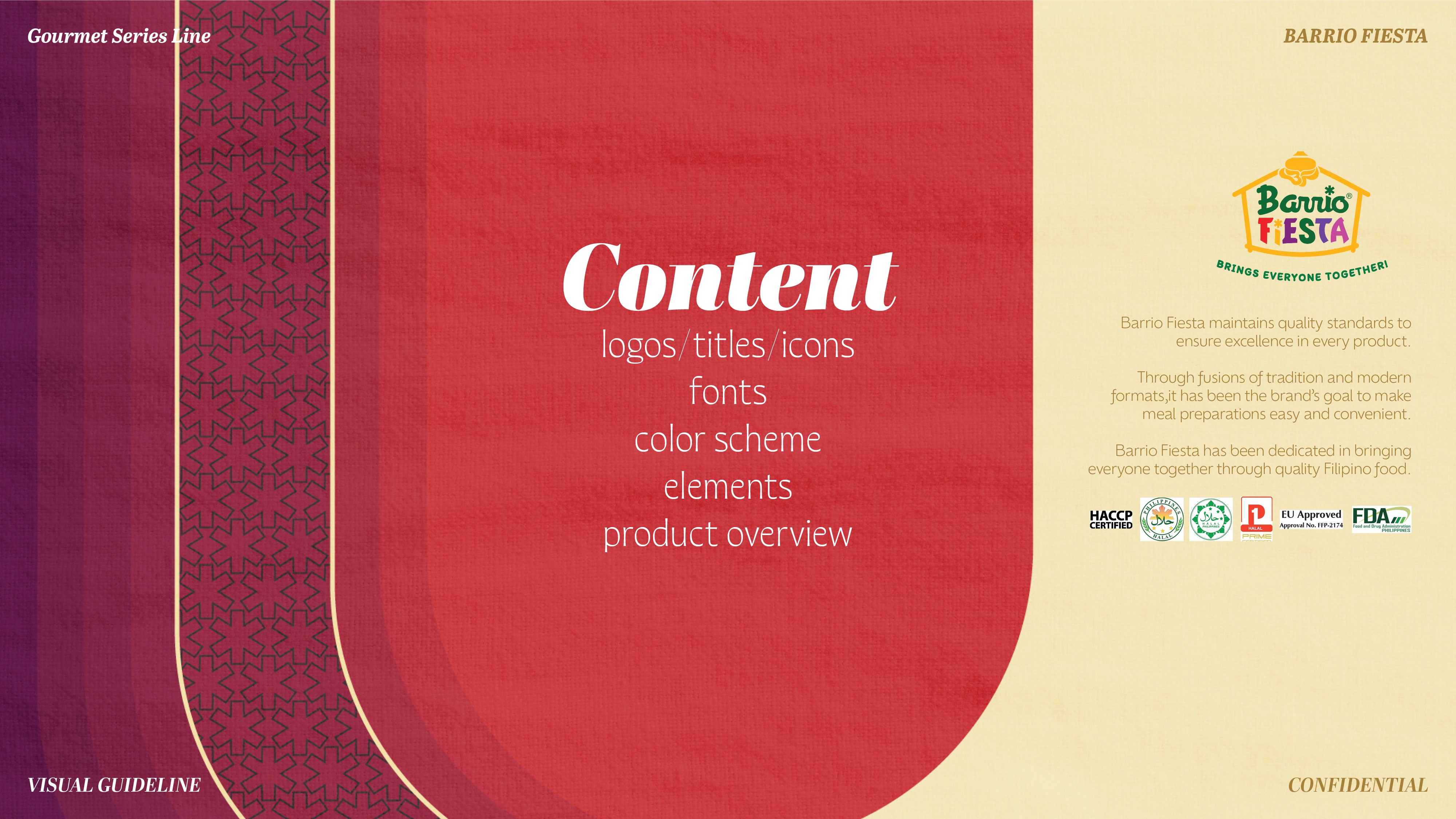
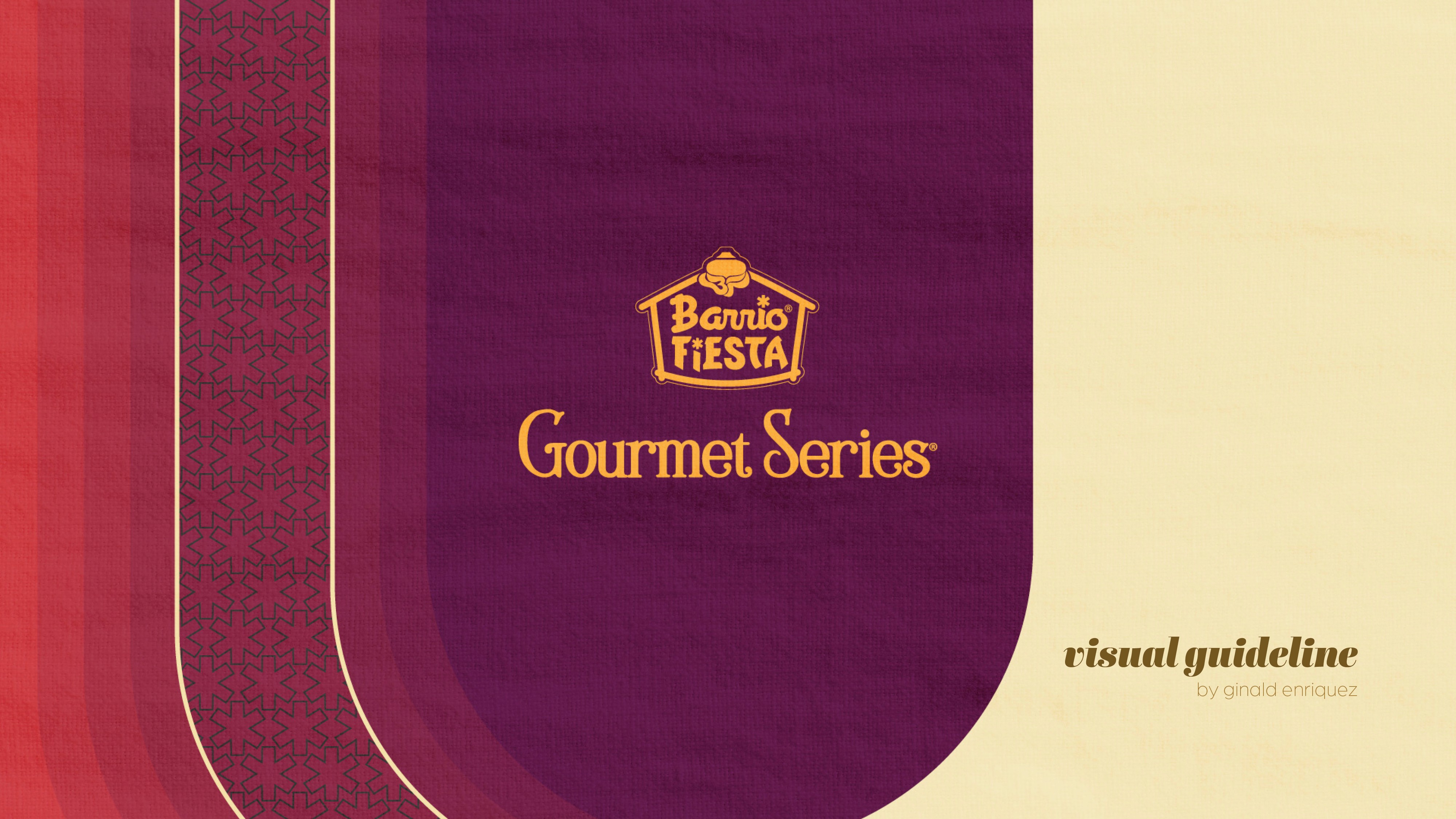
This initiative involved the creation of a comprehensive visual identity system for a high-end consumer product line.
The primary focus was on developing a refined aesthetic that marries traditional warmth with contemporary luxury. My work included defining a rich color palette, establishing typographical hierarchy, and designing detailed graphic elements and presentation rules.
The resulting guideline successfully standardized the brand's visual communications, ensuring consistency and market elevation across all media.
drag
each
card
Logos are the foundation of a brand’s visual system. In this collection, each mark is designed not just for aesthetics, but for meaning, function, and long-term scalability across platforms.
My process begins with understanding a brand’s personality, market positioning, and audience behavior before translating strategy into form, type, and symbol. From handcrafted wordmarks to illustrative emblems, every logo is built to work across digital, print, social, and environmental touchpoints.
Rather than treating logos as standalone graphics, I design them as flexible identity anchors—ready to expand into full branding systems, campaigns, and content ecosystems. The goal is clarity, memorability, and distinction in crowded markets.
Each project balances storytelling, usability, and visual impact to ensure the brand looks confident, consistent, and recognizable wherever it appears.
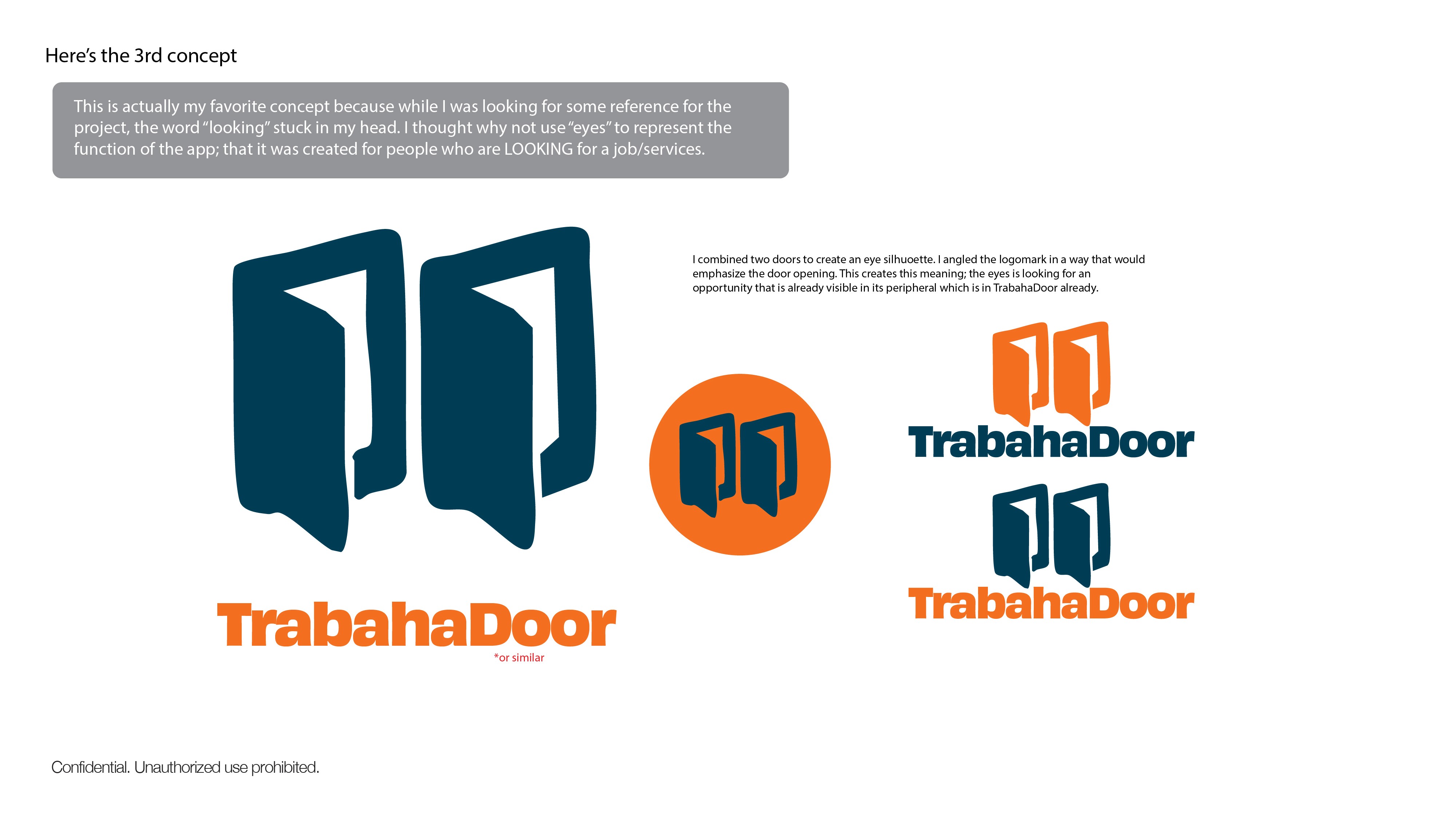
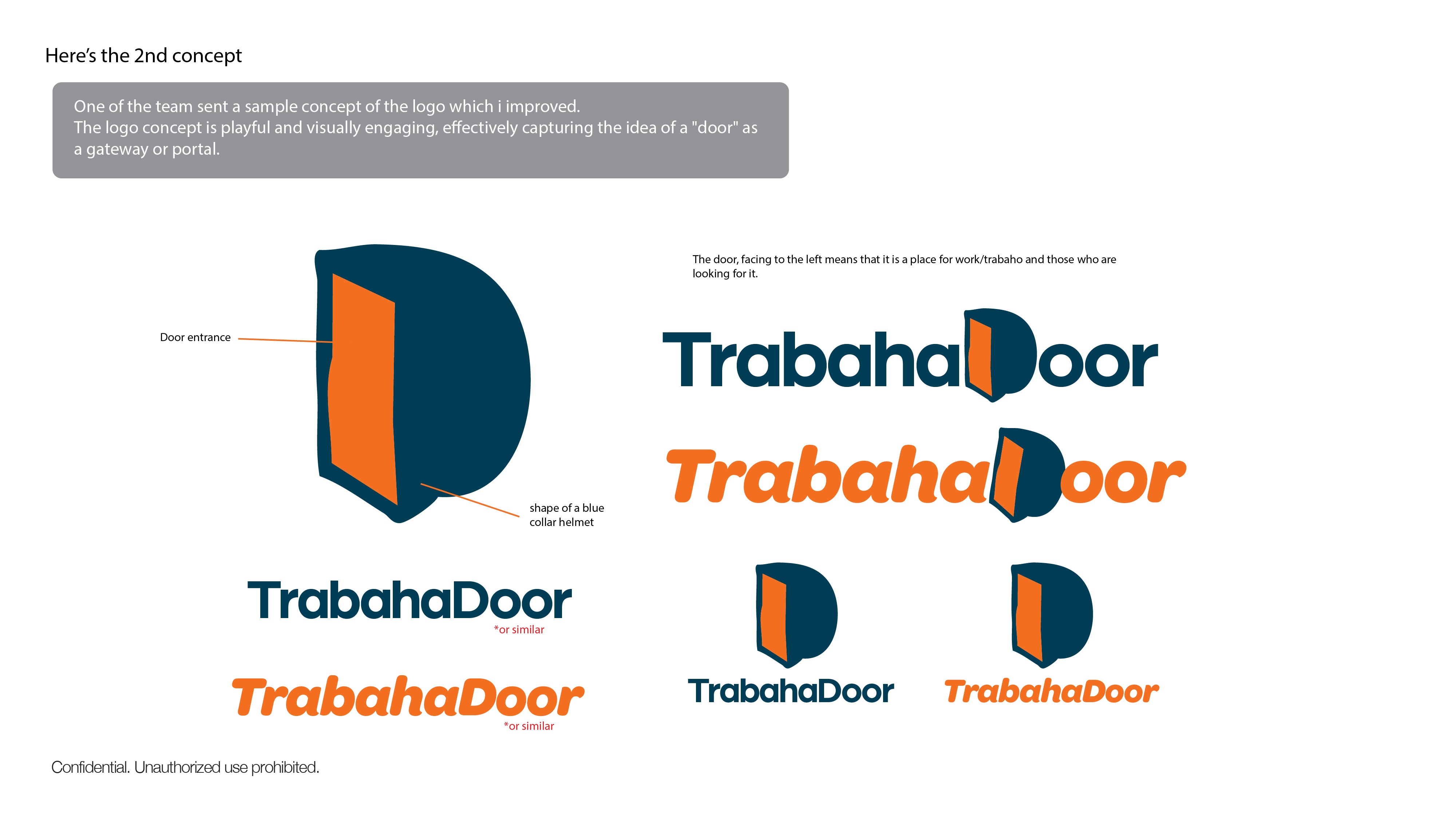
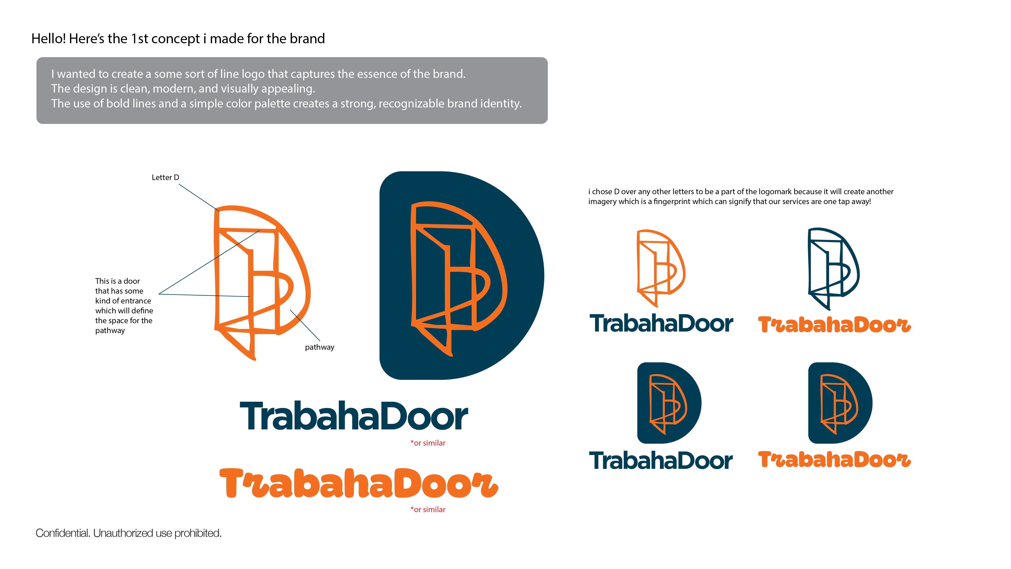
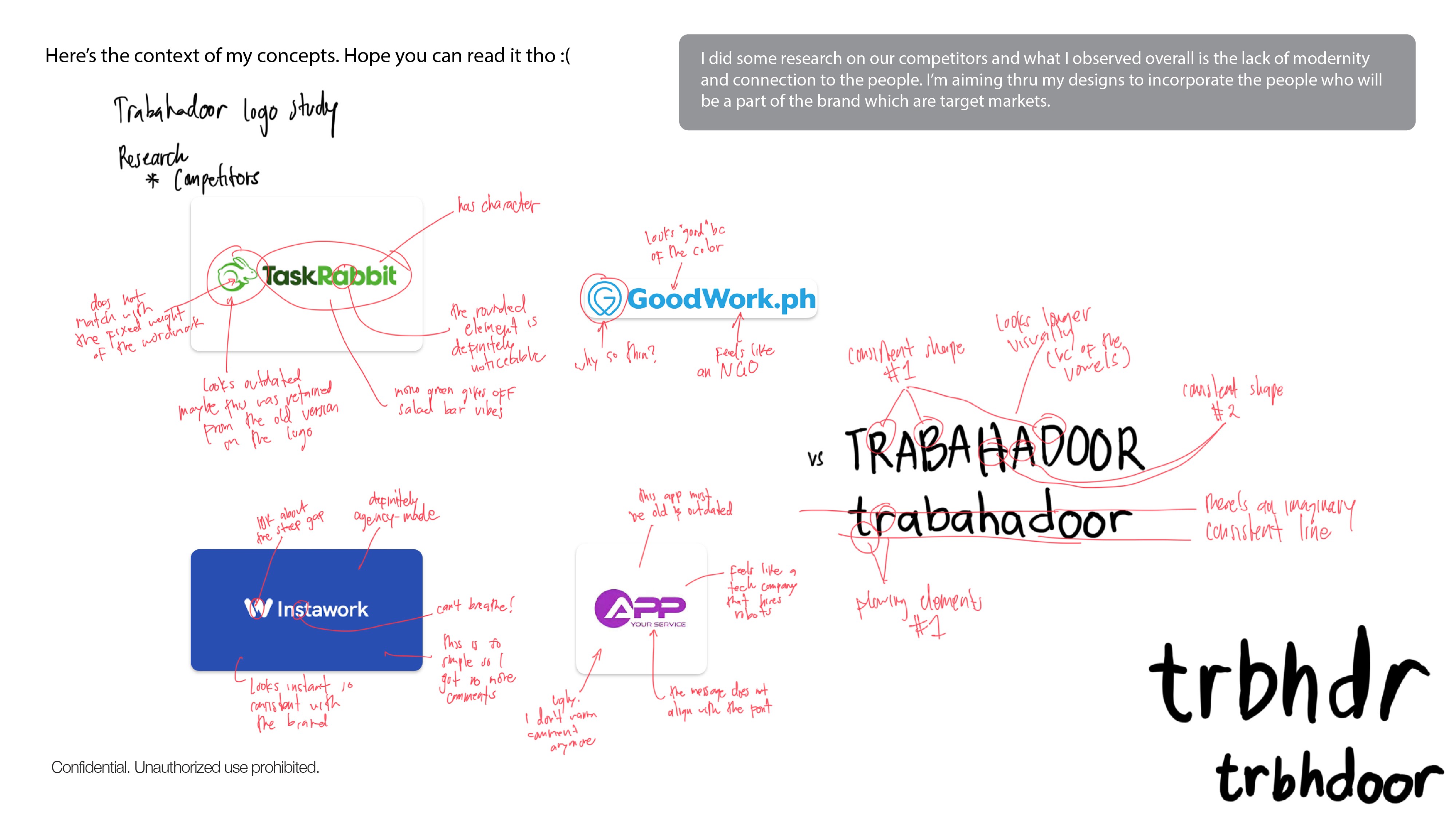
Trabahadoor is a service-matching platform designed to bridge the gap between skilled workers and those seeking immediate services. Following a competitive analysis that revealed a lack of personality in the sector, I developed three logo concepts focusing on accessibility and human connection.
These studies explore metaphors of "gateways" and "vision," utilizing a bold teal and orange palette to transform the act of job-seeking into a modern, approachable experience. By blending geometric symbols like safety helmets and doorways with clean typography, the identity establishes Trabahadoor as a professional yet highly accessible digital tool for the modern workforce.
This project showcases a series of comprehensive logo studies aimed at modernizing the Hortaleza Corporation visual identity.
The challenge was to respect the heritage of a long-standing Filipino corporation while introducing a contemporary, forward-thinking aesthetic. These proposals explore three distinct directions: fluid, abstract marks symbolizing growth and synergy; structured, emblem-based designs that reinforce stability; and refined typographic treatments.
Each study focuses on maintaining brand authority through sophisticated color palettes and balanced geometry.
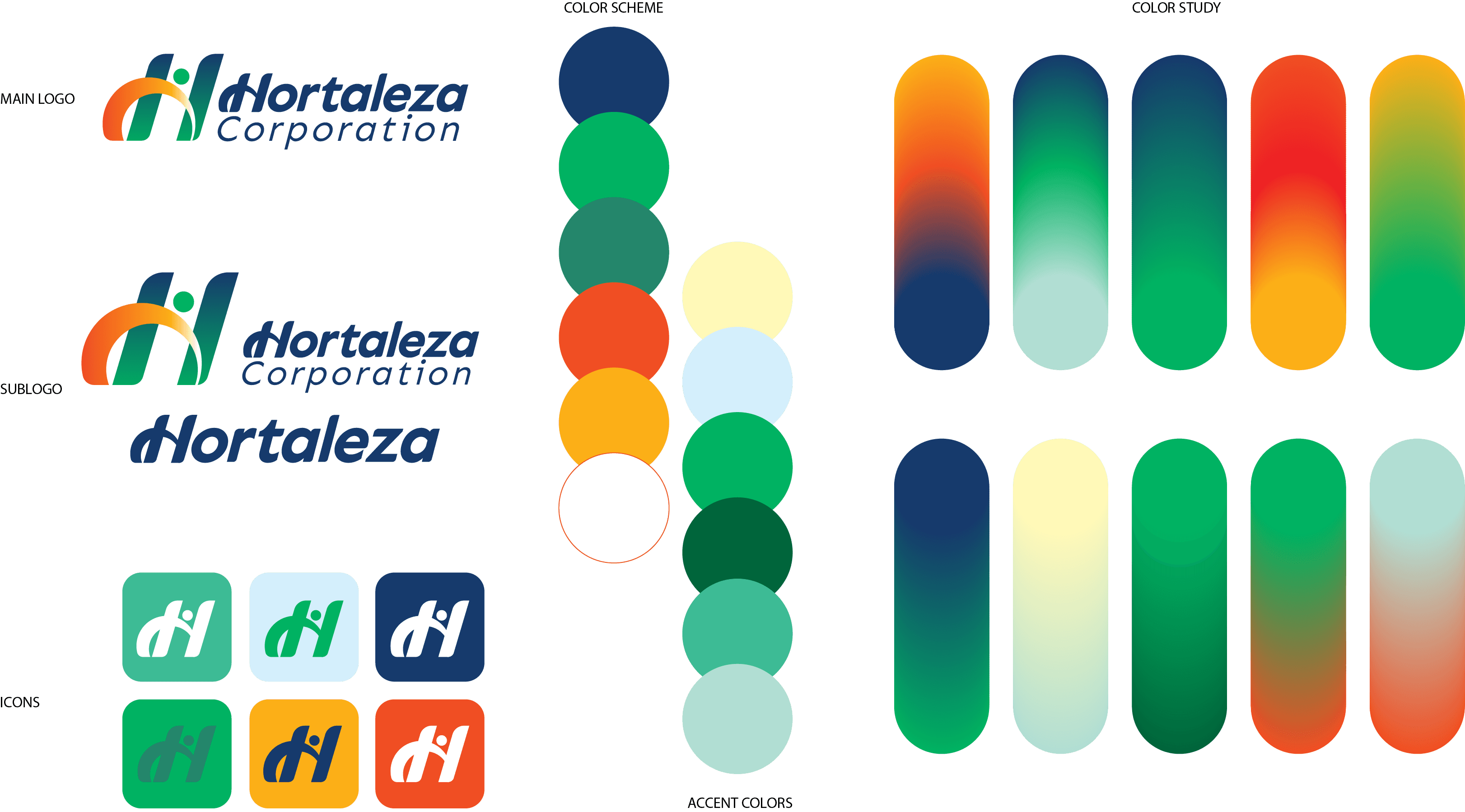
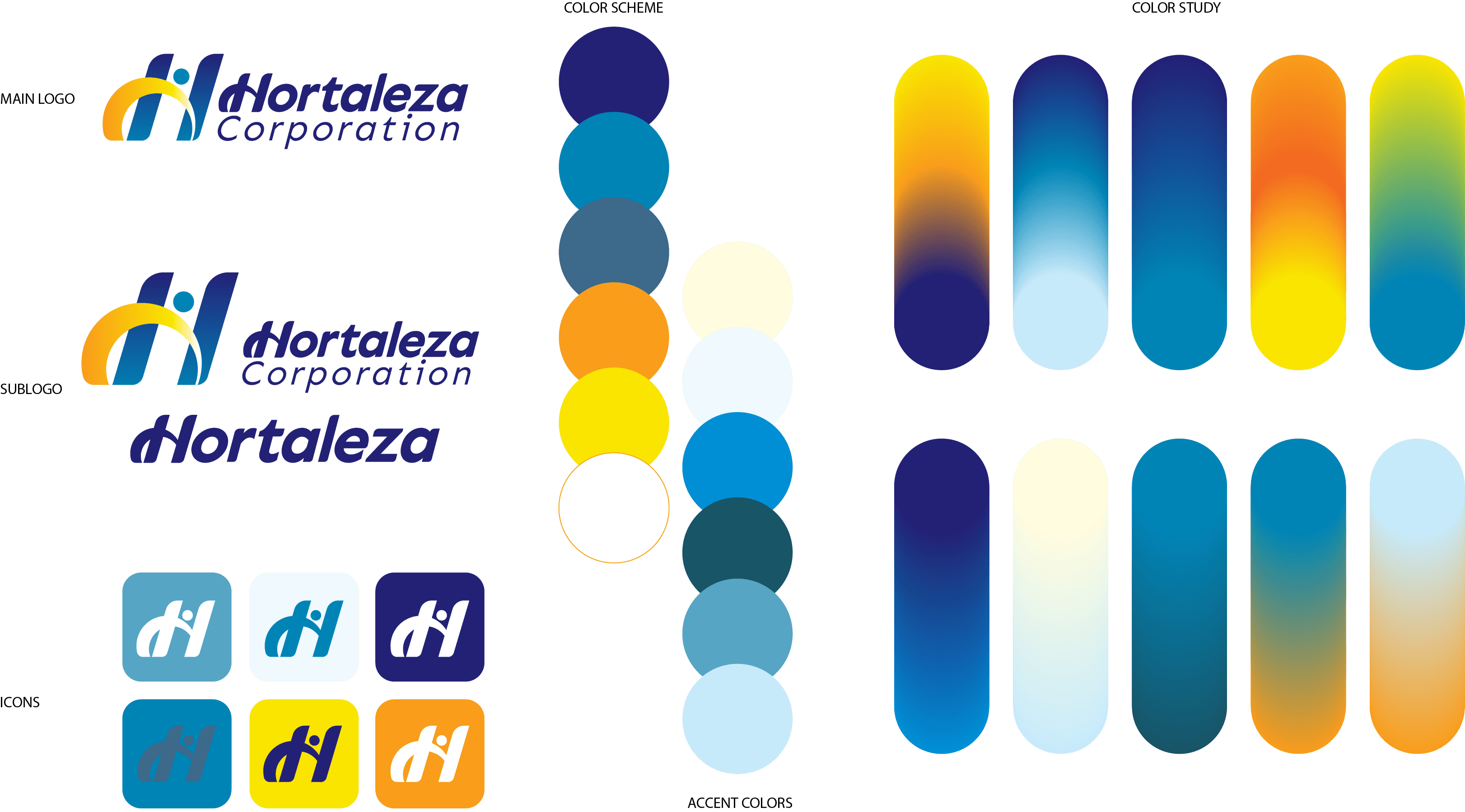
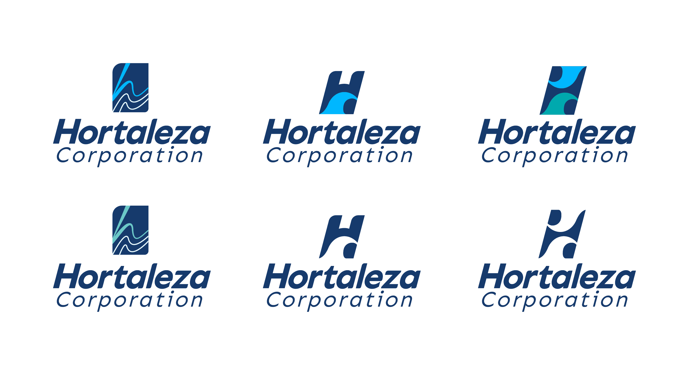
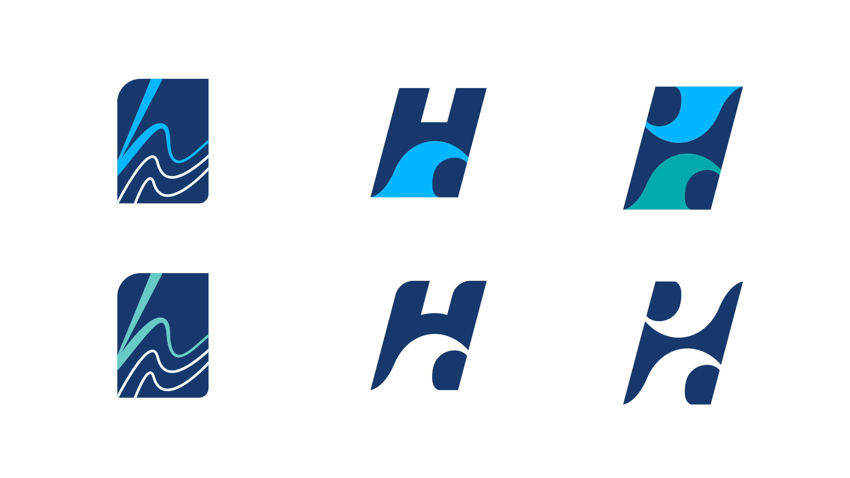
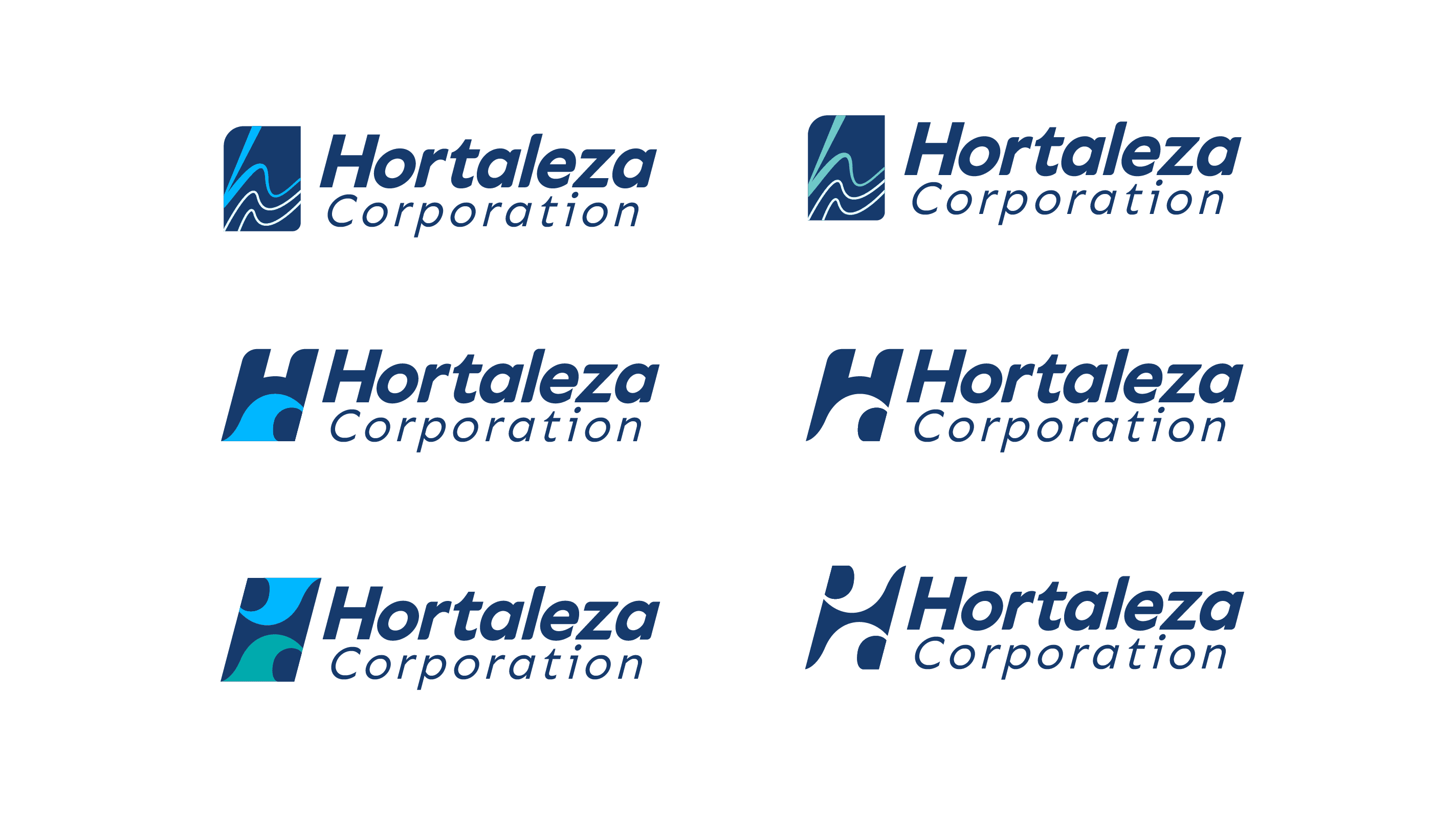
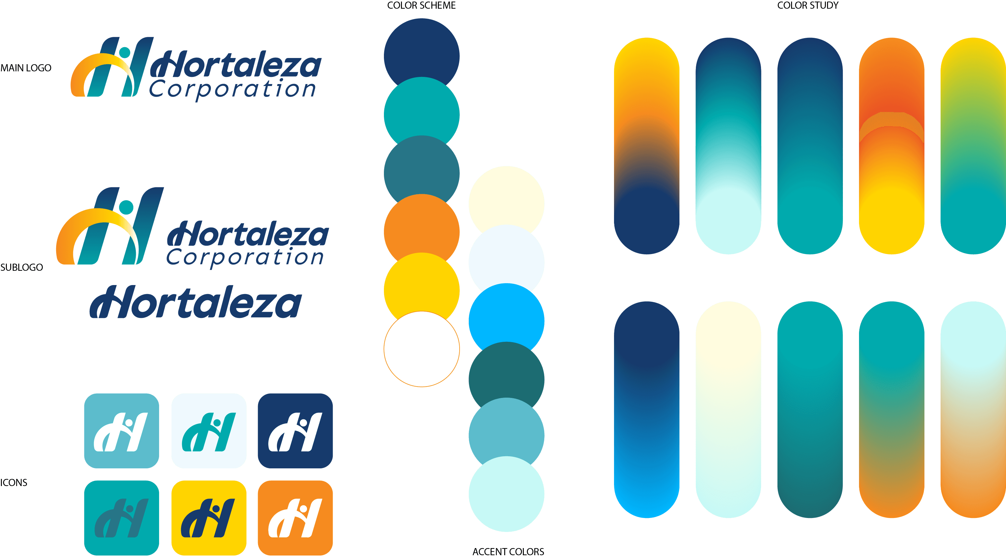
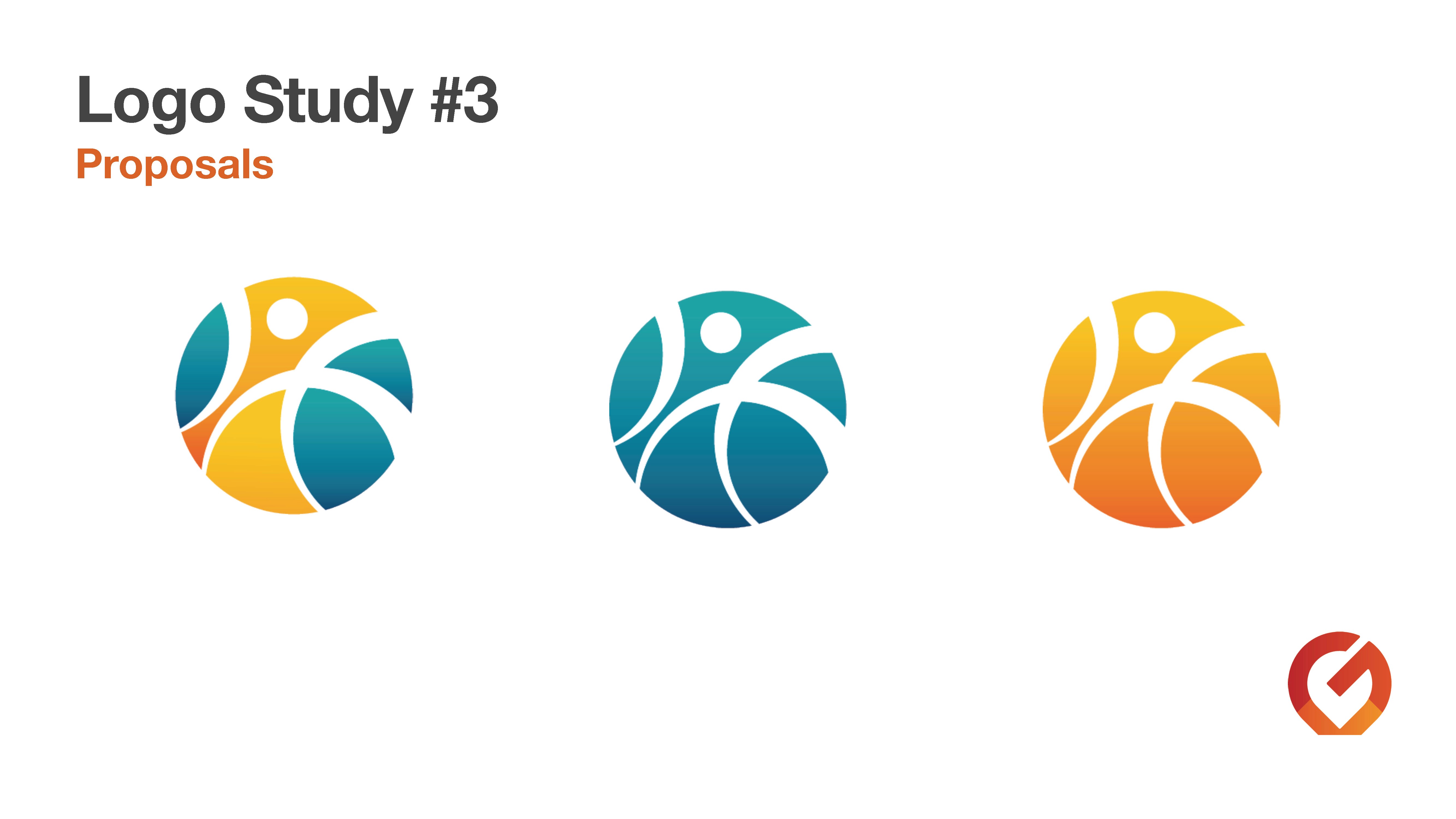
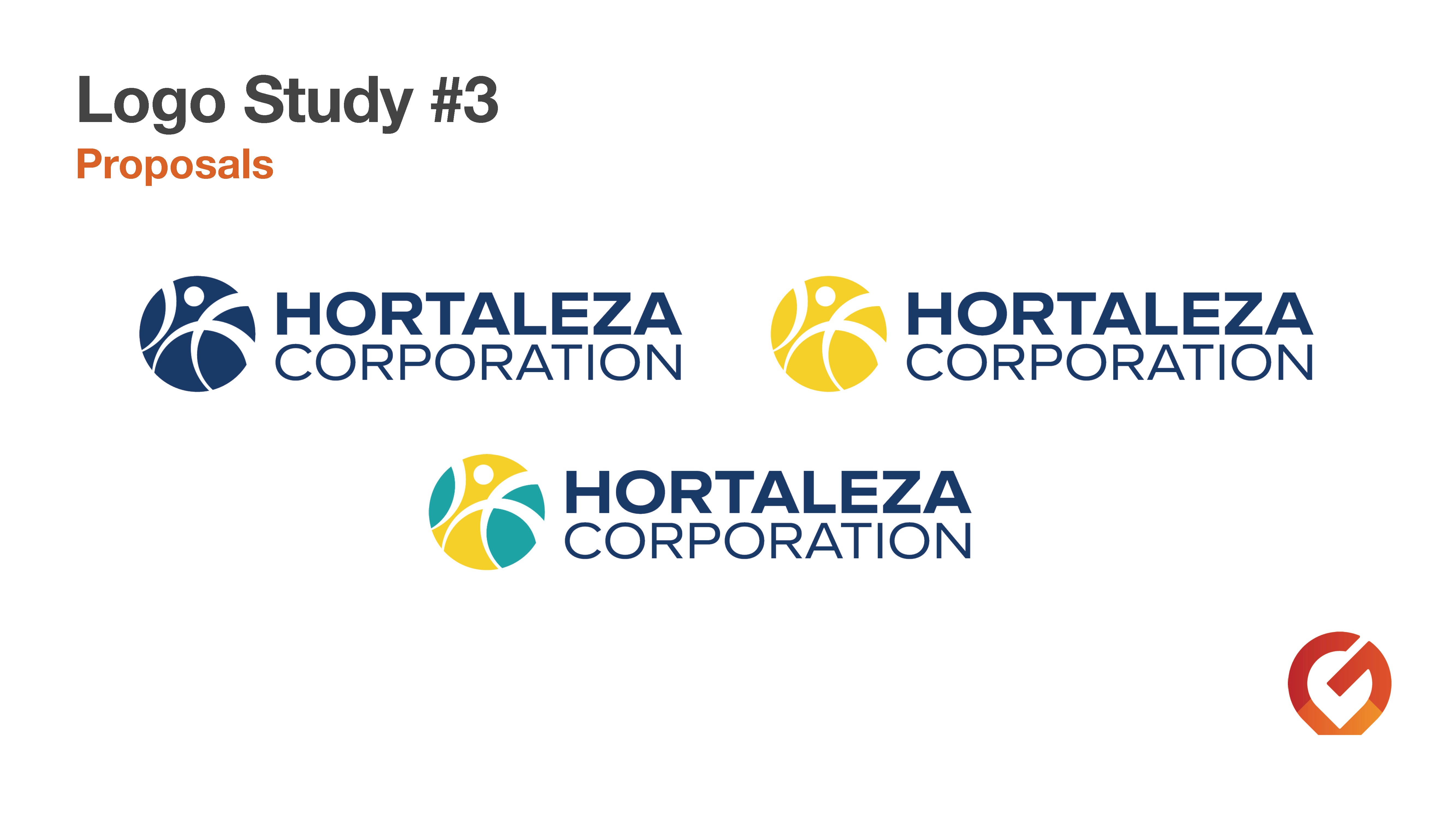
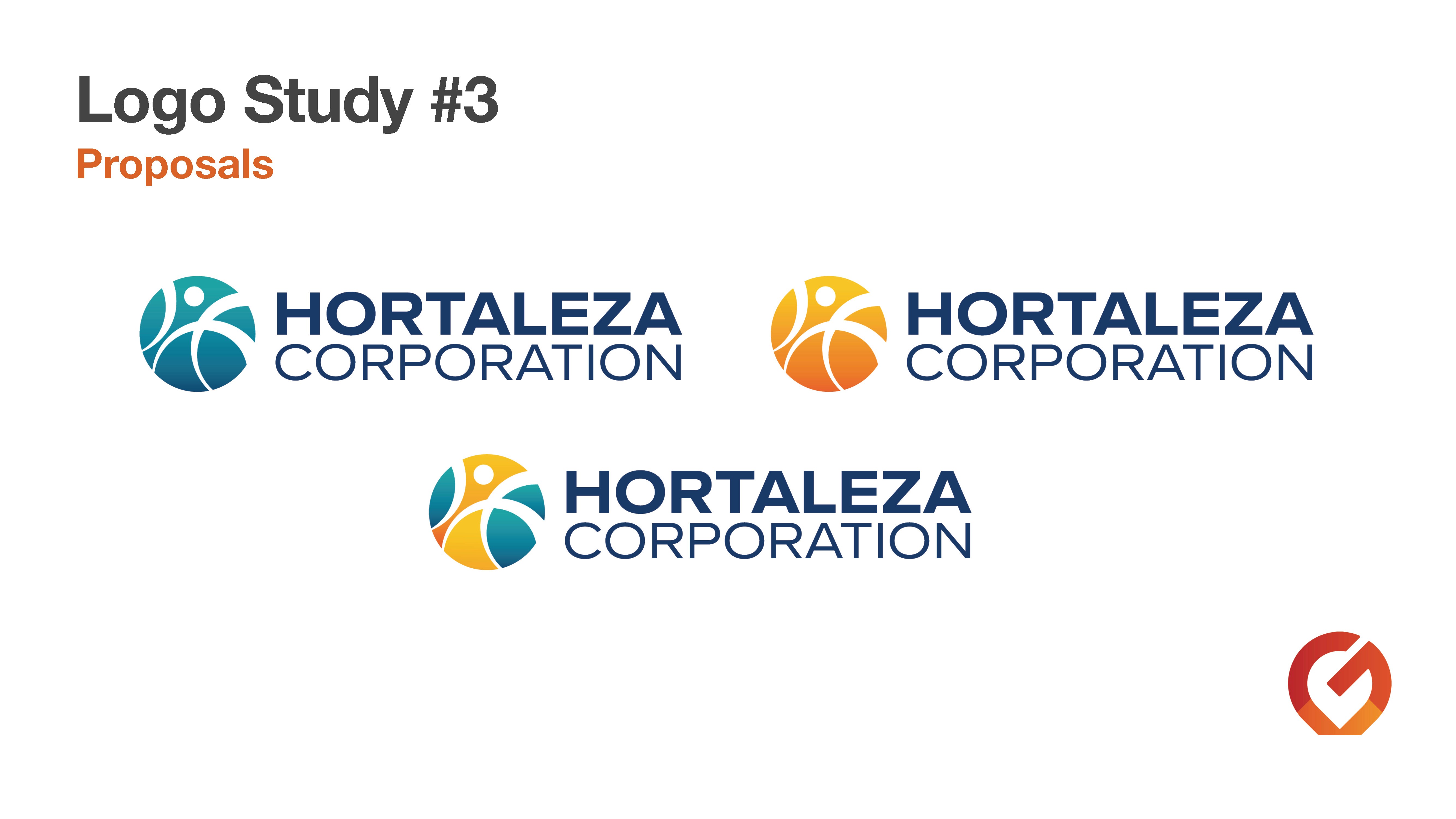
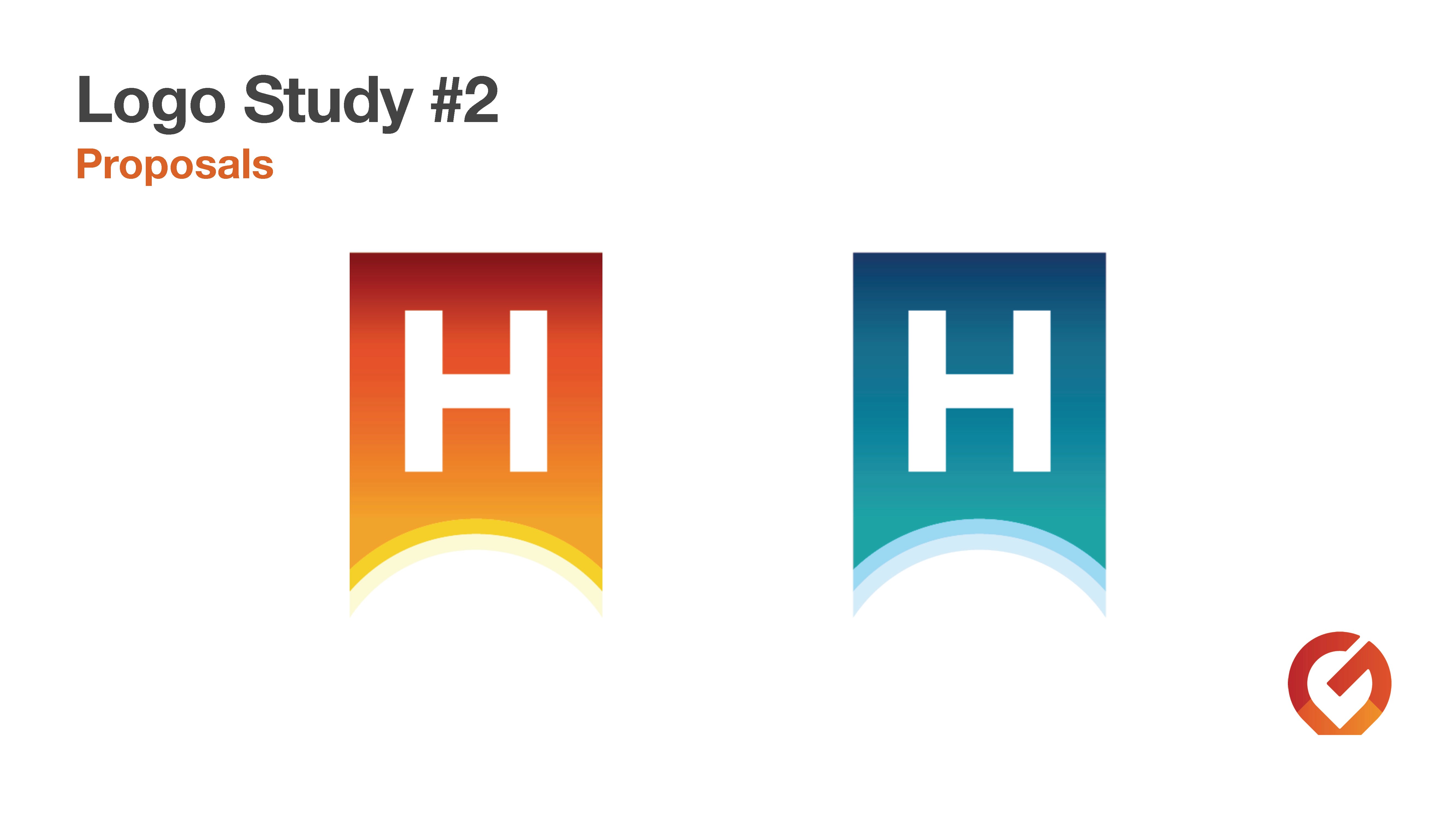
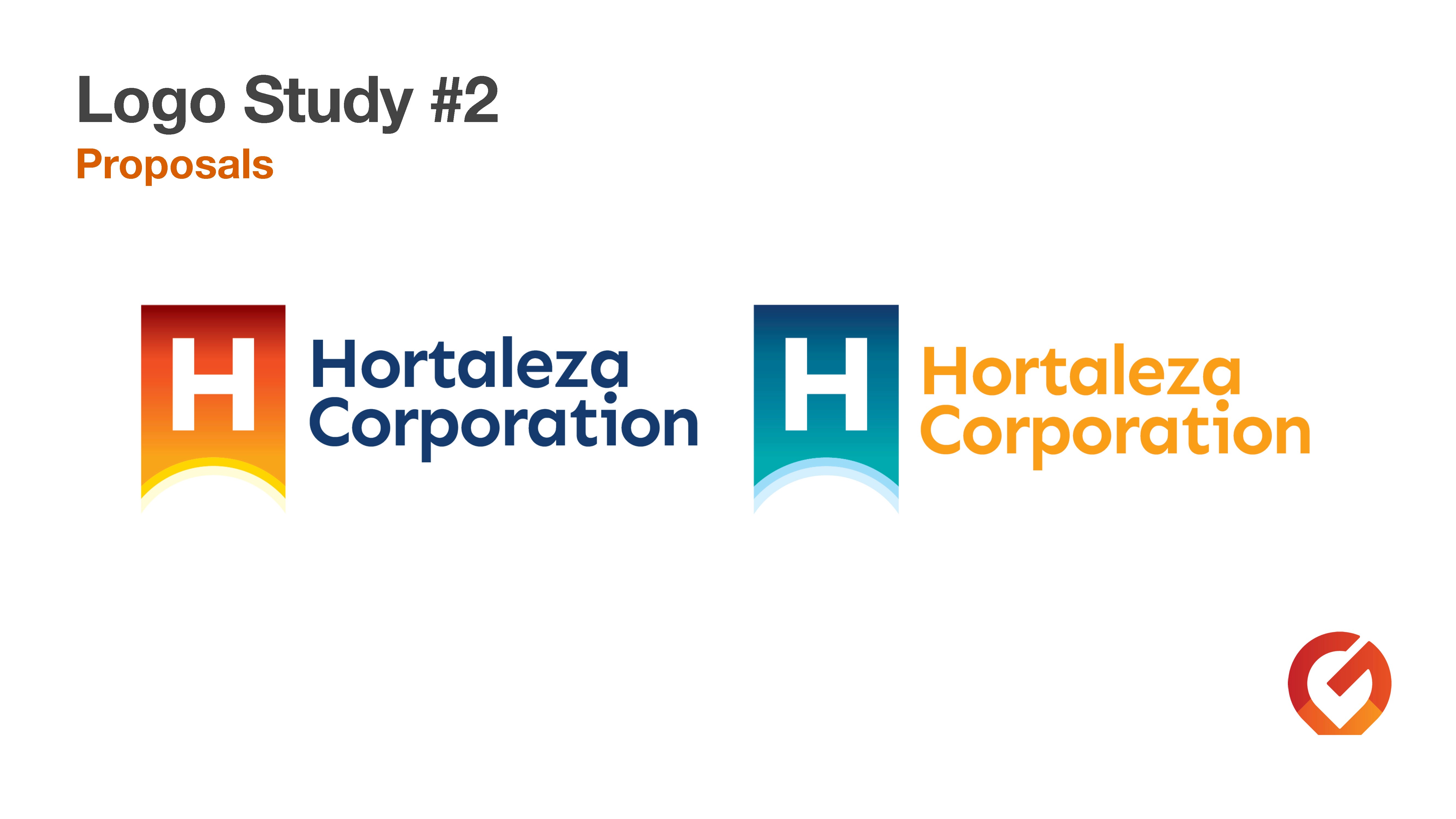
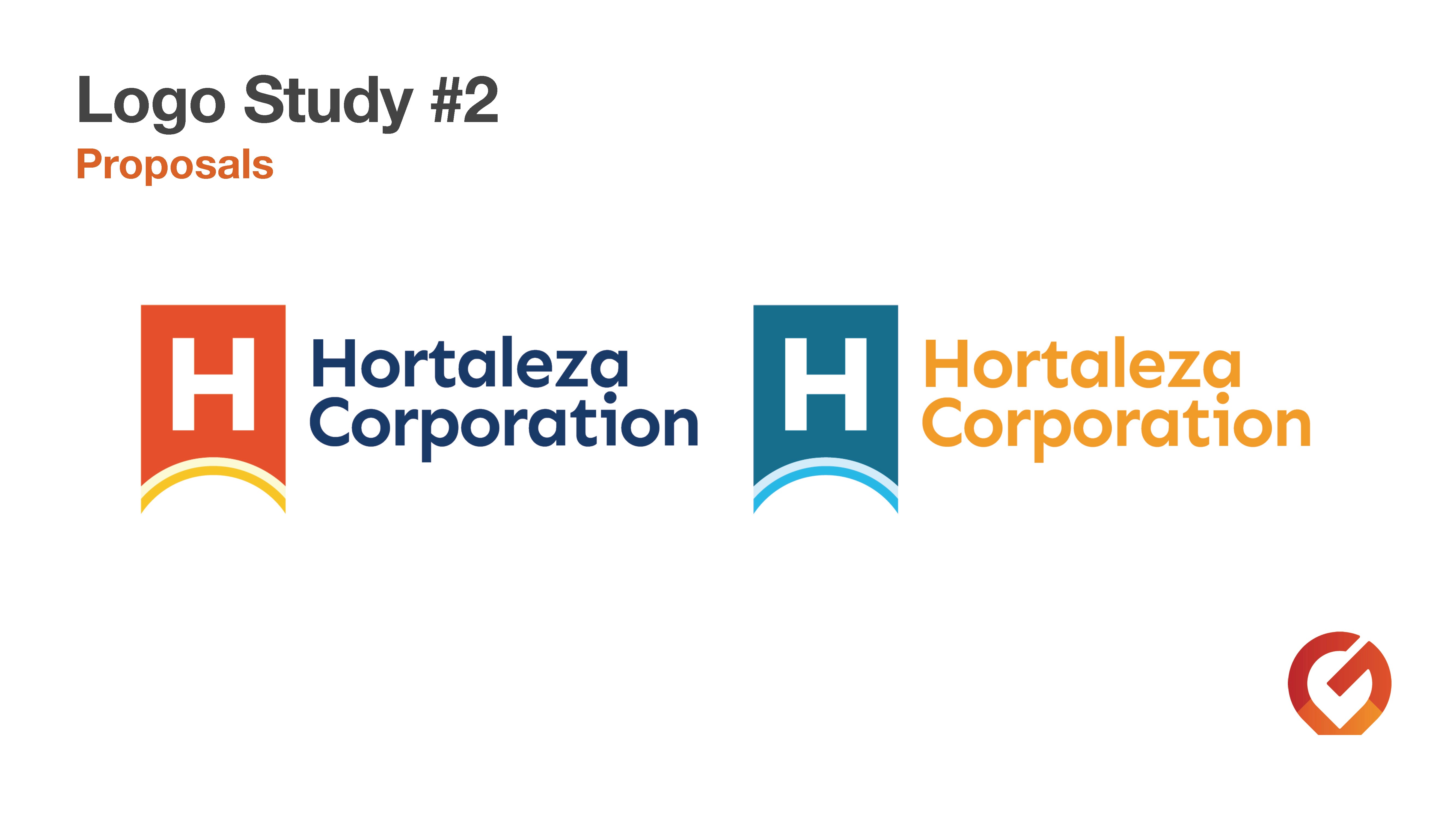
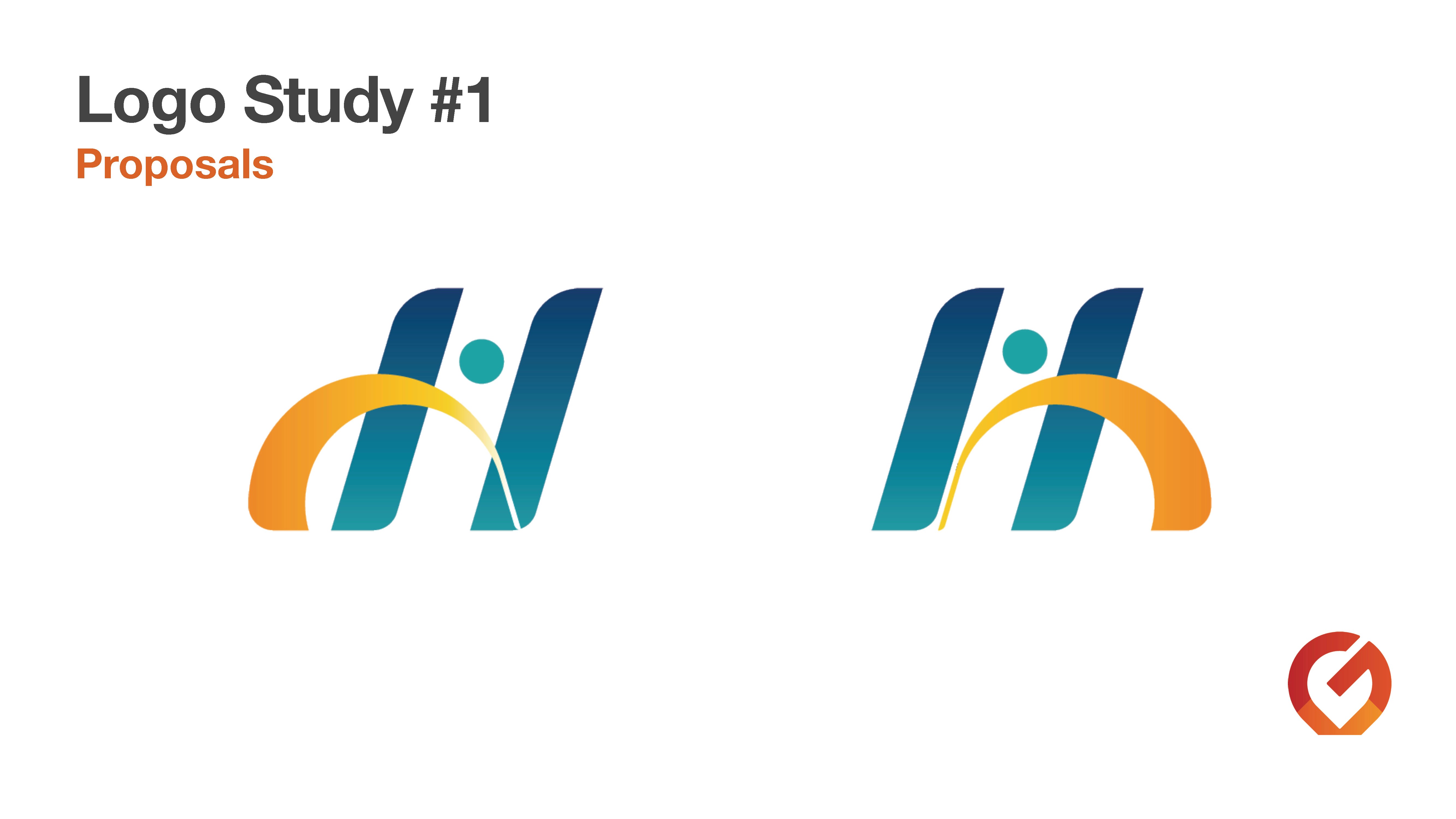
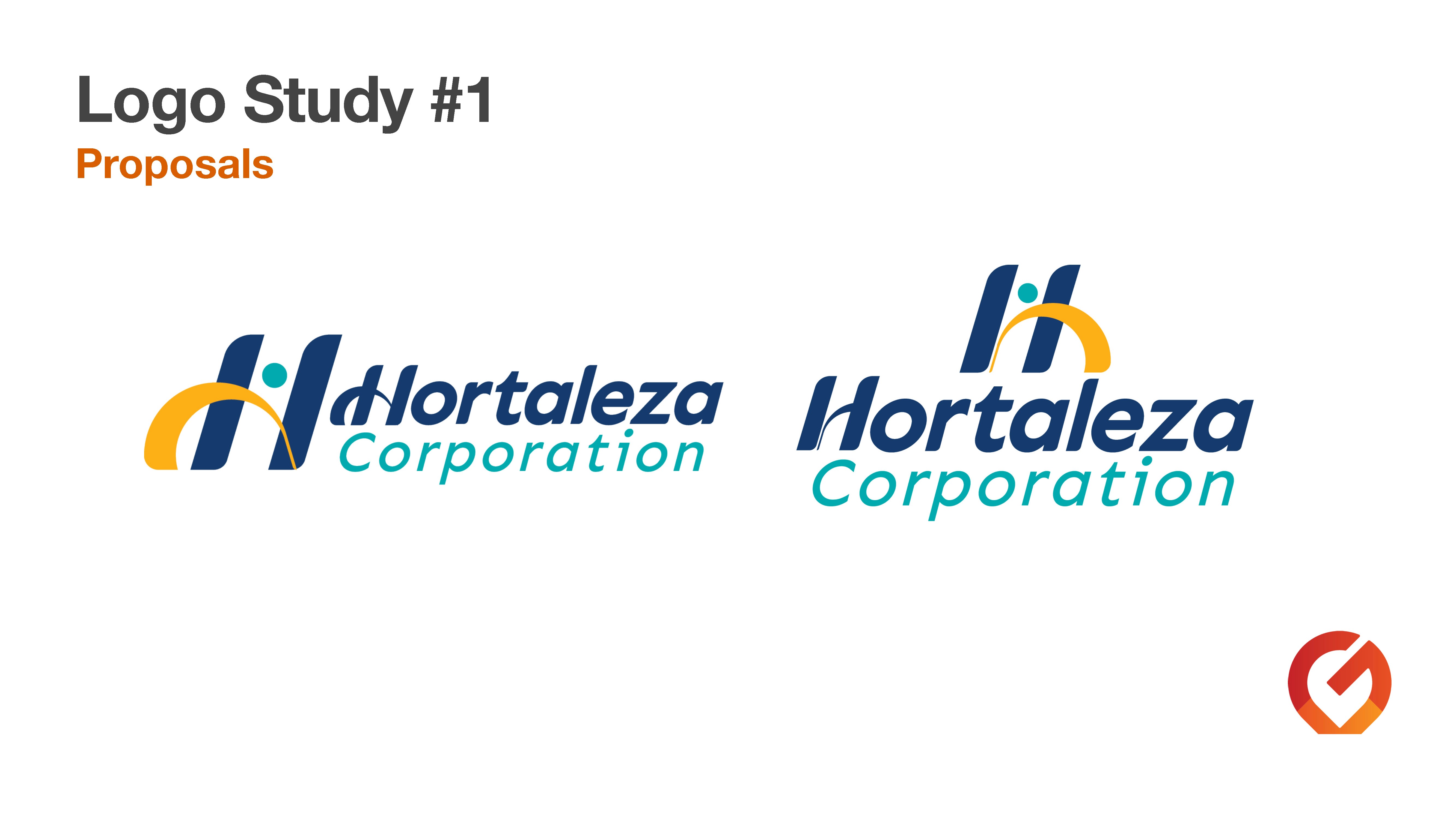
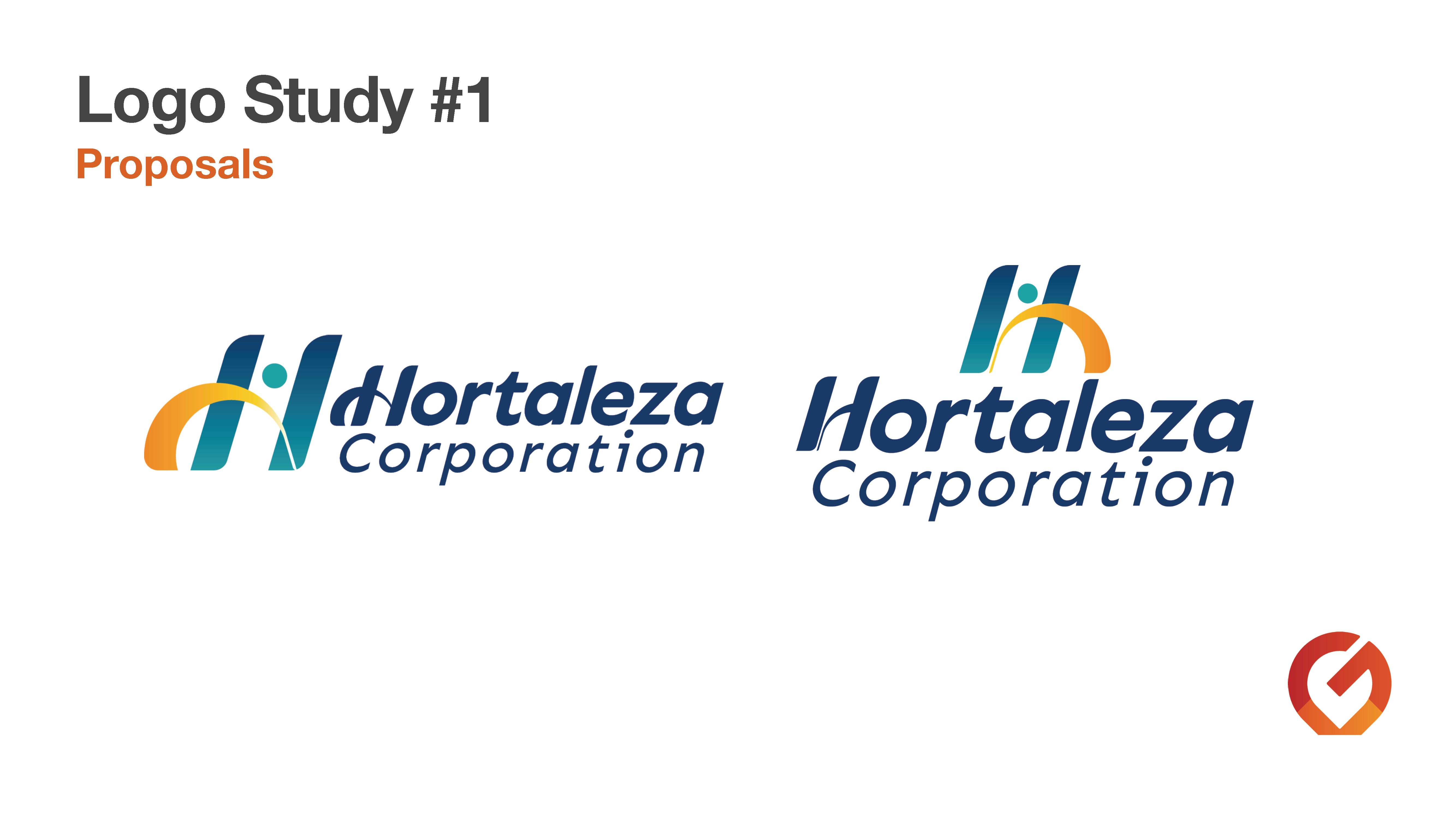
This project showcases a series of comprehensive logo studies aimed at modernizing the Hortaleza Corporation visual identity.
The challenge was to respect the heritage of a long-standing Filipino corporation while introducing a contemporary, forward-thinking aesthetic. These proposals explore three distinct directions: fluid, abstract marks symbolizing growth and synergy; structured, emblem-based designs that reinforce stability; and refined typographic treatments.
Each study focuses on maintaining brand authority through sophisticated color palettes and balanced geometry.
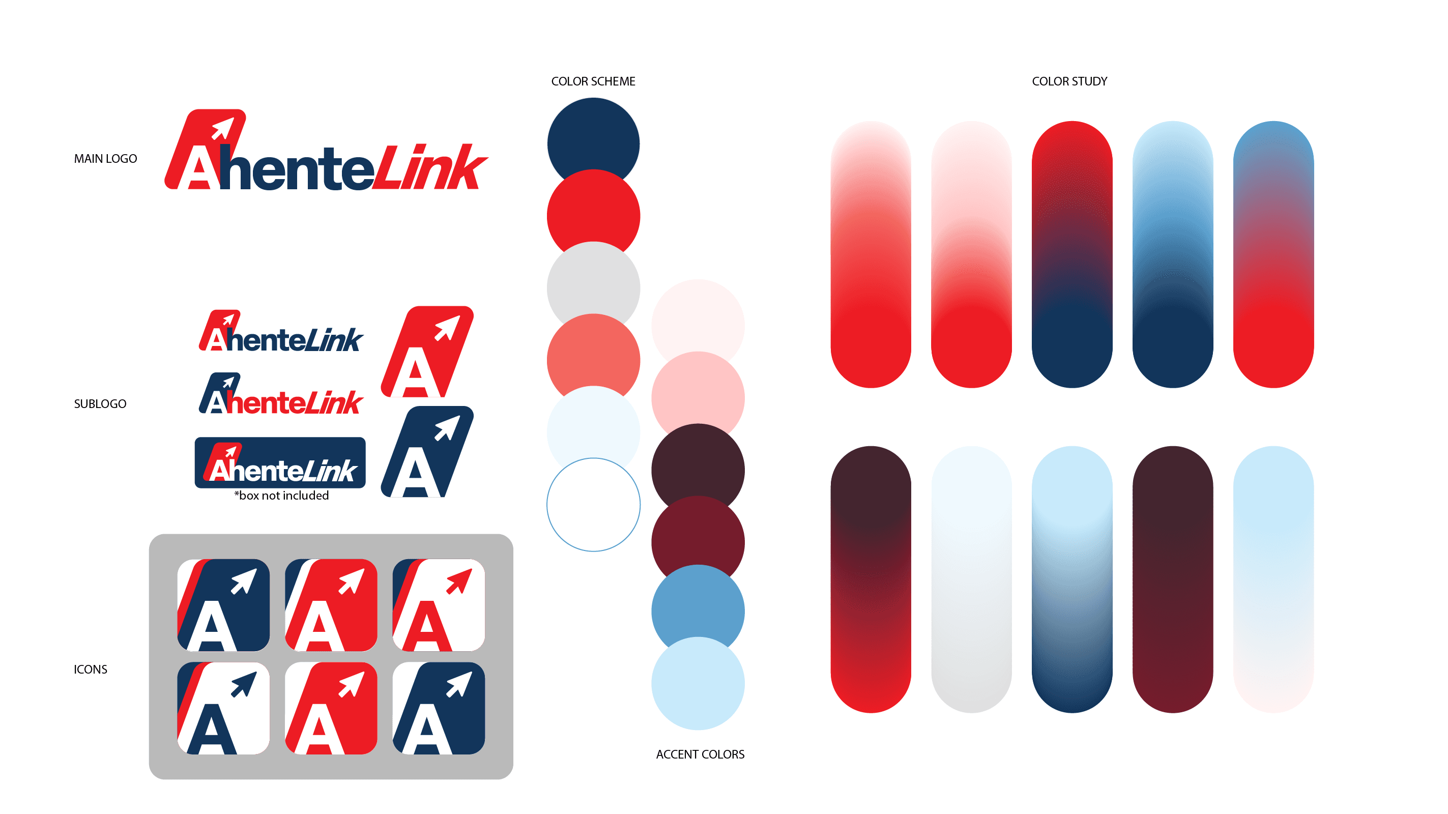
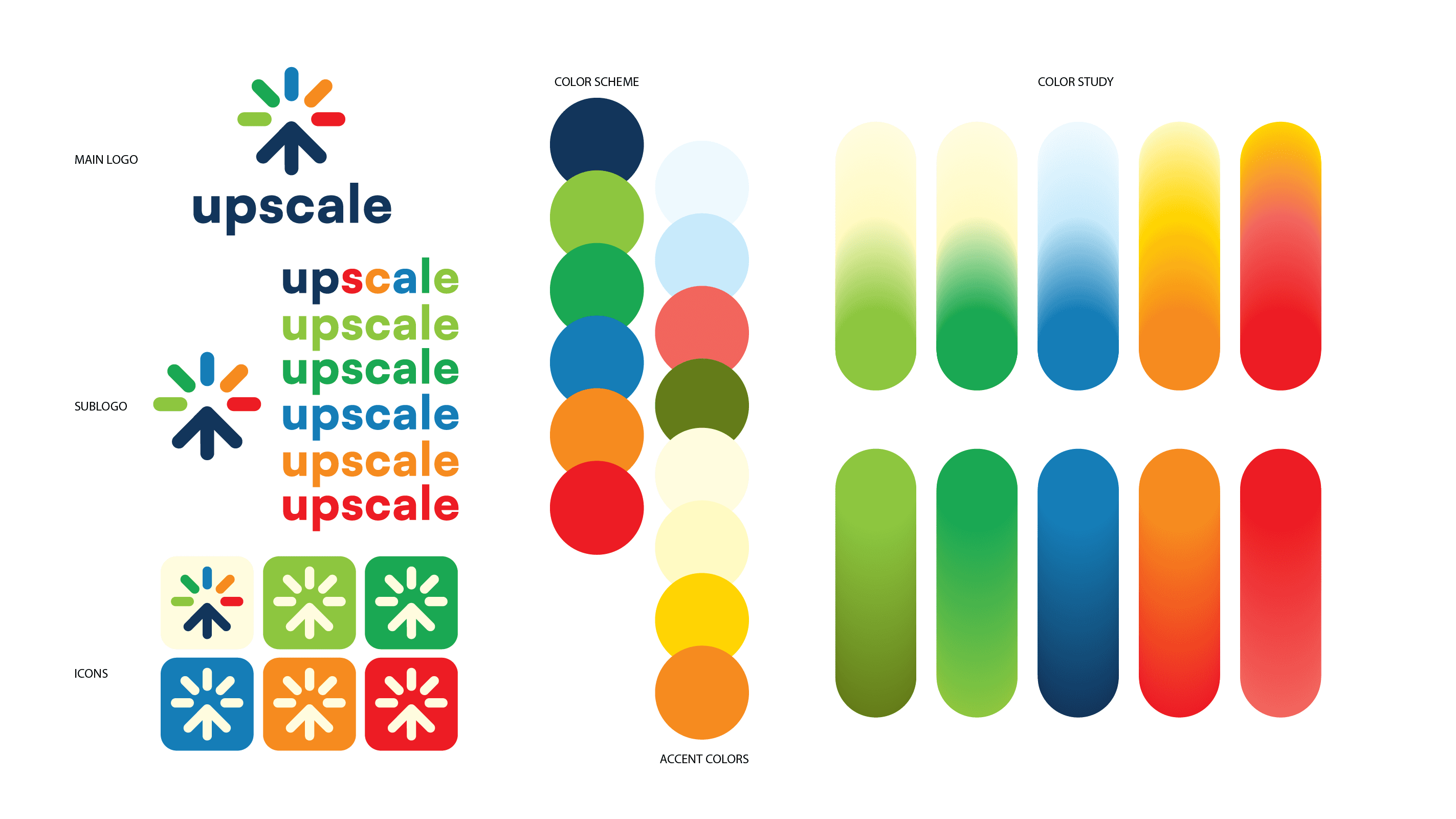
This collection showcases a series of comprehensive logo studies developed for diverse industries, including finance, tech, and retail.
Each study represents a deep dive into brand architecture—exploring how a central mark translates across sub-logos, app iconography, and secondary color palettes.
By focusing on scalability and color psychology, these studies ensure a cohesive brand presence across all digital and physical touchpoints.
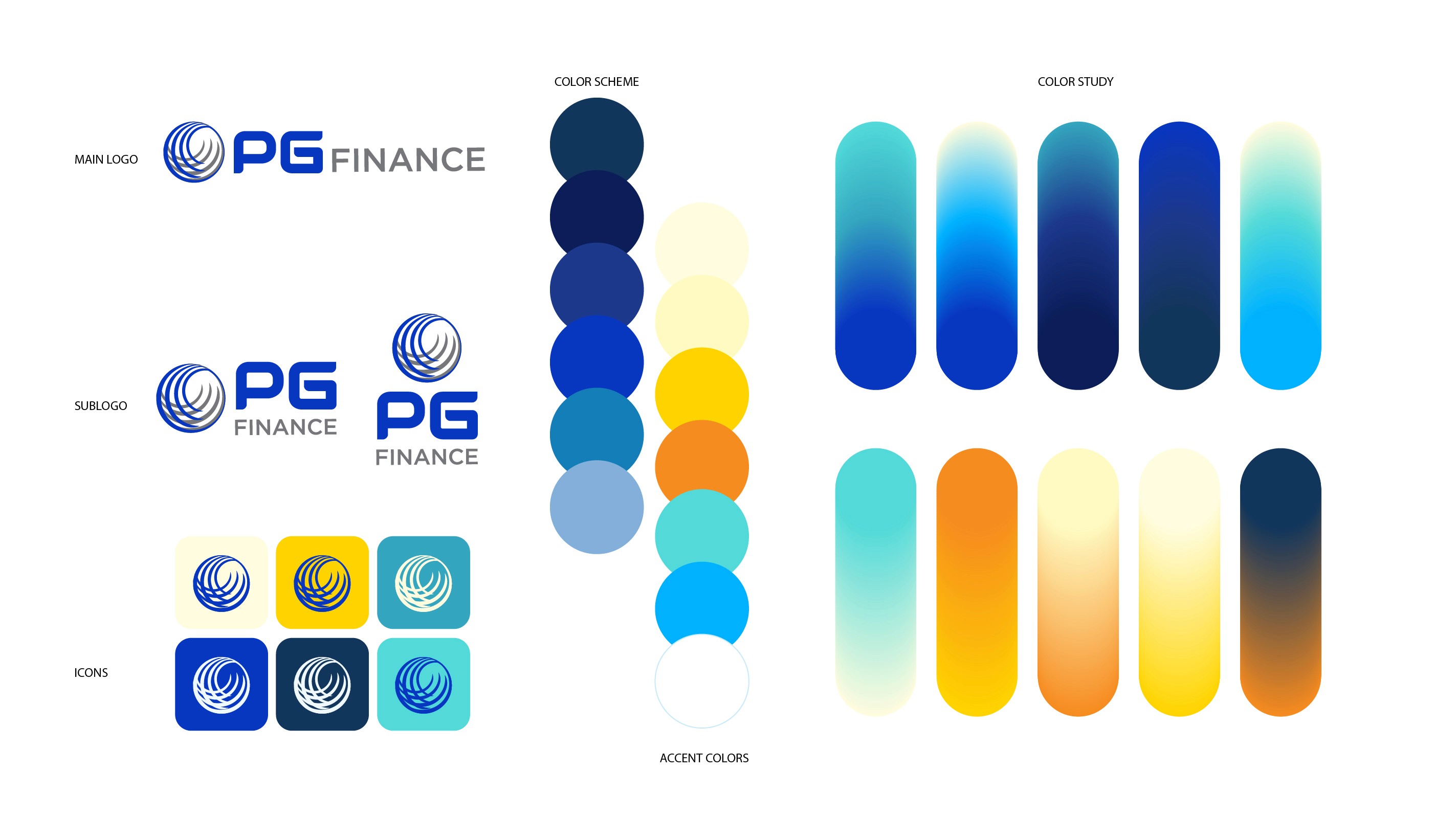
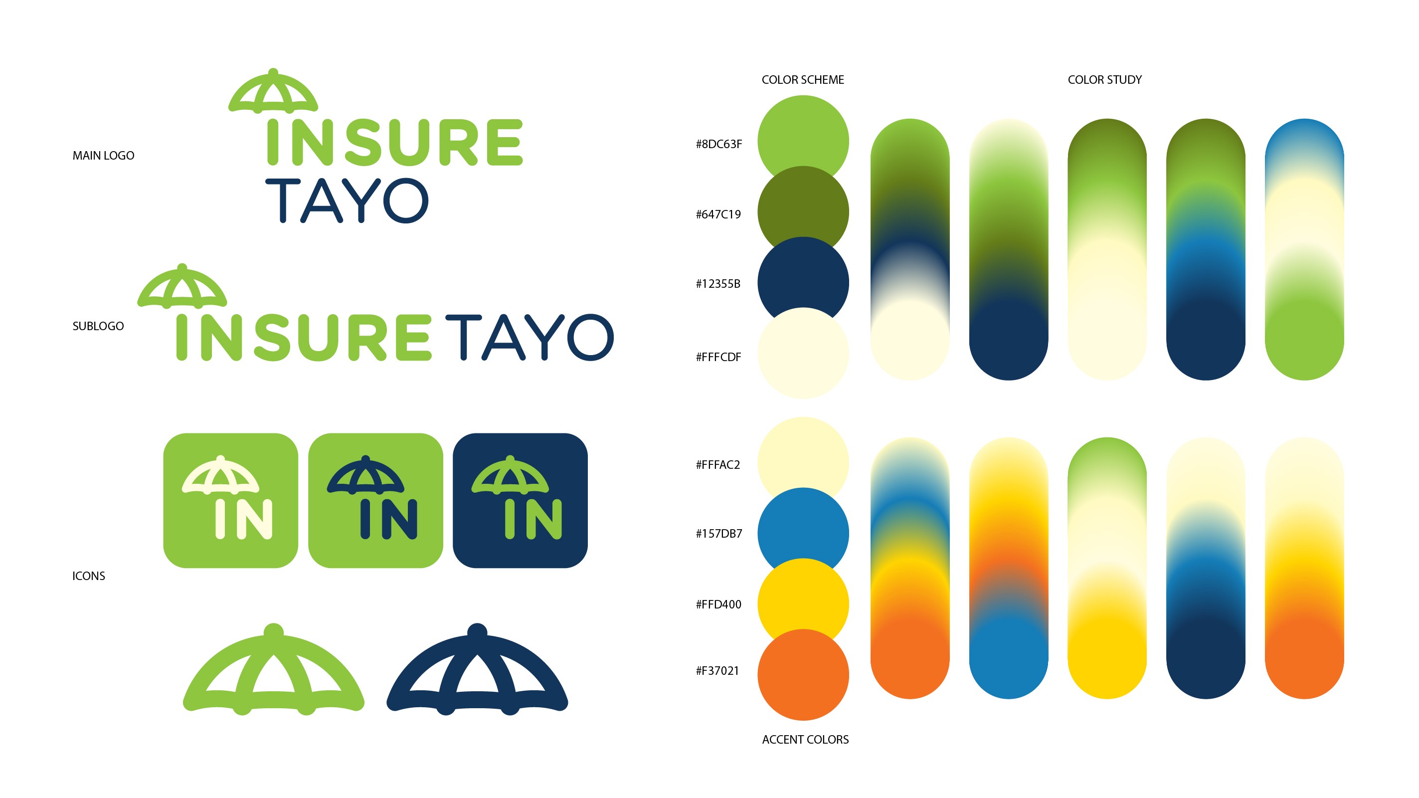
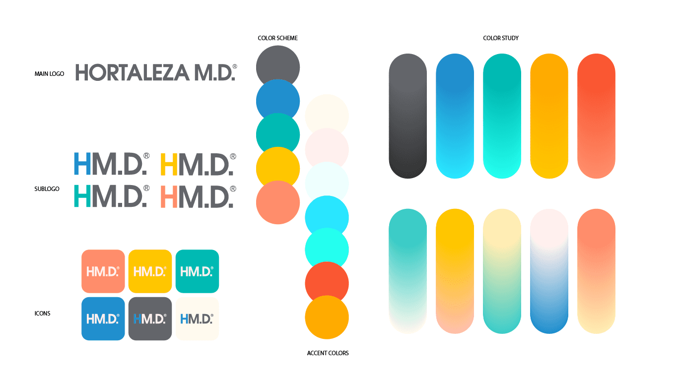
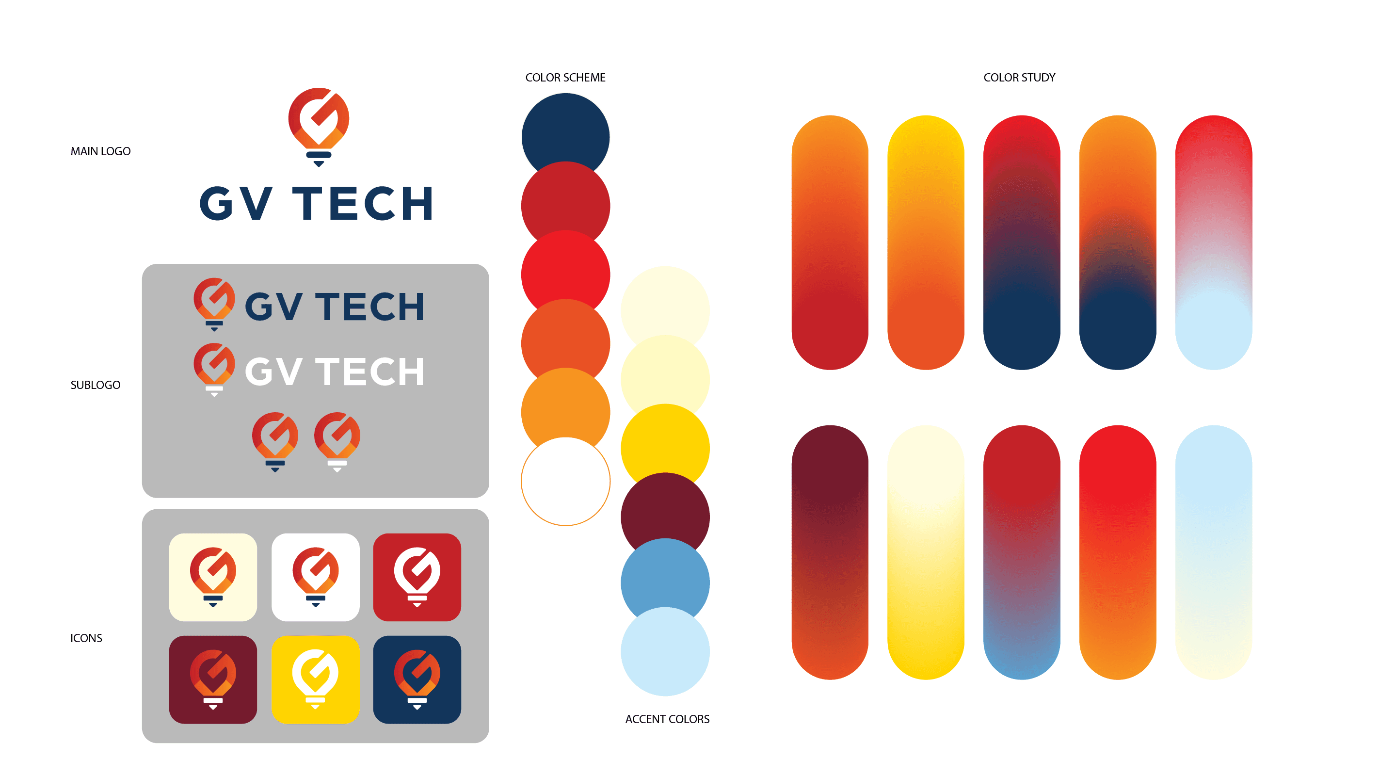
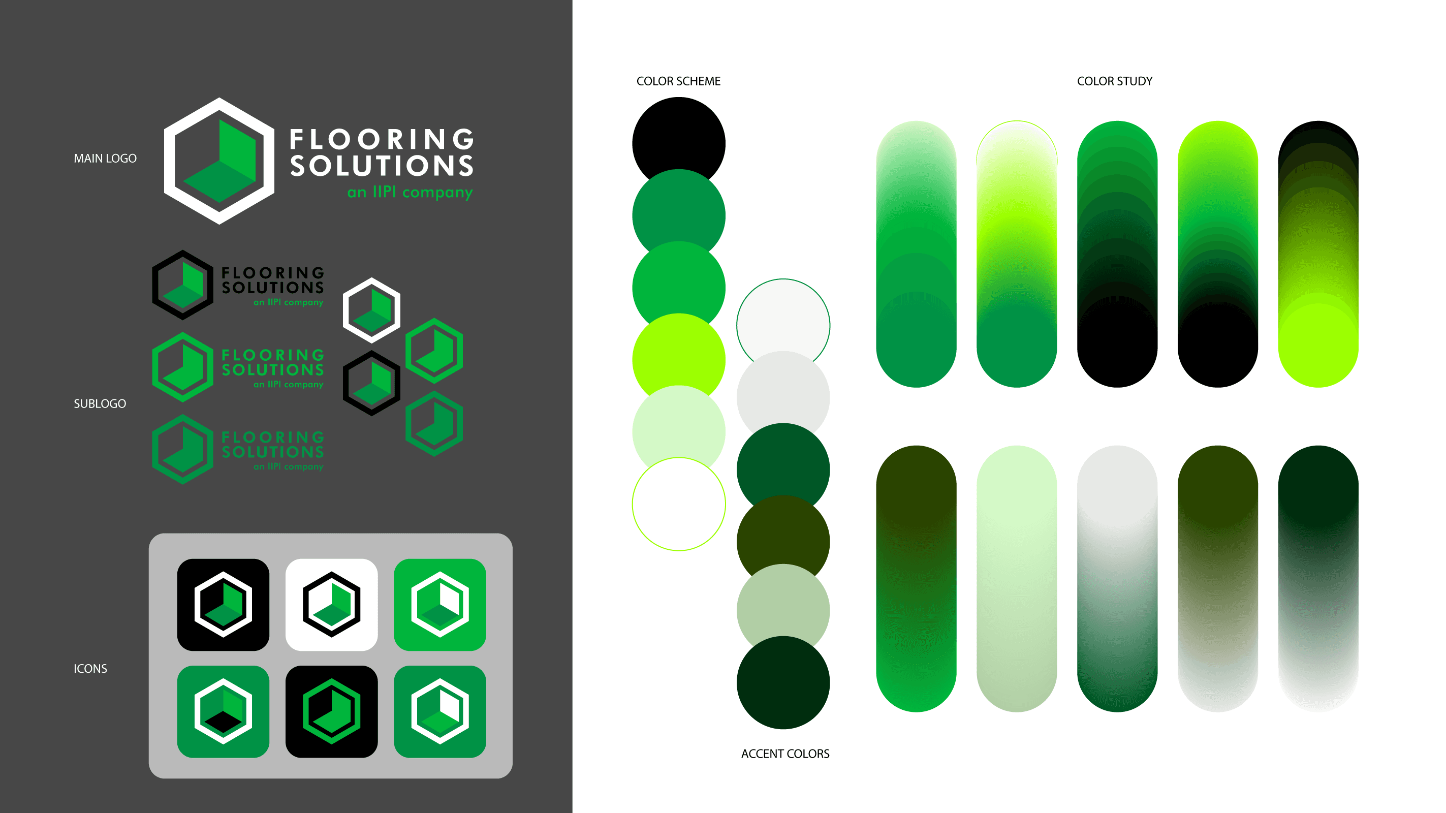
This collection showcases a series of comprehensive logo studies developed for diverse industries, including finance, tech, and retail.
Each study represents a deep dive into brand architecture—exploring how a central mark translates across sub-logos, app iconography, and secondary color palettes.
By focusing on scalability and color psychology, these studies ensure a cohesive brand presence across all digital and physical touchpoints.
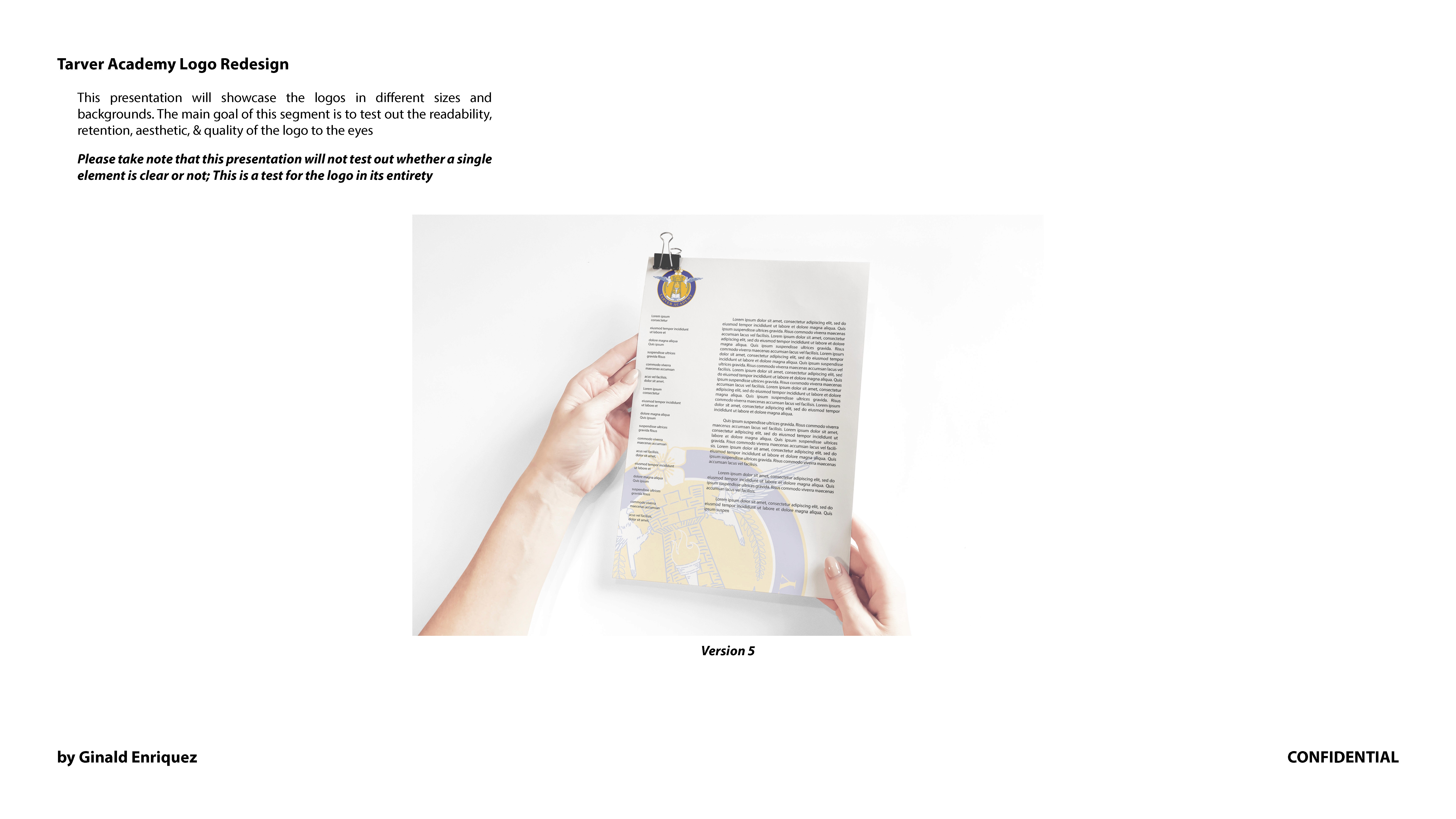
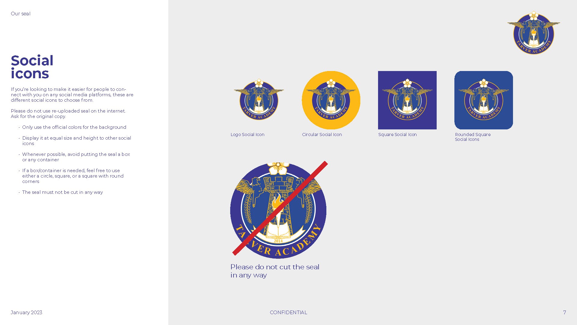
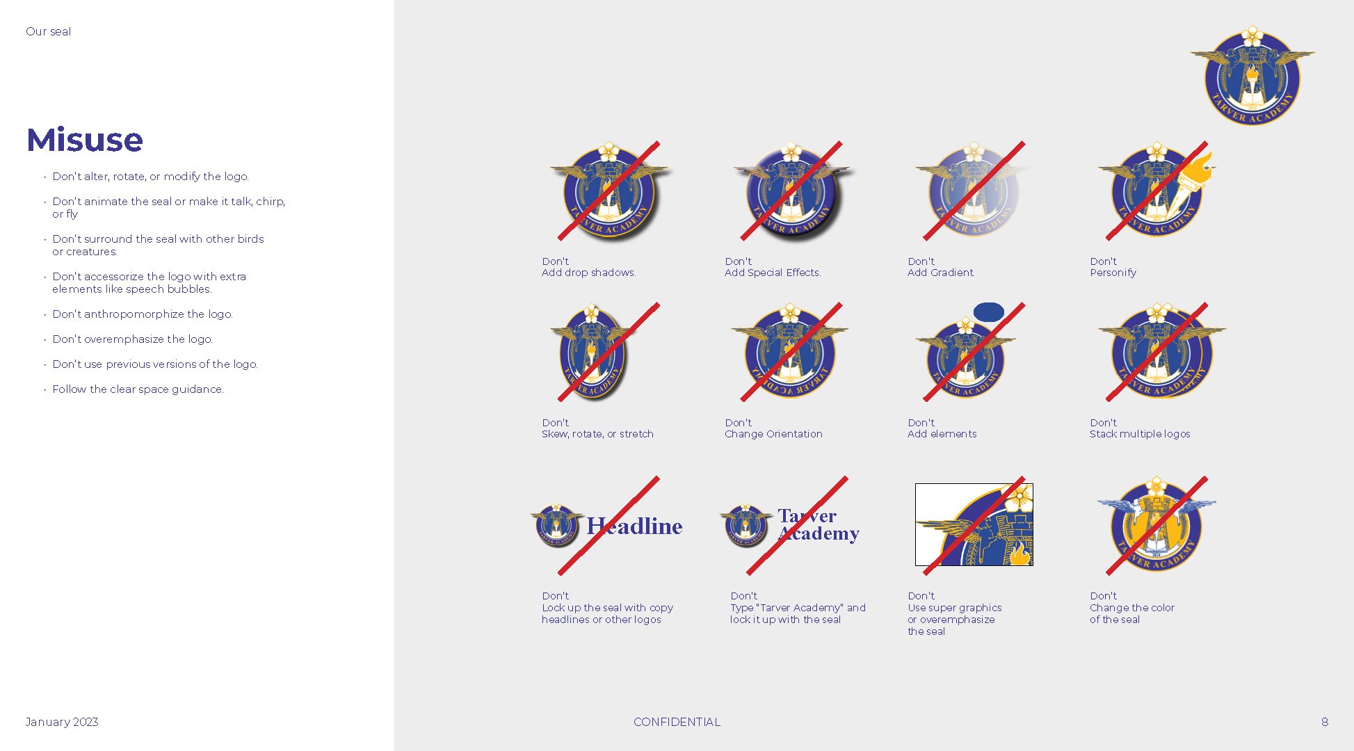
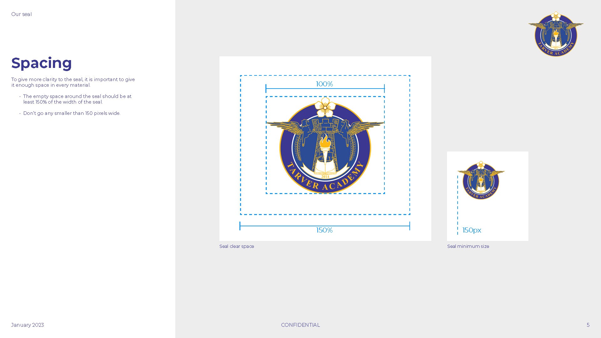
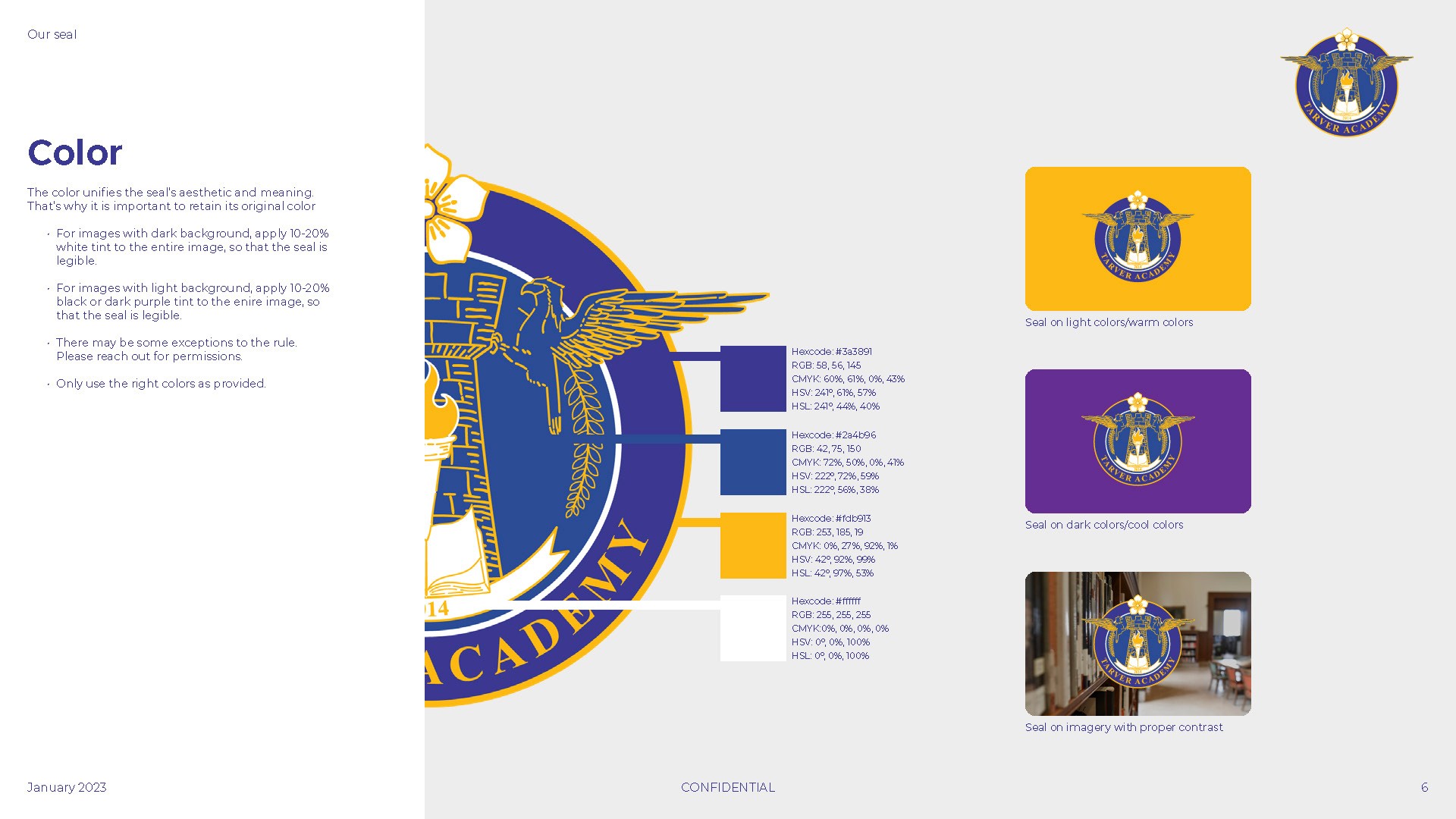
This project establishes a comprehensive visual system for Tarver Academy, centered on the official institutional seal. The guidelines codify essential design standards, including precise clear space requirements, minimum sizing for legibility, and a unified primary color palette to ensure professional consistency across all platforms. By defining rigorous rules for social media iconography and prohibiting the unauthorized alteration or misuse of brand assets, the system protects the academy’s visual integrity.
This strategic framework provides the legal and aesthetic foundation necessary for maintaining a recognizable and respected institutional identity.
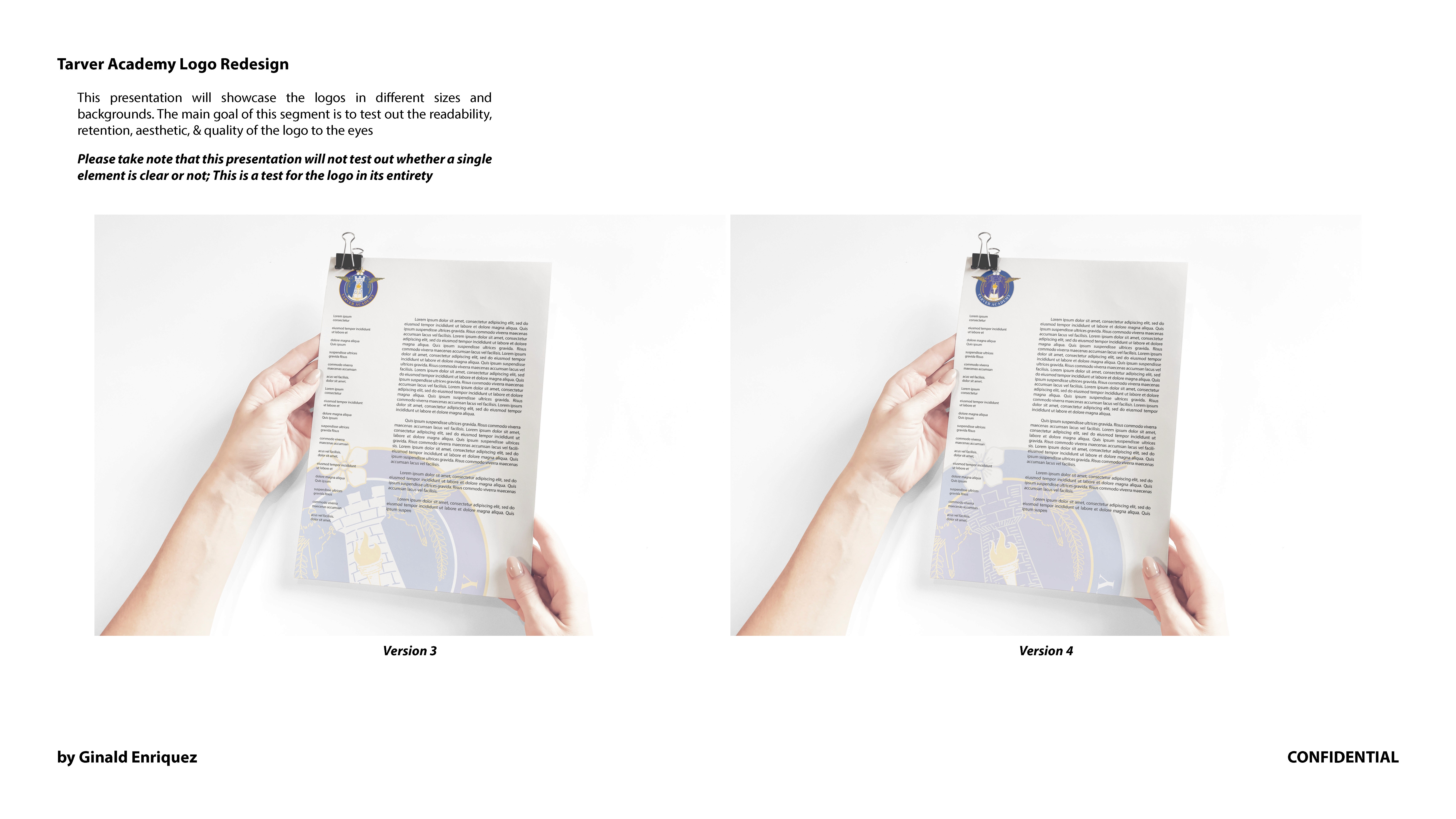
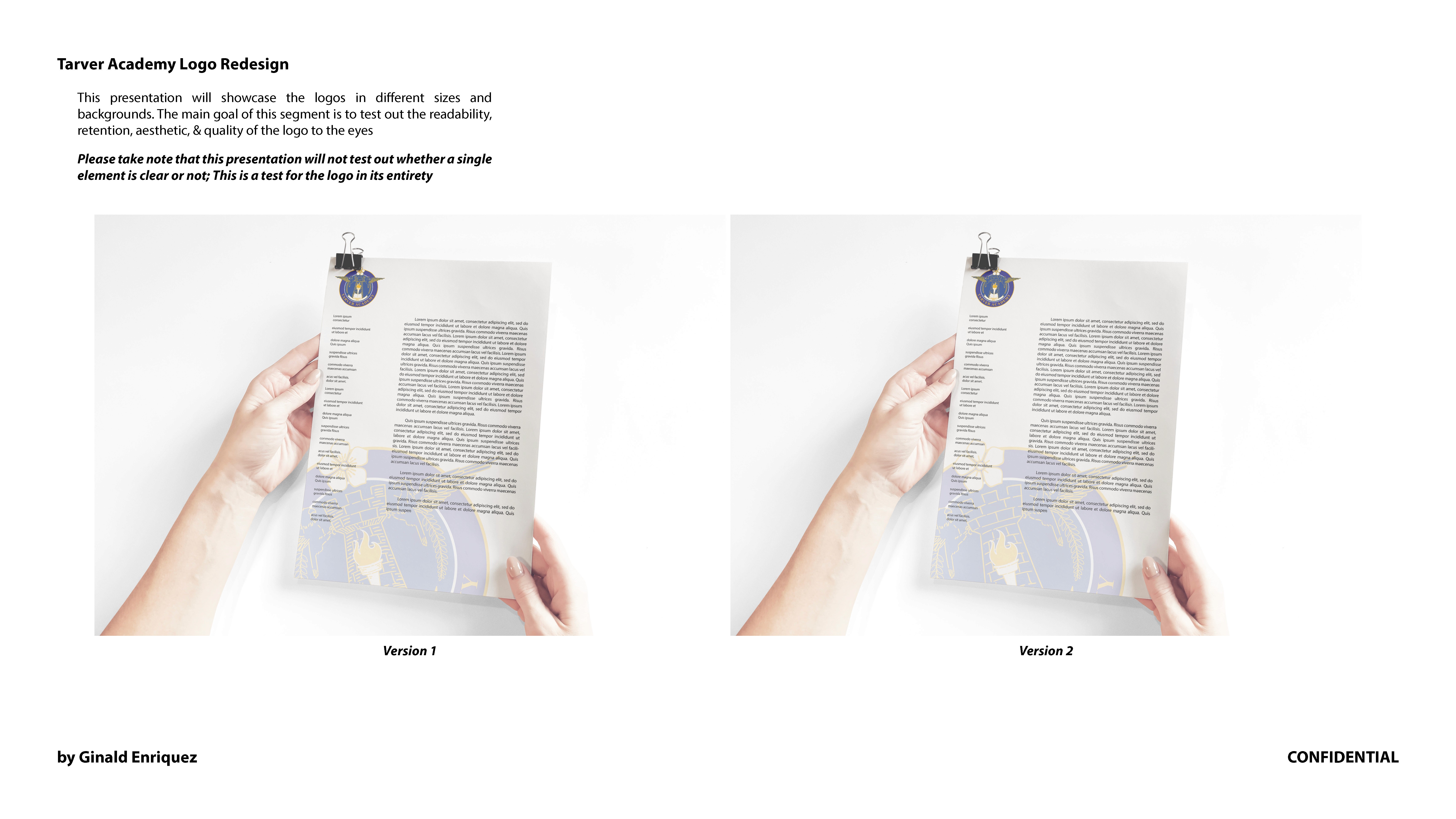
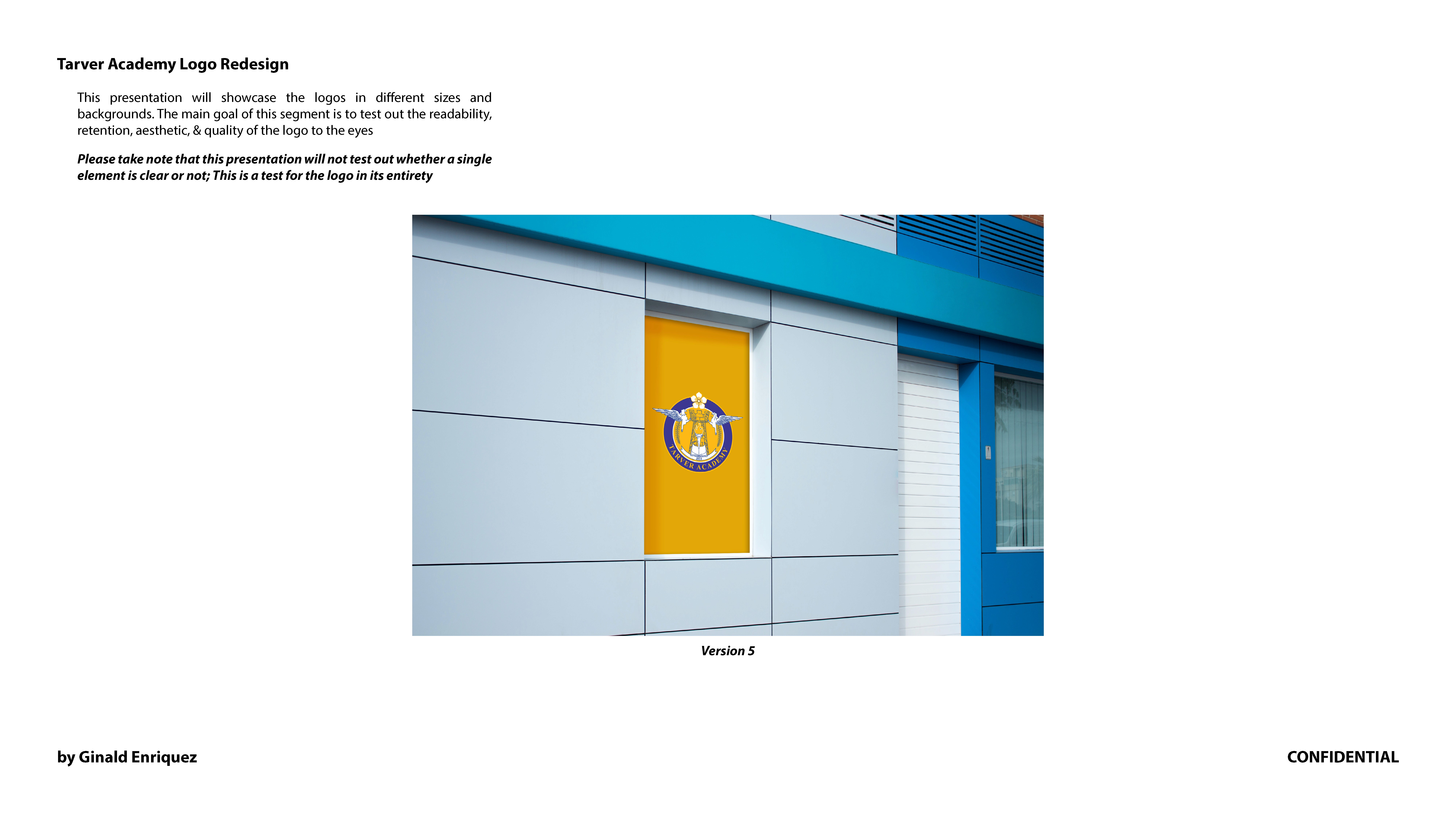
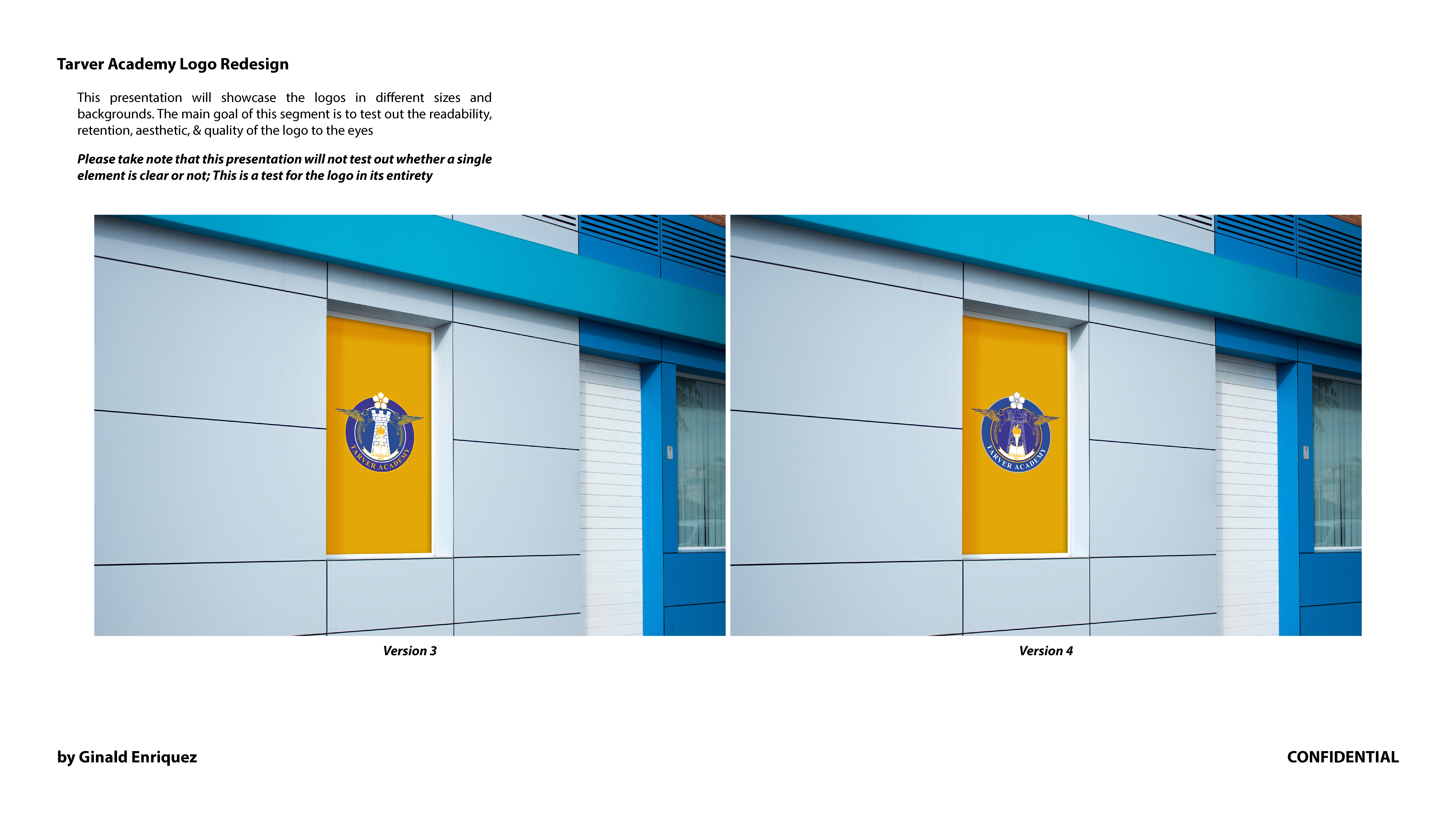
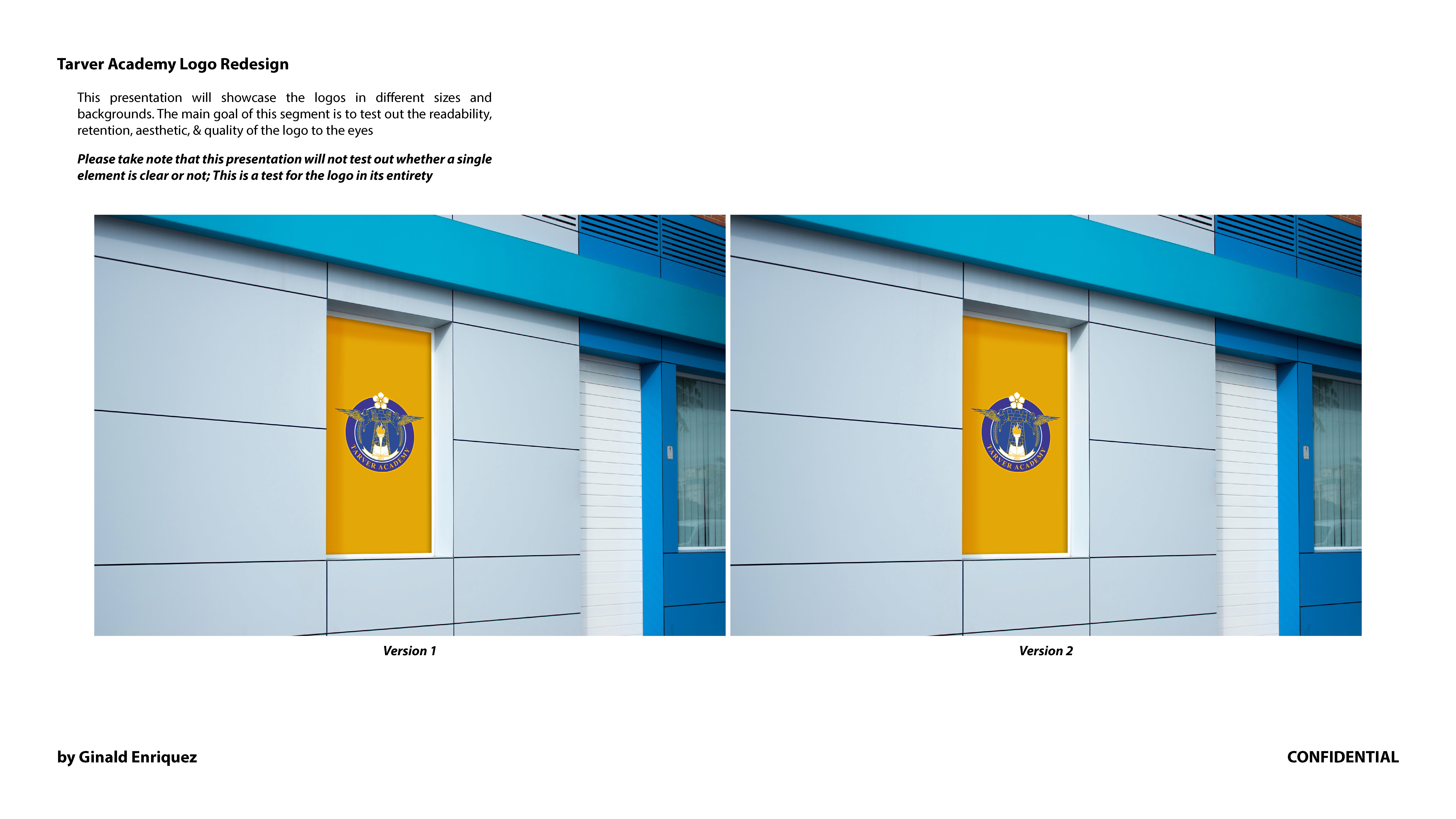
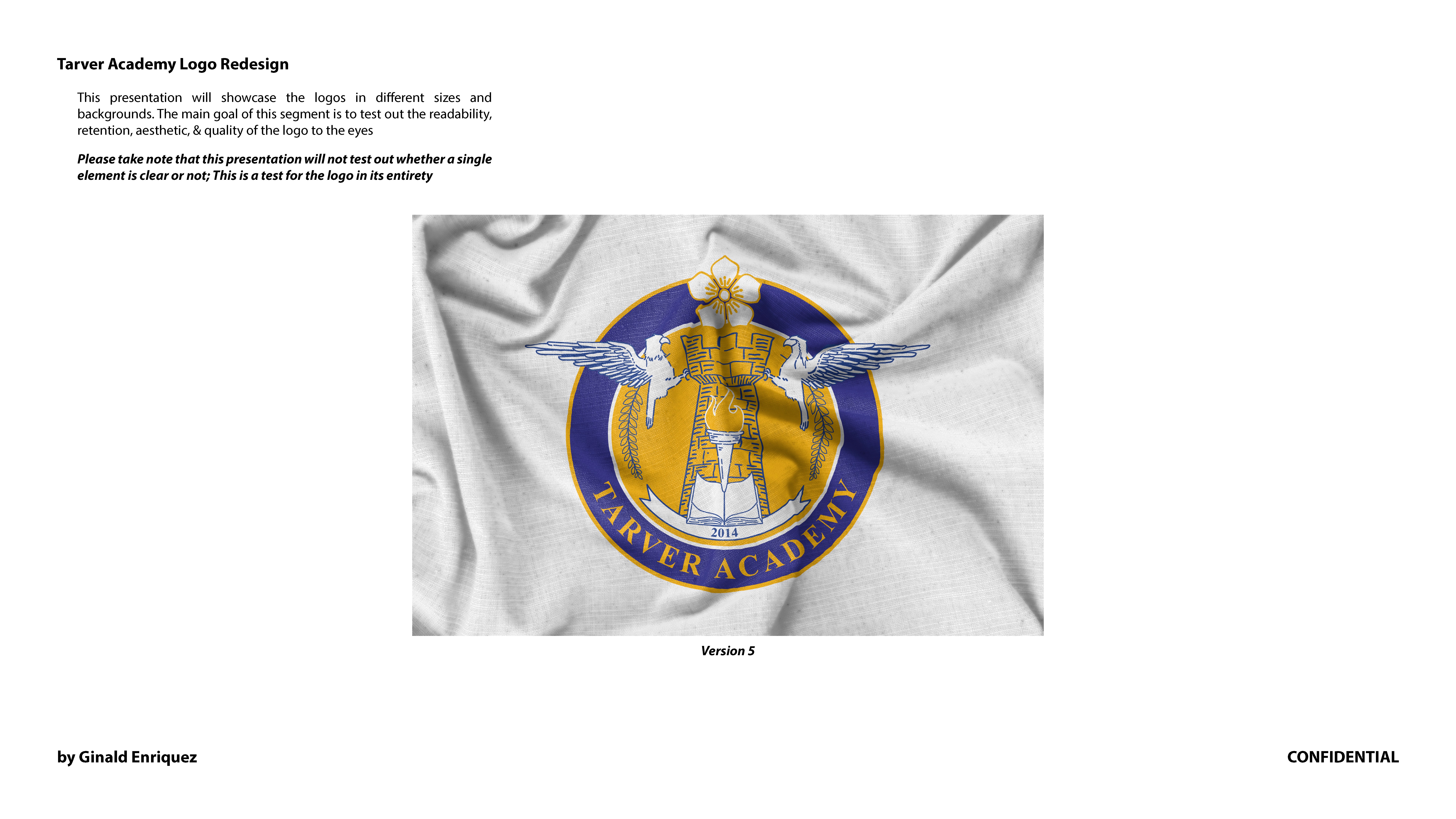
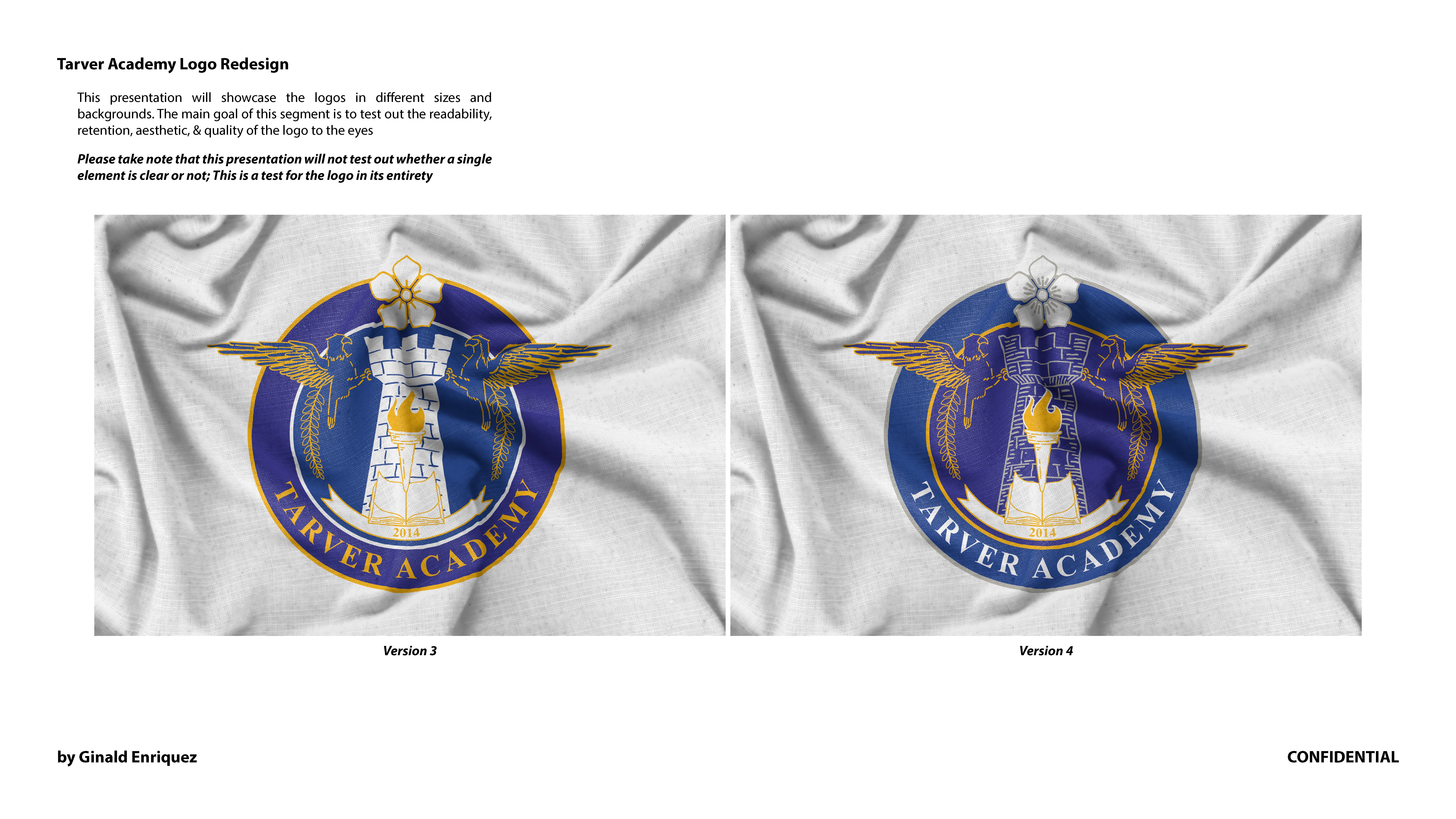
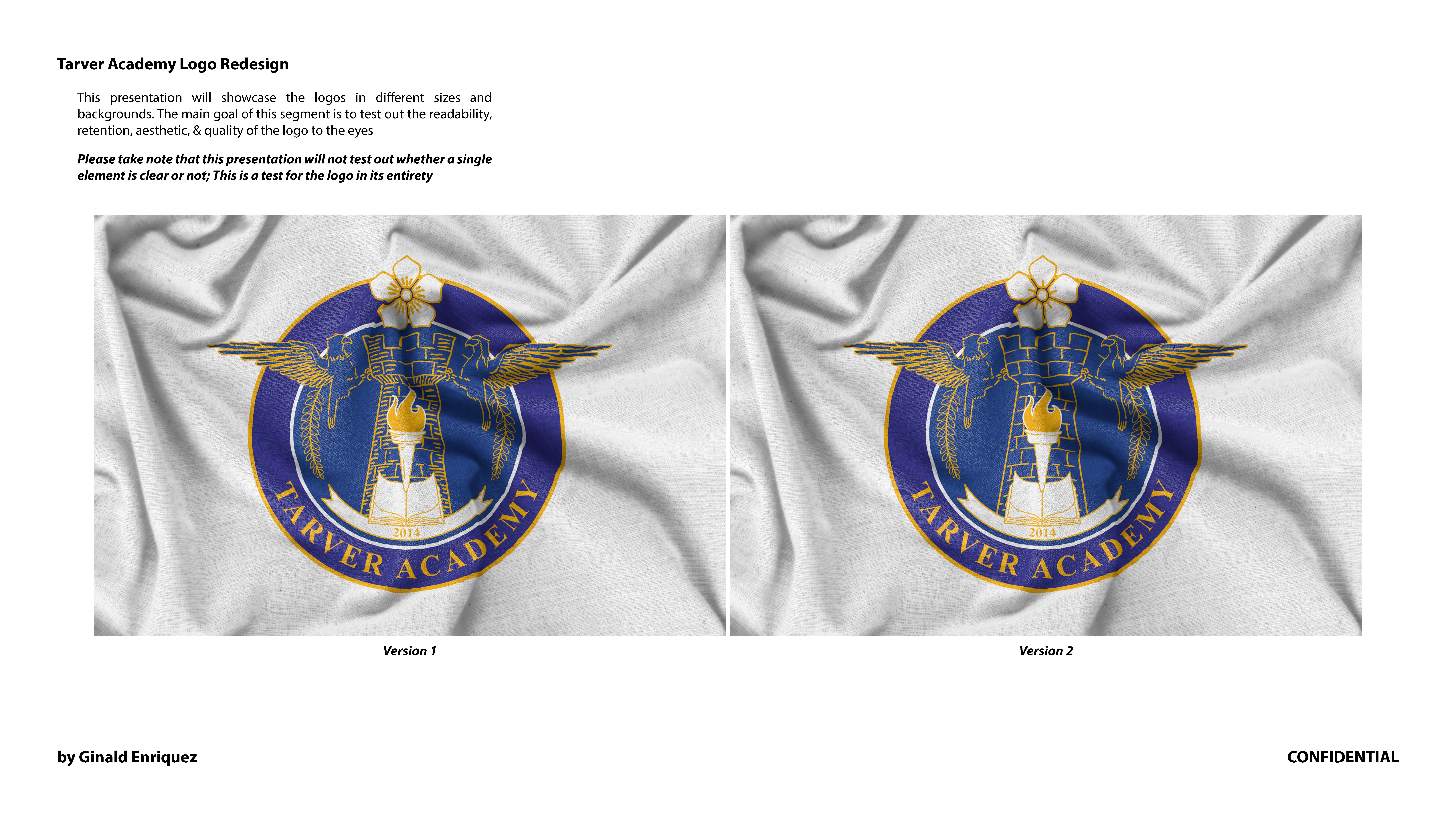
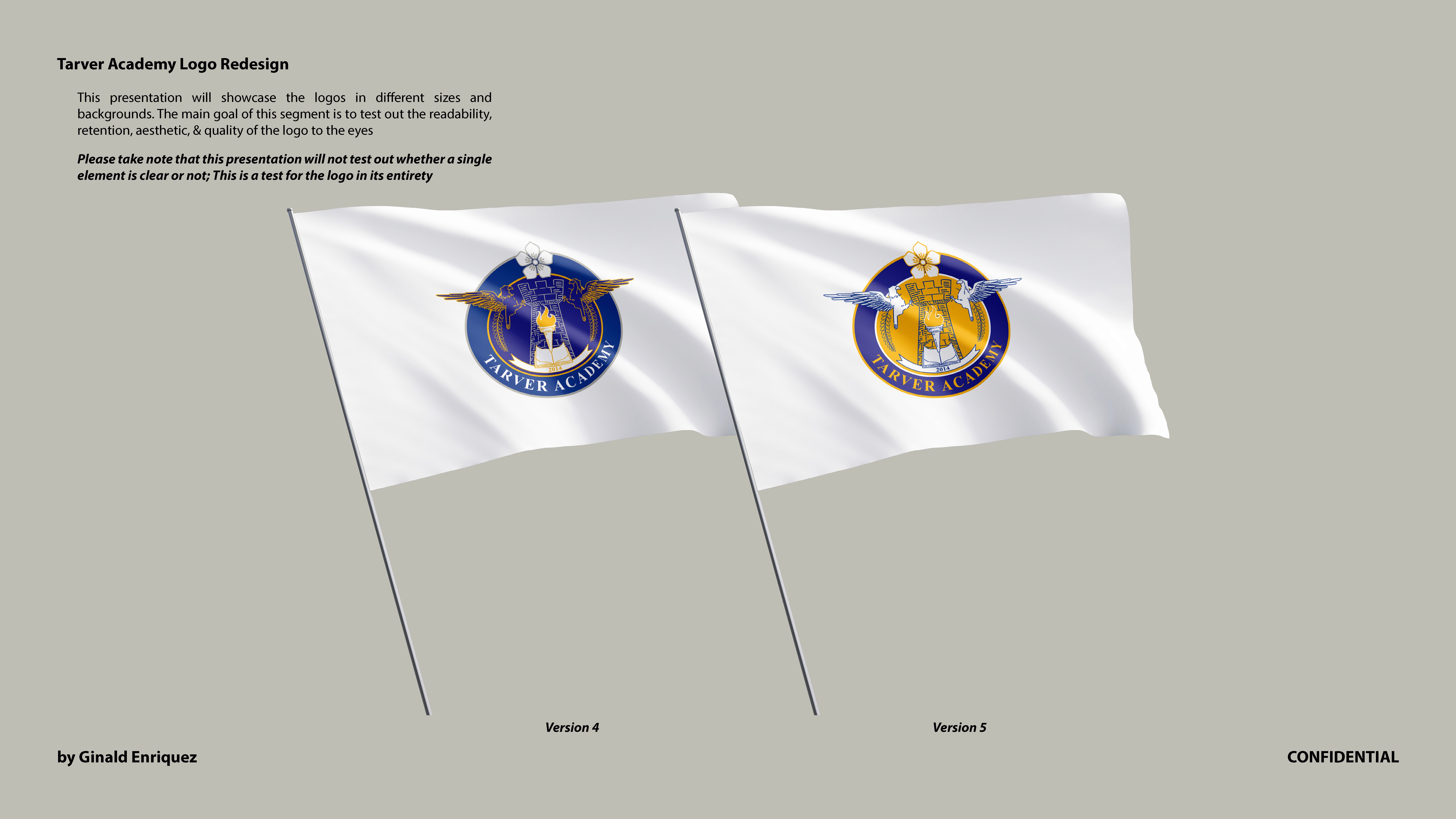
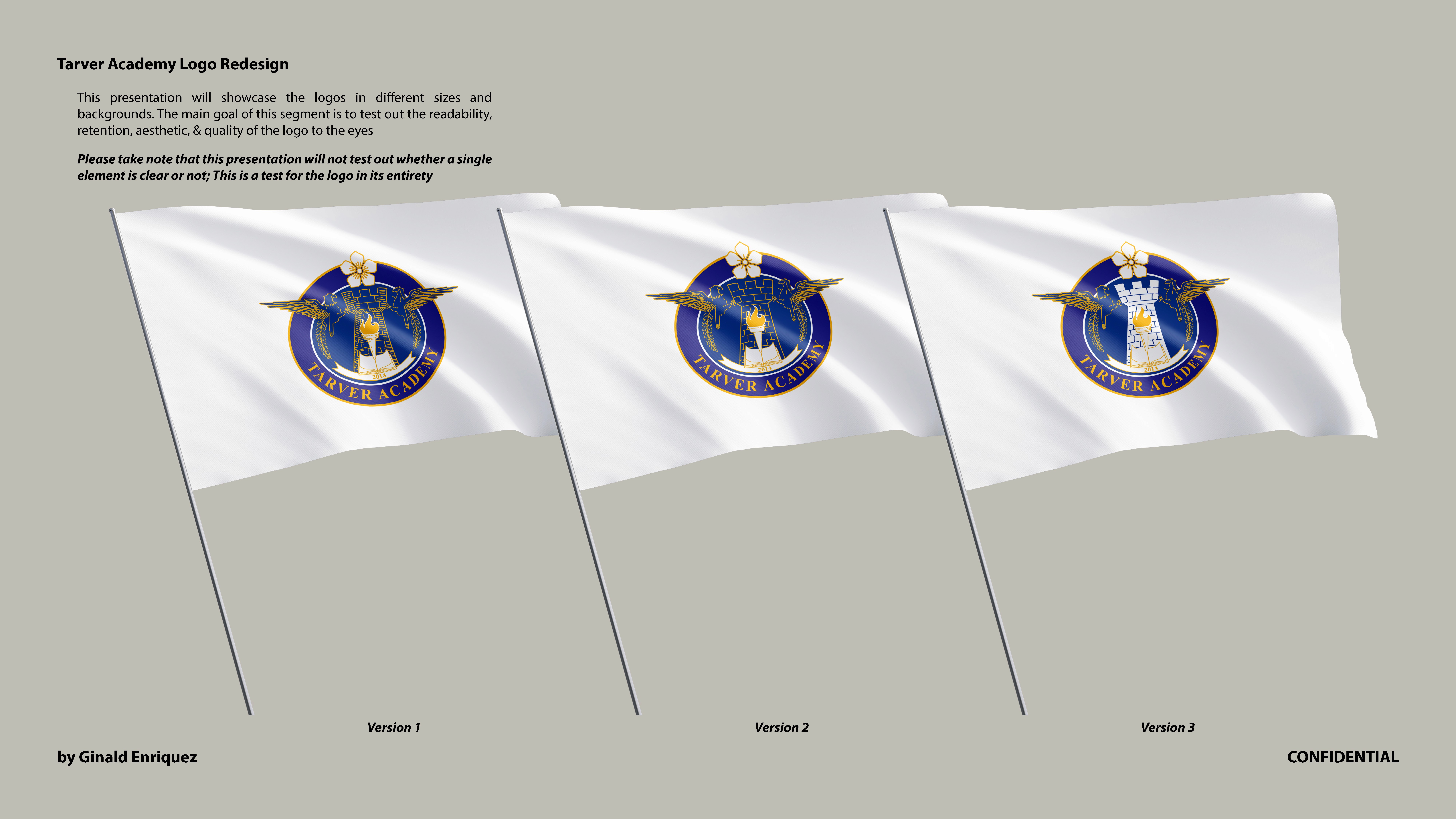
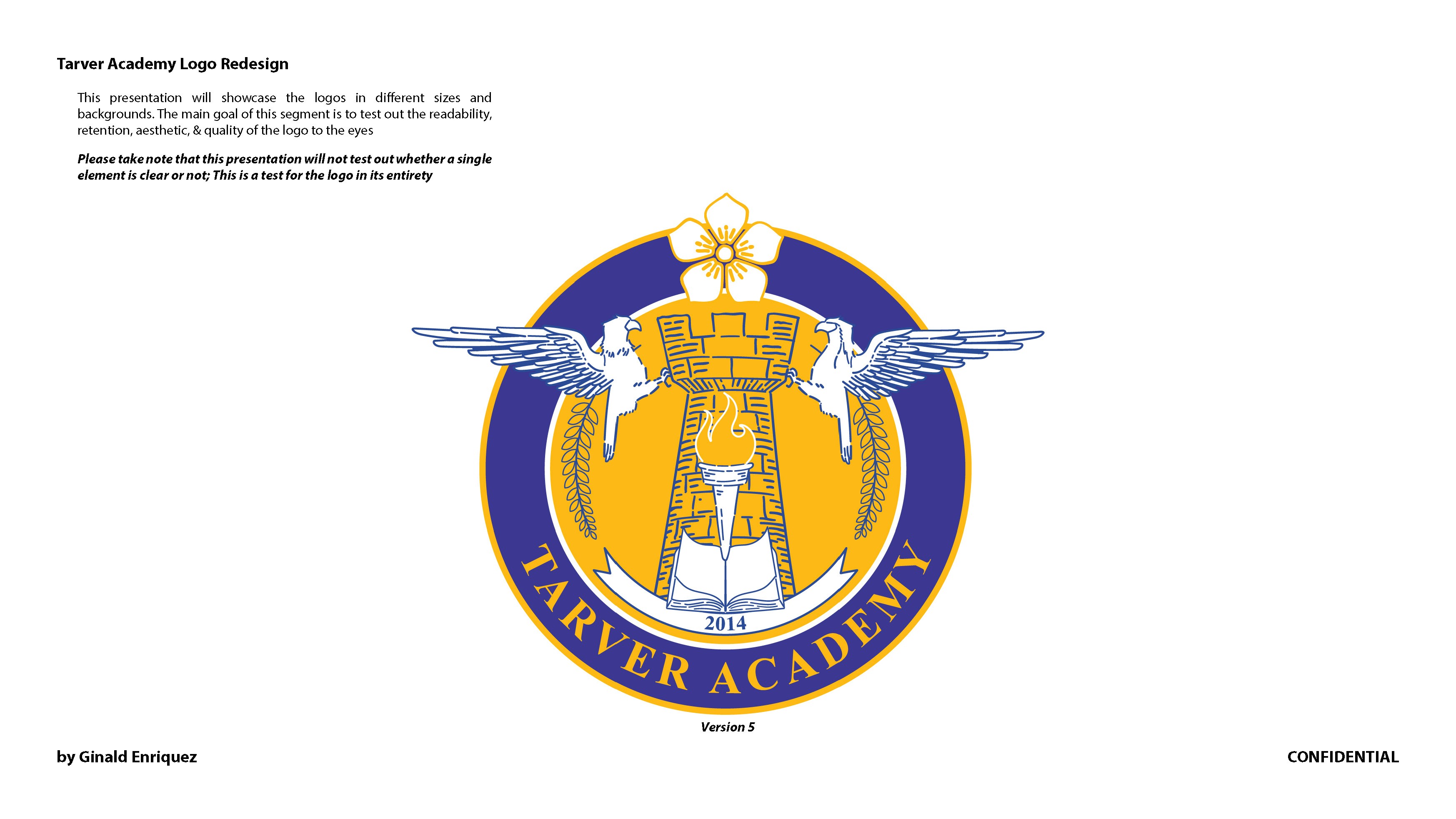
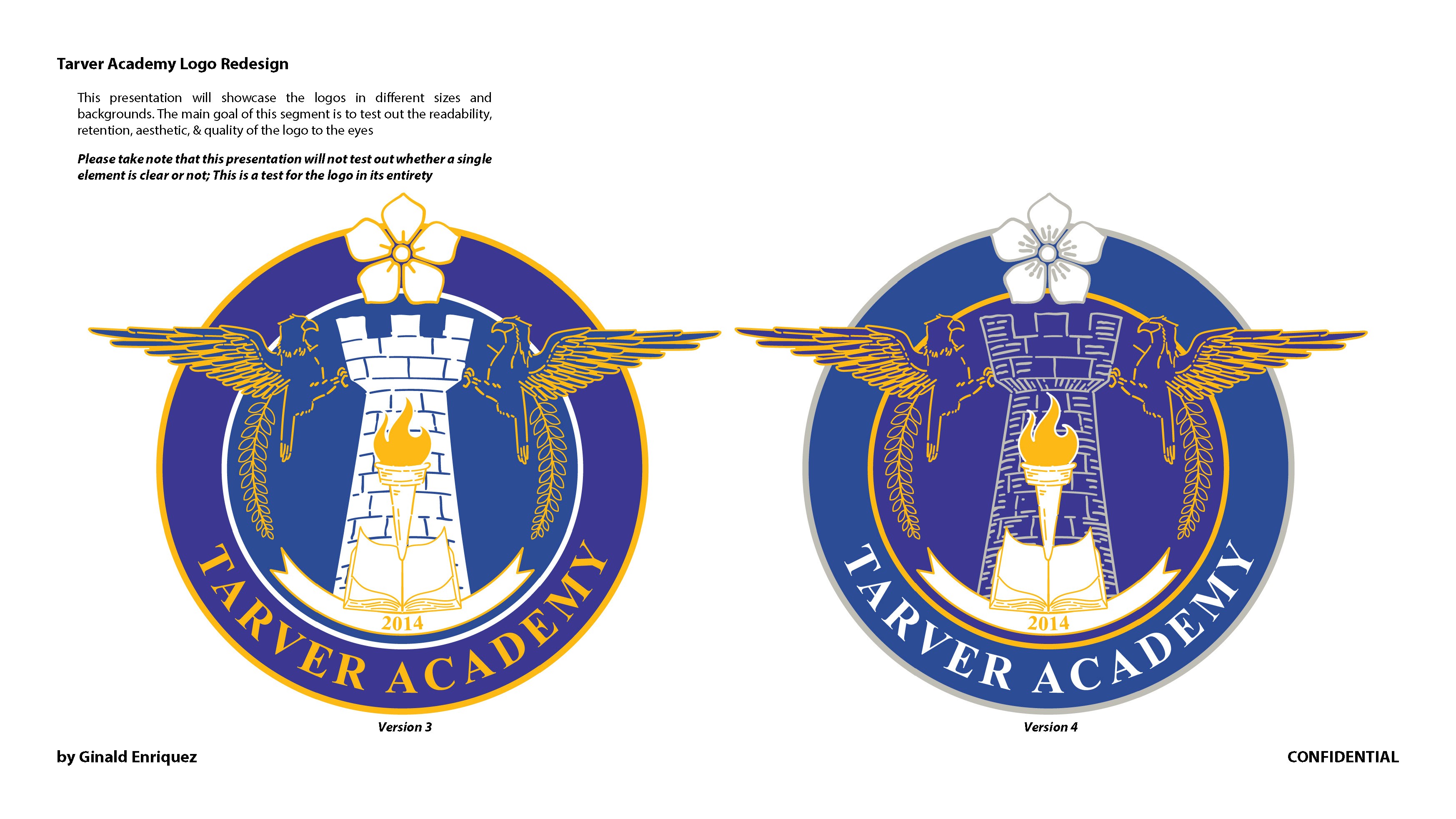
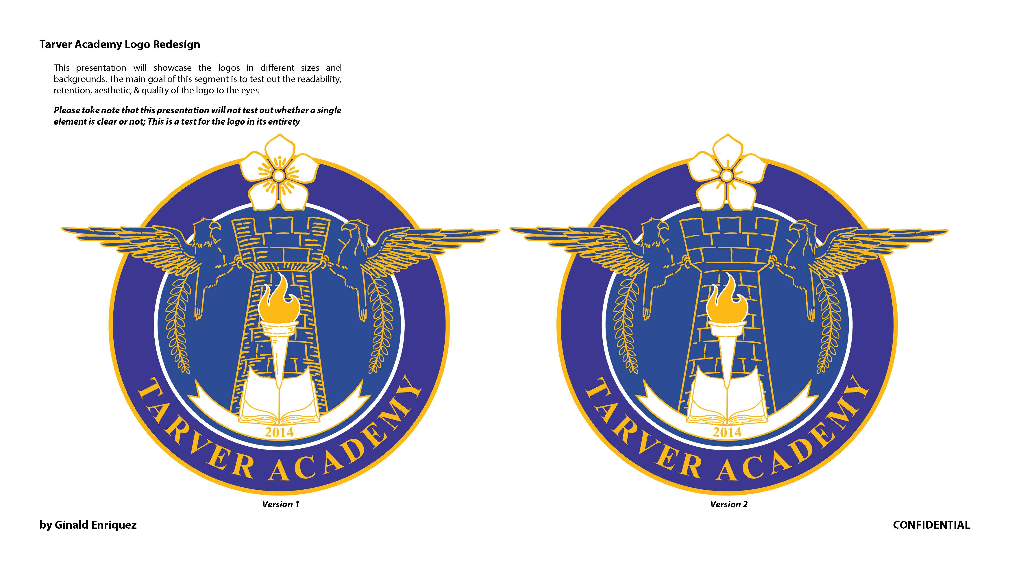
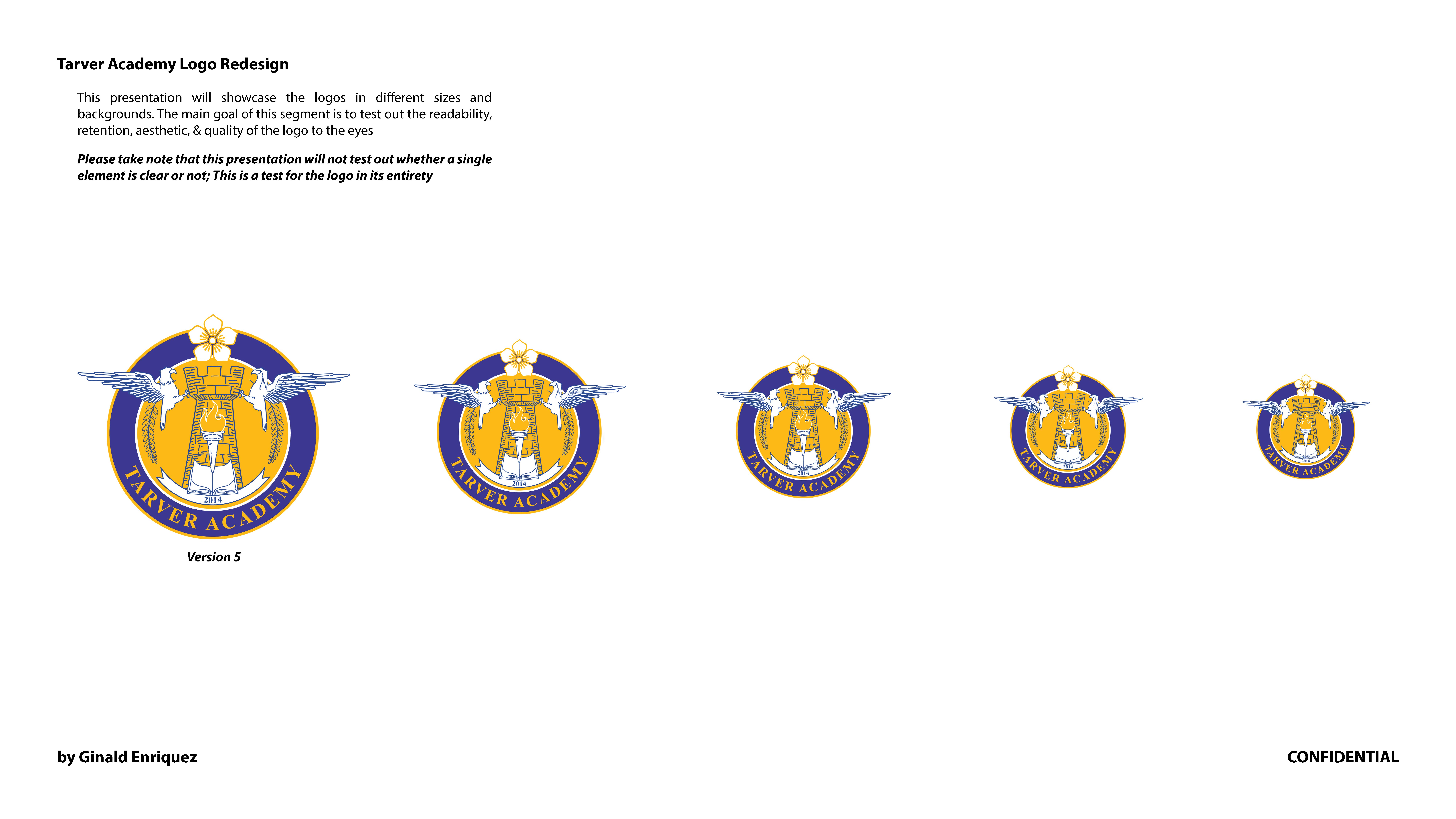
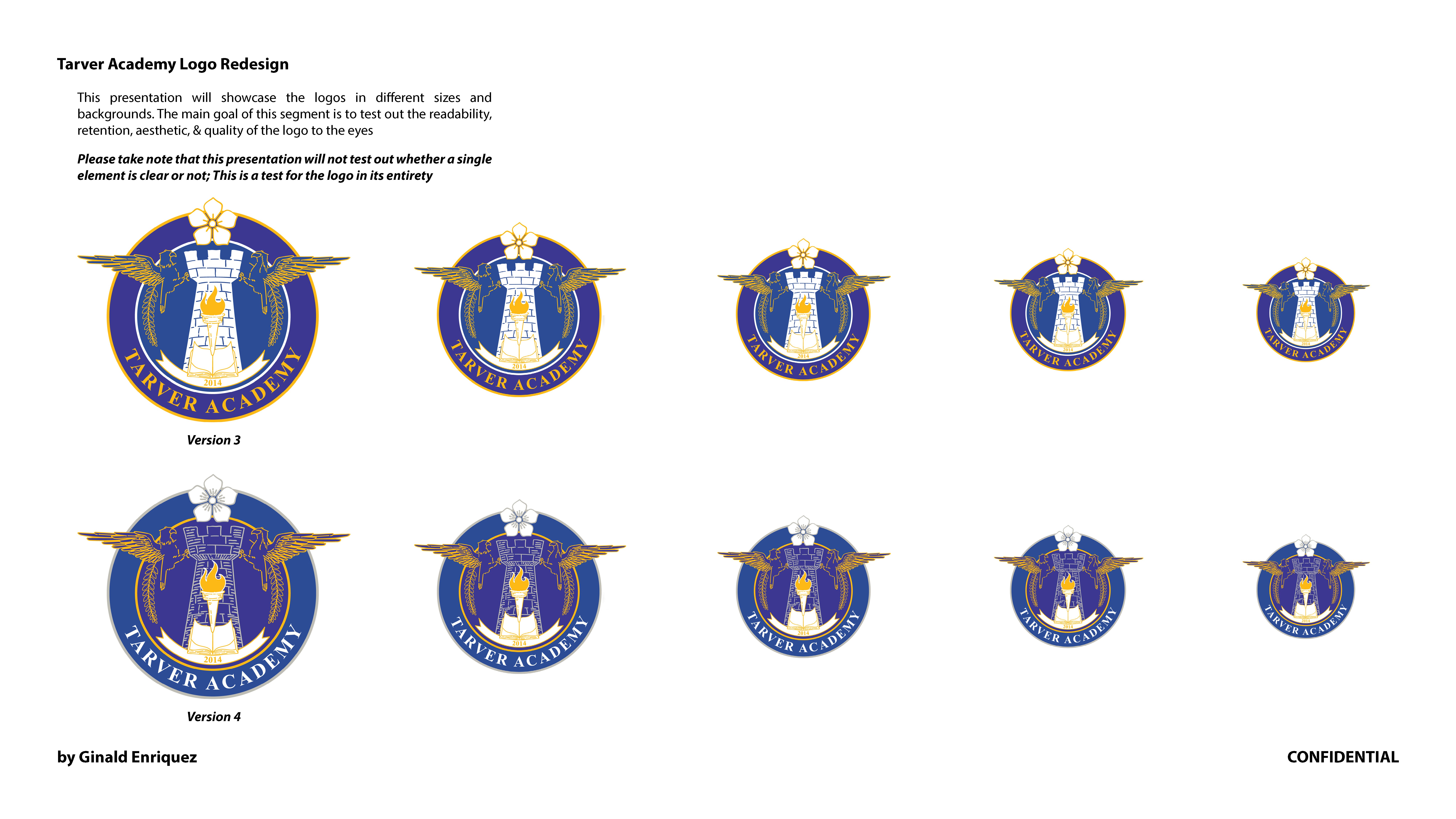
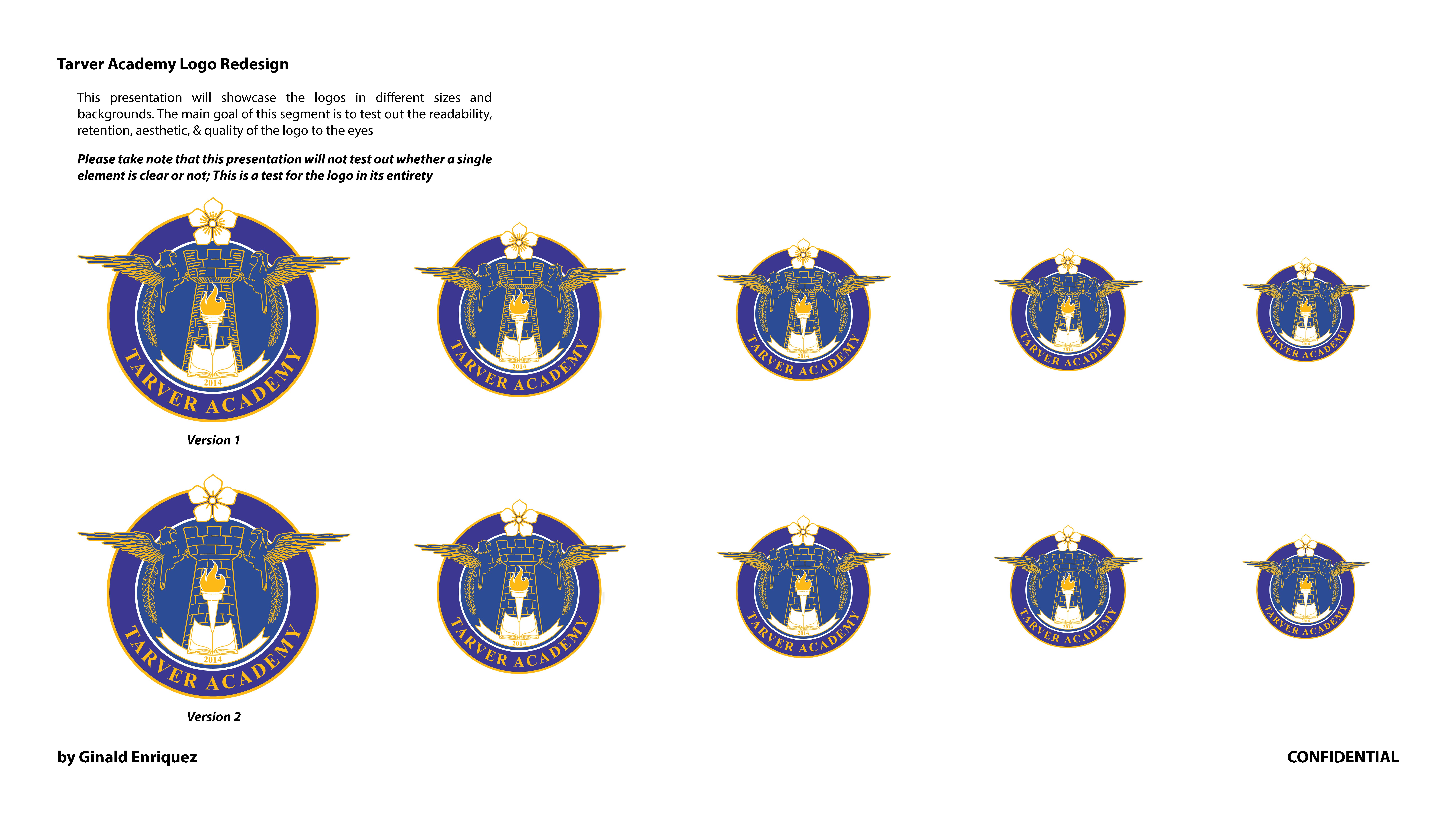
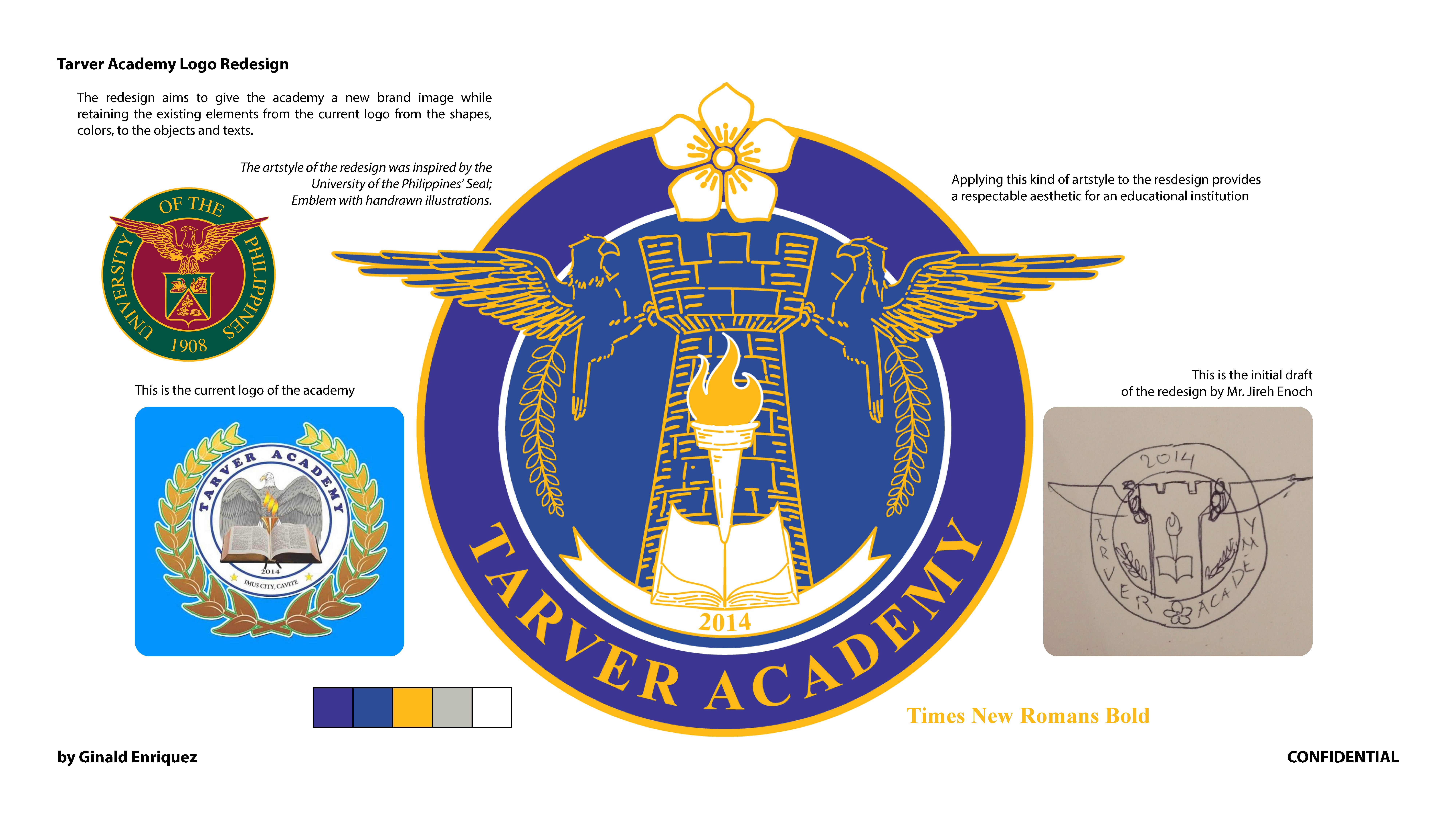
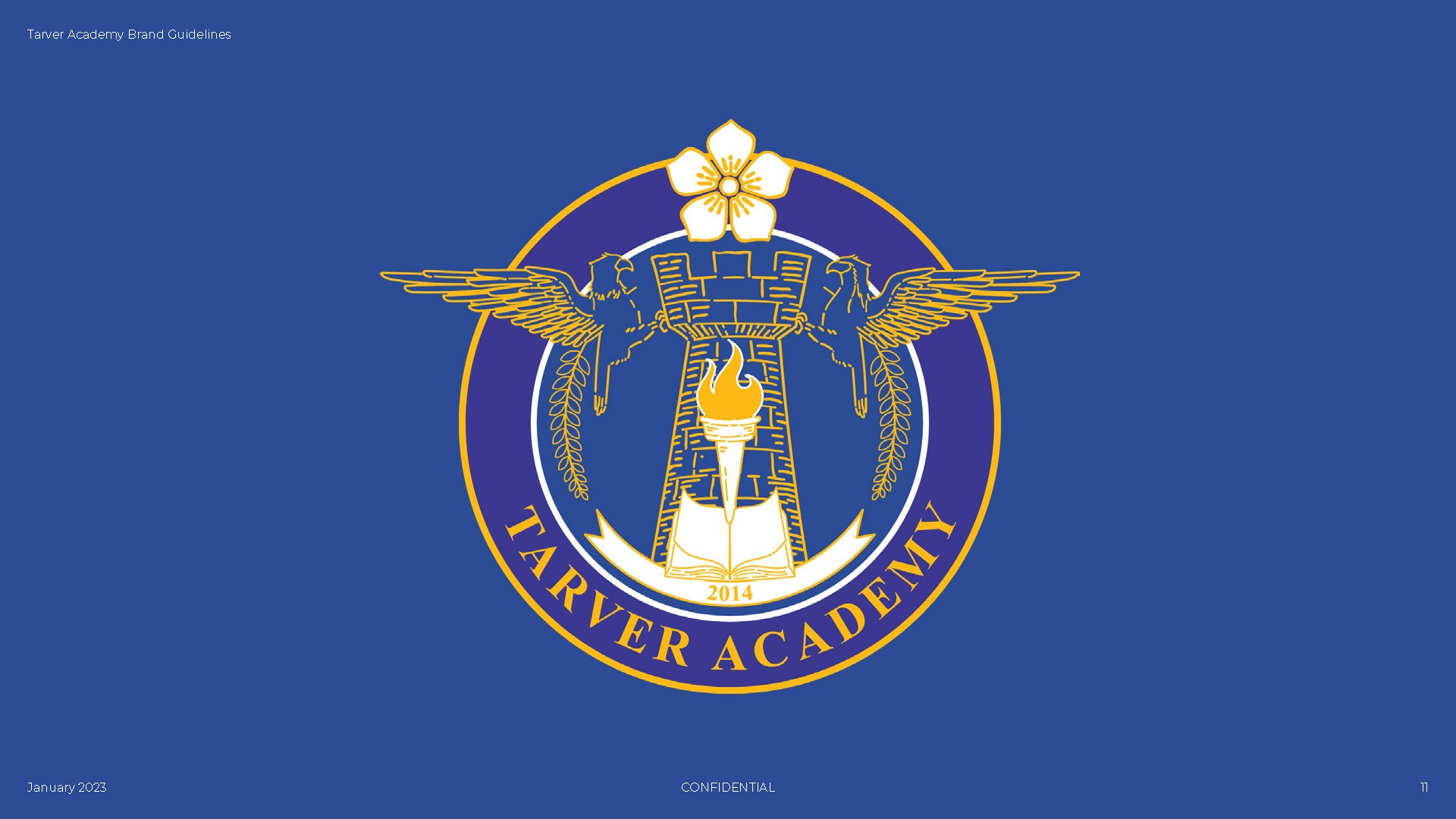
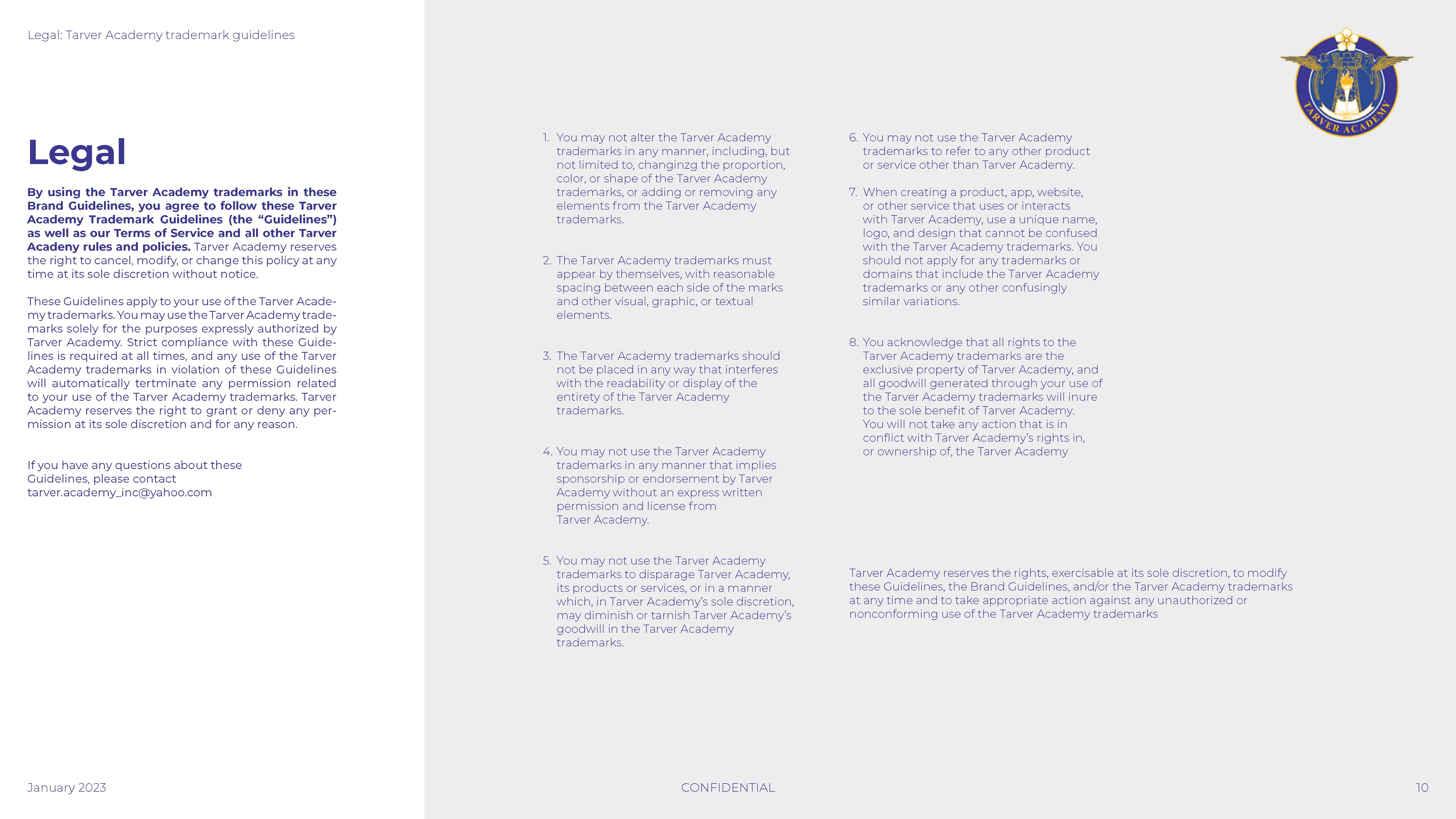
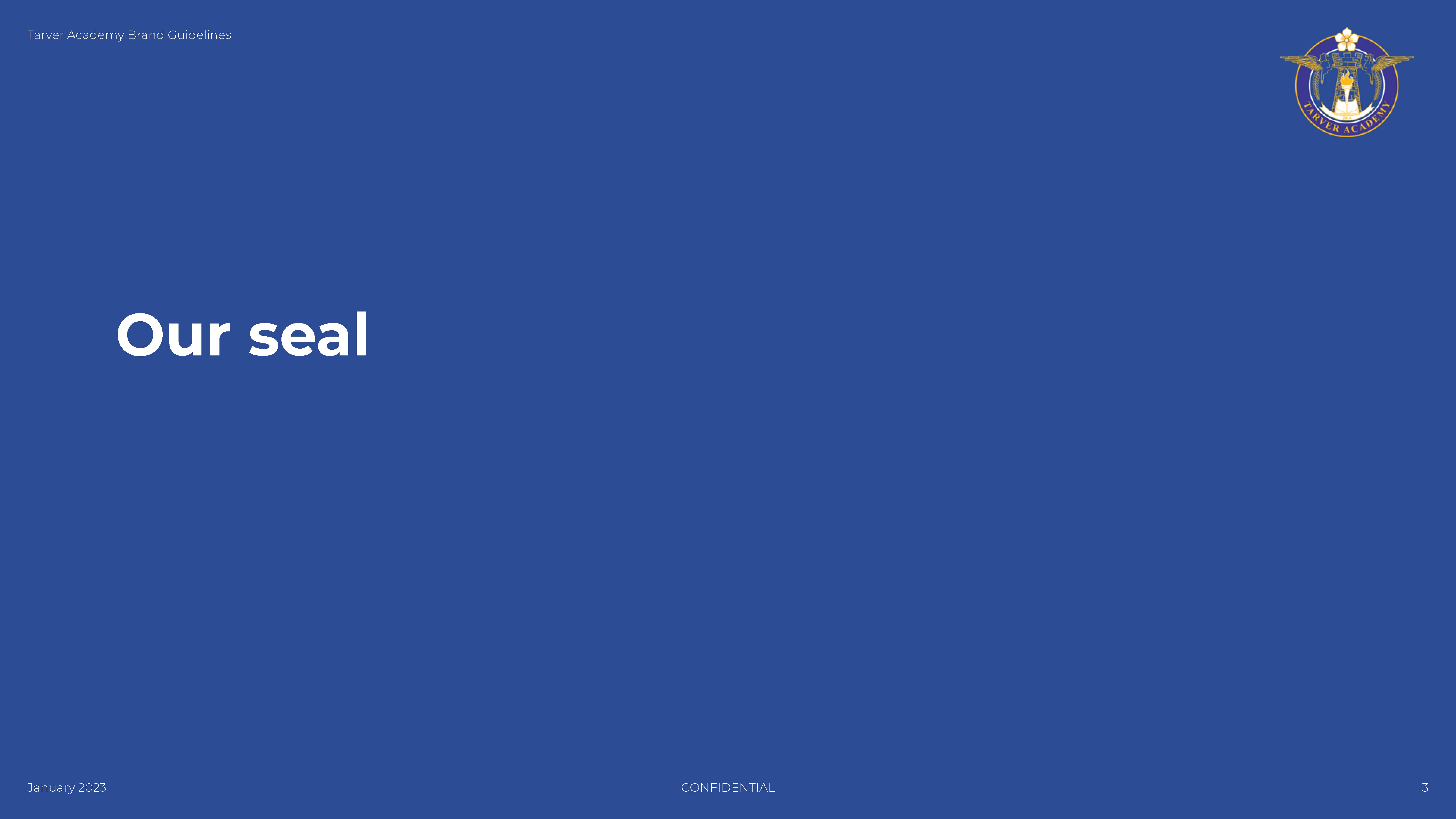
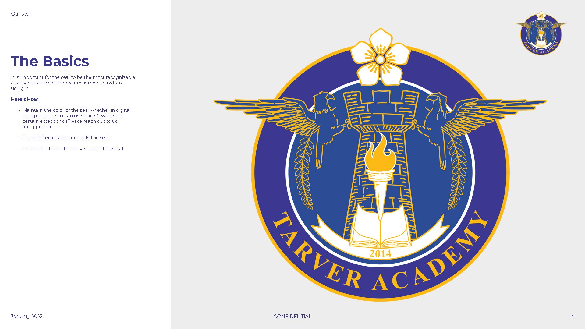
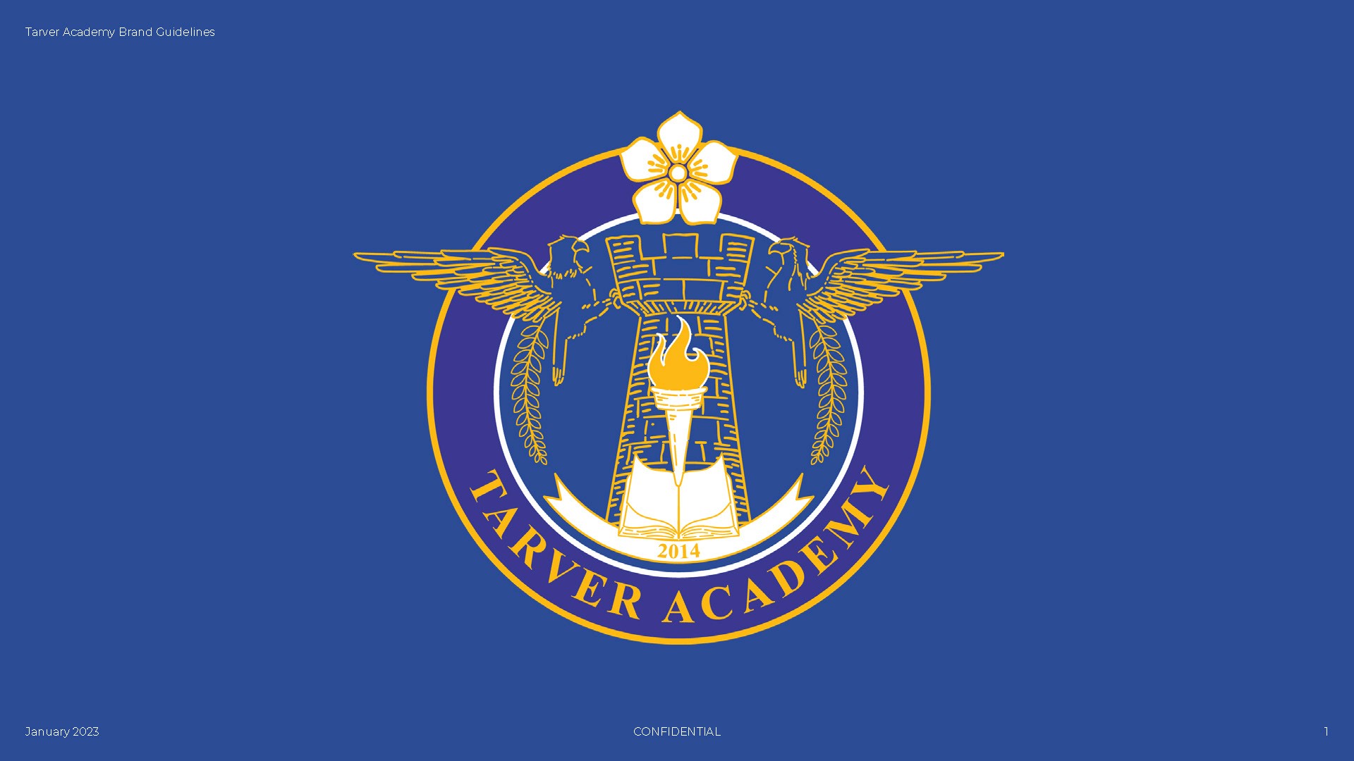
This project establishes a comprehensive visual system for Tarver Academy, centered on the official institutional seal. The guidelines codify essential design standards, including precise clear space requirements, minimum sizing for legibility, and a unified primary color palette to ensure professional consistency across all platforms. By defining rigorous rules for social media iconography and prohibiting the unauthorized alteration or misuse of brand assets, the system protects the academy’s visual integrity.
This strategic framework provides the legal and aesthetic foundation necessary for maintaining a recognizable and respected institutional identity.
This branding project explores the visual identity for The Clay, a multispecialty restaurant specializing in authentic Indian cuisine. The design centers on the Tandoori, or clay oven, serving as a symbolic mascot that bridges traditional cooking methods with modern hospitality.
By integrating hand-drawn botanical illustrations of spices and culinary elements into both the Tandoori vessel and a bold "Big C" monogram, the identity creates a versatile system that scales from delicate print menus to large-scale interior murals. The final concepts balance earthy, organic textures with elegant serif typography to position the brand as both culturally rich and sophisticated.
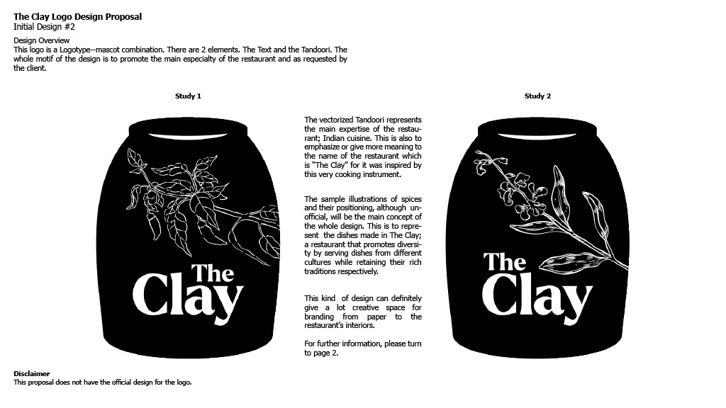
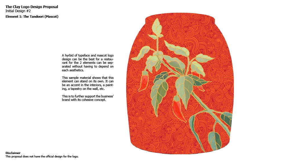
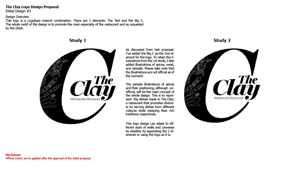
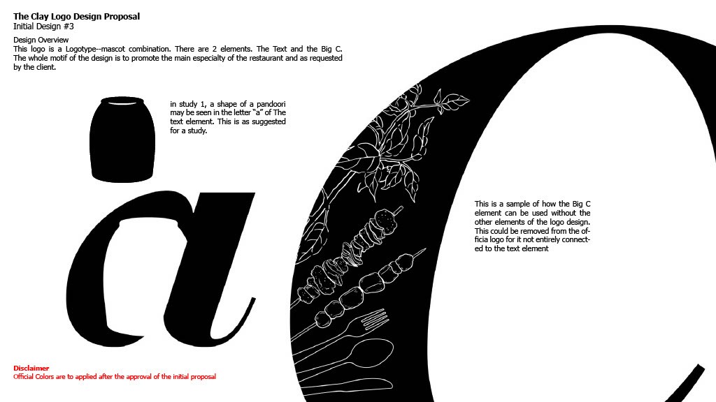
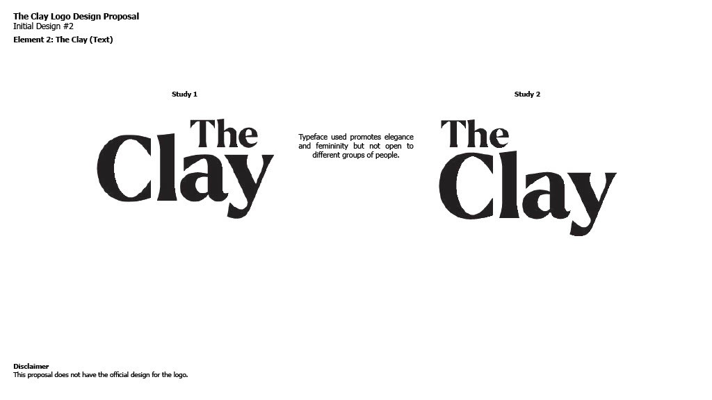
This branding project explores the visual identity for The Clay, a multispecialty restaurant specializing in authentic Indian cuisine. The design centers on the Tandoori, or clay oven, serving as a symbolic mascot that bridges traditional cooking methods with modern hospitality.
By integrating hand-drawn botanical illustrations of spices and culinary elements into both the Tandoori vessel and a bold "Big C" monogram, the identity creates a versatile system that scales from delicate print menus to large-scale interior murals. The final concepts balance earthy, organic textures with elegant serif typography to position the brand as both culturally rich and sophisticated.
Logos are the foundation of a brand’s visual system. In this collection, each mark is designed not just for aesthetics, but for meaning, function, and long-term scalability across platforms.
My process begins with understanding a brand’s personality, market positioning, and audience behavior before translating strategy into form, type, and symbol. From handcrafted wordmarks to illustrative emblems, every logo is built to work across digital, print, social, and environmental touchpoints.
Rather than treating logos as standalone graphics, I design them as flexible identity anchors—ready to expand into full branding systems, campaigns, and content ecosystems. The goal is clarity, memorability, and distinction in crowded markets.
Each project balances storytelling, usability, and visual impact to ensure the brand looks confident, consistent, and recognizable wherever it appears.
This project showcases a series of comprehensive logo studies aimed at modernizing the Hortaleza Corporation visual identity.
The challenge was to respect the heritage of a long-standing Filipino corporation while introducing a contemporary, forward-thinking aesthetic. These proposals explore three distinct directions: fluid, abstract marks symbolizing growth and synergy; structured, emblem-based designs that reinforce stability; and refined typographic treatments.
Each study focuses on maintaining brand authority through sophisticated color palettes and balanced geometry.
Trabahadoor is a service-matching platform designed to bridge the gap between skilled workers and those seeking immediate services. Following a competitive analysis that revealed a lack of personality in the sector, I developed three logo concepts focusing on accessibility and human connection.
These studies explore metaphors of "gateways" and "vision," utilizing a bold teal and orange palette to transform the act of job-seeking into a modern, approachable experience. By blending geometric symbols like safety helmets and doorways with clean typography, the identity establishes Trabahadoor as a professional yet highly accessible digital tool for the modern workforce.